
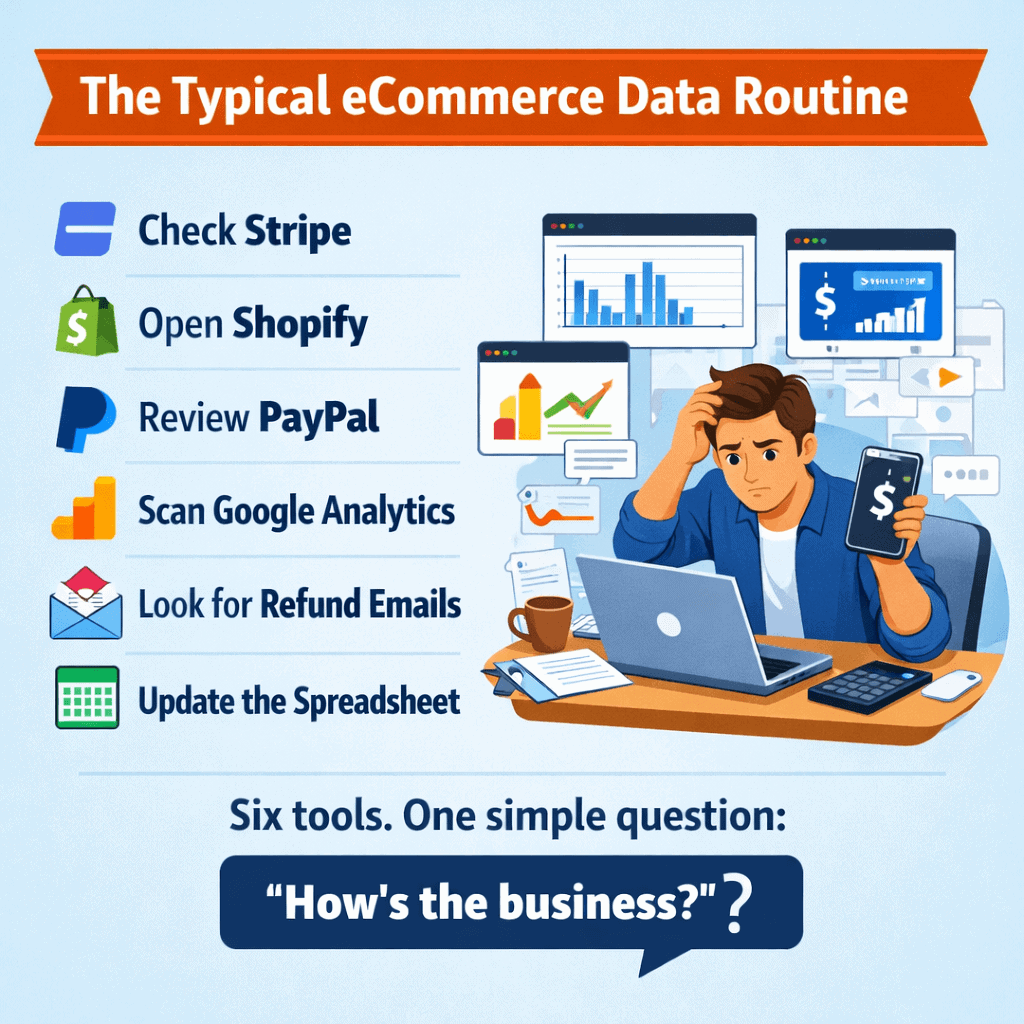
Every eCommerce owner has a version of the same morning routine. Check Stripe for weekend sales. Open Shopify to compare. Switch to PayPal. Glance at Google Analytics. Scan email for refund notifications. Open the spreadsheet someone was supposed to update but didn’t.
Thirty minutes later, you have a rough idea of where things stand. Rough being the key word.
Here’s the thing. The data you need exists. It’s just scattered across six platforms that don’t talk to each other.
Putler’s home dashboard is the screen that replaces that entire ritual. When you log in, this is the first thing you see. A single page with everything already consolidated, cleaned, and waiting.
It’s split into two sections: the Pulse (what’s happening this month, right now) and the Overview (deeper metrics for any date range). Let’s walk through what you get.
The Pulse eCommerce dashboard: what’s happening right now
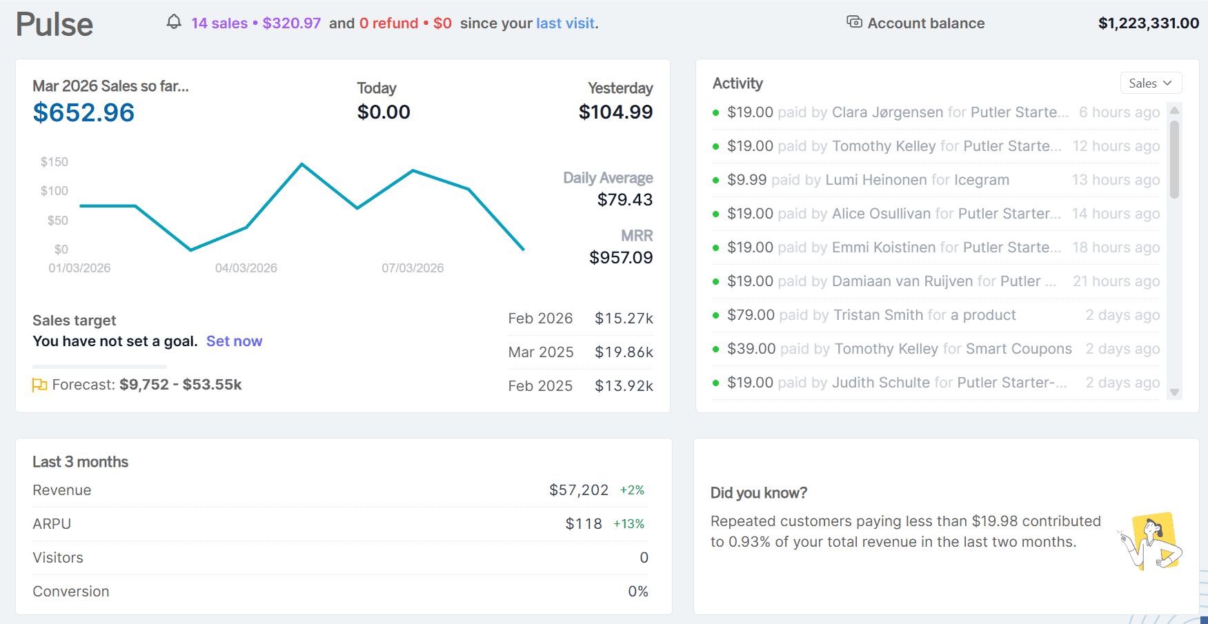
The top half of the Home Dashboard is your real-time health check. Four blocks that tell you exactly where things stand this month.
Sales Metrics Widget
Your current month’s revenue with the context that actually makes it useful. You see total sales to date, daily sales figures, and a 3-day trend graph that shows whether momentum is building or fading.
But what makes this block genuinely different from checking your payment gateway is the forecast and the target tracker.
The forecast projects where the month will land as a range (say, $20,000 to $32,000). Putler calculates this by comparing your recent three-month average against the same period last year, identifying the growth trend, and applying it forward.
It also runs a second calculation based on your minute-level sales pace so far this month. Two methods, one realistic range. You also get a year-over-year comparison showing exactly how this month stacks up against the same month last year.
Activity Log
A live feed of every sale, refund, dispute, transfer, and failed transaction happening across all your connected platforms. Filter by type to isolate just disputes or just refunds, or select “ALL” to see the full stream.
If you run multiple stores, everything streams into this single feed.
A Stripe dispute, a PayPal refund, and a Shopify sale all show up here, in order, from one place. No more checking five inboxes to piece together what happened over the weekend.
Three Months Comparison
Four numbers that tell you whether the business is actually growing or just busy. Visitors, conversion rate, ARPU (average revenue per user), and revenue. Last 90 days compared to the preceding 90 days, with percentage change for each.
Revenue might be up 10%, but if your conversion rate dropped 15% in the same window, that growth came from more traffic, not better performance. Most store owners only check this quarterly. Here, it’s always visible.
That’s the Pulse. Takes about ten seconds to scan. You know where you stand.
The Overview: go deeper into any time period
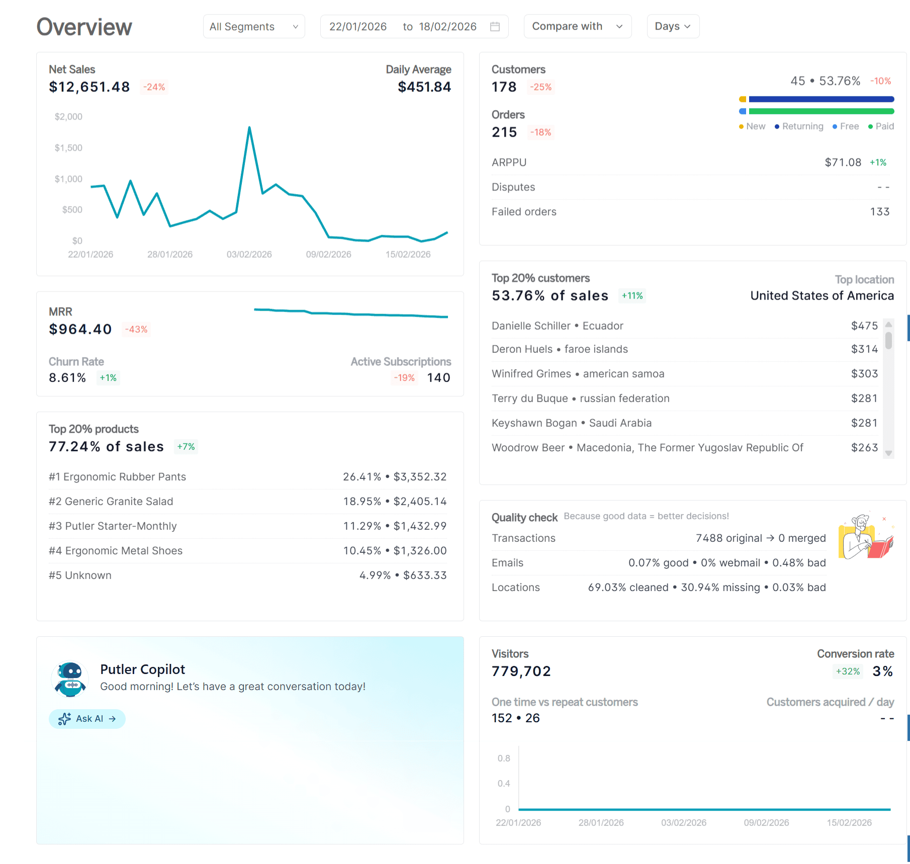
Below the Pulse, the Overview section lets you pick any date range and drill into detailed performance metrics. This is where the eCommerce dashboard goes from a morning check-in to a proper decision-making tool.
Set the date picker and everything updates instantly: sales, customers, traffic, subscriptions, and your top performers.
Date Picker
Choose any date range, filter by segment (product categories, customer demographics), and compare time periods. Select last 7 days and Putler automatically compares to the 7 days before that.
Select a quarter and it compares to the previous quarter. The percentage next to each metric tells you instantly whether you’re trending up or down. Once the date picker is set, every report in the Overview reflects that range.
Net Sales Widget
Total revenue for your selected period, daily averages that show what a typical day looks like, a trend graph that makes ups and downs visible at a glance, and a historical comparison showing percentage change vs the equivalent previous period.
This is the “are we making more or less than last time?” answer, calculated automatically.
Customer Metrics
A snapshot of how customers are actually engaging with your business in the selected period. Orders processed, unique customer count (not just order volume, but how many individual people bought), trend direction vs previous period, ARPPU (average revenue per paying user), disputes raised and unresolved, and failed orders.
Orders steady but disputes spiking 20%? That’s a product or payment problem. Failed orders climbing? There’s a checkout issue that’s costing you real money. This block catches the things that aggregate revenue numbers hide.
Website Metrics
Conversion rate for the period, a graph showing the split between one-time and repeat customers, and daily customer acquisition trends.
If you ran a campaign last week, this is where you see whether it actually brought in buyers, not just visitors.
The one-time vs repeat split is particularly useful: if 60% of your customers never come back, that changes your entire retention strategy. Most analytics tools bury this insight. Here, it’s on the overview screen.
Subscription Metrics
MRR, churn rate, and active subscriptions right on the Home Dashboard. If you run a mixed business with both subscriptions and one-time products, you don’t need to switch to the Subscriptions Dashboard for a quick check.
The key health numbers are here alongside your eCommerce metrics. Both revenue streams, one screen.
Top 20% Customer Insights
The small group carrying roughly 80% of your revenue, shown with their net sales contribution and primary location. This block makes the Pareto principle visible with your actual data.
If your most valuable customers are concentrated in one region, that changes how you think about targeting, localization, and ad spend.
Top 20% Product Insights
Same principle applied to your catalog. Which products drive the bulk of revenue, how much each contributes, and their percentage of total sales.
Putler identifies the top 20% of products sold (by sales contribution, in descending order) and shows their combined impact. You see the answer without opening the Products Dashboard.
Putler Copilot: skip the dashboards, ask a question
Sometimes you don’t need to browse the eCommerce dashboard at all. You just need one number.
Putler Copilot is an AI chat assistant sitting right on the Home Dashboard.
Type a question in plain English and get an answer from your connected data:
“What is my average revenue per day?”
“How many orders did I receive last month?”
“Who are my top customers by revenue?”
“What was my total sales yesterday?”
“How many returning customers do I have?”
It works best for revenue trends, order counts, customer lookups, averages, totals, and period comparisons. Currently in beta, so it doesn’t yet handle future predictions, external market data, or languages other than English.
But for the moments when you just need one specific number without navigating three screens and applying two filters, it saves real time. An advanced version is coming with the next Putler release.
The bottom line
Without a proper eCommerce dashboard, knowing “how’s the business?” requires five tabs, thirty minutes, and a spreadsheet nobody maintains. With it, the answer takes ten seconds.
The Pulse handles this month: sales vs target, forecast, activity feed, and three-month trends. The Overview handles any date range: net sales, customer engagement, conversion rates, subscription health, and your top 20% performers. And Copilot handles the one-off questions you’d otherwise spend five minutes clicking around to answer.
It’s not the dashboard for deep analysis. That’s what the Sales, Products, Customers, and Subscriptions dashboards are for. The Home Dashboard is the one that tells you whether you need to go deeper, or whether everything’s fine and you can get on with your day.
- How to Find Your Best Selling Hours, Locations, and Patterns with Putler Sales Heatmap
- Customer Profiles: How to Know Everything About Every Customer with Putler
- Product Analysis for eCommerce: How to Find Which Products Actually Drive Revenue
- eCommerce Transaction Management: One Dashboard for Every Payment, Refund, and Report
- eCommerce Data Consolidation: How Putler Connects and Cleans Data from 17+ Sources