You know how much money came in last month. That part’s easy. Every payment gateway on the planet can tell you that.
But can you answer this: what day and hour do you sell the most? Which city generates your highest average order value? Why did last Tuesday spike while this Saturday flatlined?
Most store owners can’t. Not because the data doesn’t exist, but because it’s buried inside transaction logs nobody has time to read. You end up making timing decisions (when to send emails, when to launch a flash sale, when to increase ad spend) based on instinct instead of evidence.
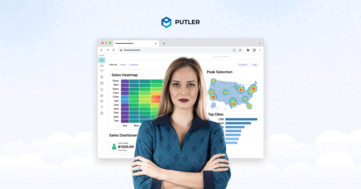
Putler’s Sales Dashboard exists to fix that. It takes your raw transaction data from every connected source and turns it into patterns you can actually see and act on.
It’s one of the core features of Putler, a complete analytics platform built for eCommerce owners who sell across multiple platforms.
Let’s walk through what you get.
First up: the numbers that tell you where you stand
You open the Sales Dashboard and the first thing across the top is a row of metrics for your selected date range.
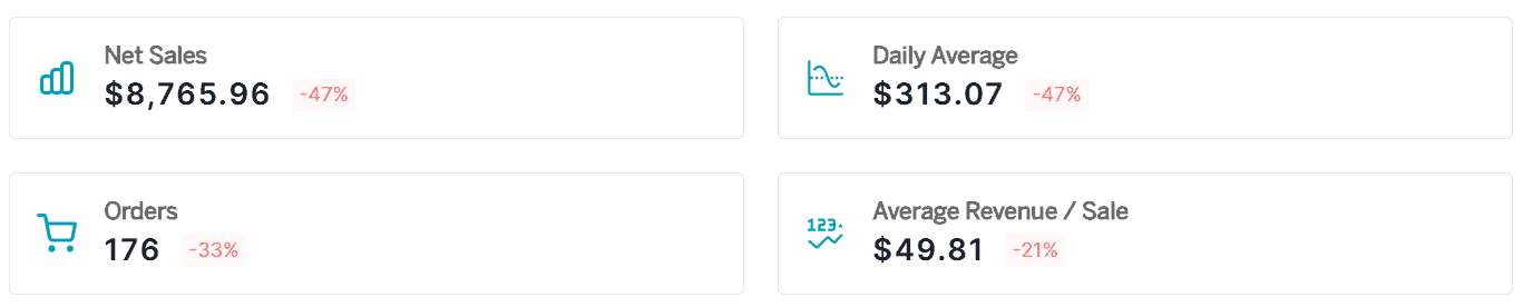
Net sales: The headline number, total revenue after subtracting refunds and discounts. If you made $100,000 but refunded $8,000 and gave $2,000 in discounts, your net sales are $90,000. Clean, honest, no inflated totals.
Daily average: What a typical day looks like, broken down from your total. Helpful for goal setting (are you hitting $500/day? $2,000/day?) and for spotting when a day falls weirdly below or above the norm.
Orders: The raw count of transactions, because revenue alone can be misleading. If your net sales jumped 30% but orders only grew 5%, your average order value went up. That’s a different story than “we’re getting more customers.”
Average revenue per sale: Total gross sales divided by orders, making the math explicit. If this number is trending down over months, you might have a pricing problem or a product mix shift happening quietly.
If you run subscriptions, the dashboard also shows MRR, churn rate, and active subscriptions right here. No switching to a separate screen. If you sell both one-time and recurring, you see both sides in one view.
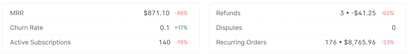
Refunds and disputes sit alongside everything else. Not hidden in a separate tab. Not something you have to go dig for. They’re right there, because understanding how much is going out matters just as much as knowing how much came in.
Below all of this.
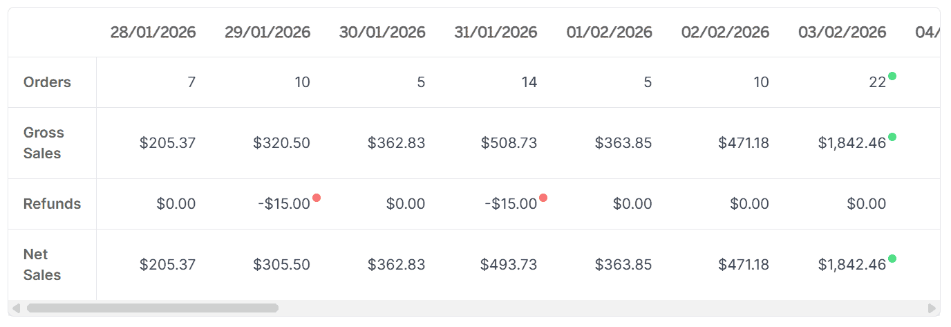
A breakdown chart plots your net sales and orders over time. You can view it by days, months, or years. A spike that looked random in your daily totals might turn out to be a pattern when you zoom out to months. A slow decline you didn’t notice day-to-day becomes obvious on a quarterly view.
That’s the overview. Now let’s look at the feature most Putler users didn’t expect to love.
The Sales Heatmap: the feature you didn’t know you needed
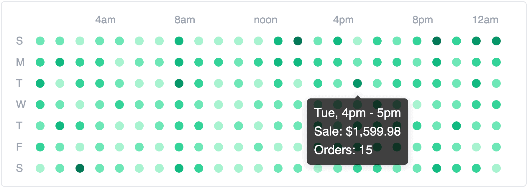
It sits in the top corner of the Sales Dashboard. A simple grid. Days of the week down the left side. Hours of the day across the top. Every cell color-coded by sales activity. Darker spots mean more sales. Lighter spots mean quieter periods.
That’s it. And it almost always looks different from what you’d expect.
Here’s why this matters practically:
Most timing decisions in eCommerce are based on assumptions. You schedule email campaigns for “morning” because that feels right. You run flash sales on weekends because that’s what everyone does. You boost ads during business hours because that’s when you’re online.
The sales heatmap replaces assumptions with data. Once you see the actual pattern, the actions become obvious:
- Schedule your email campaigns to land in inboxes right before your peak hours
- Time flash sales for windows when buying activity is already high
- Stop running ads during dead zones where you’re paying for impressions nobody acts on
- Staff your live chat during the hours customers are actually shopping
For the dark spots (high sales periods), the question isn’t “are we doing well here?” but “how do we push this even higher?” A flash sale during your naturally strongest window amplifies what’s already working.
For the light spots (low sales periods), identifying them is the first win. You can try to activate those hours with special offers, or you can accept that they’re quiet and stop wasting budget there. Either way, you’re making the decision with evidence.
The sales heatmap updates based on your selected date range, so you can compare patterns across seasons. Your December rhythm probably looks nothing like your June rhythm, and knowing that changes how you plan.
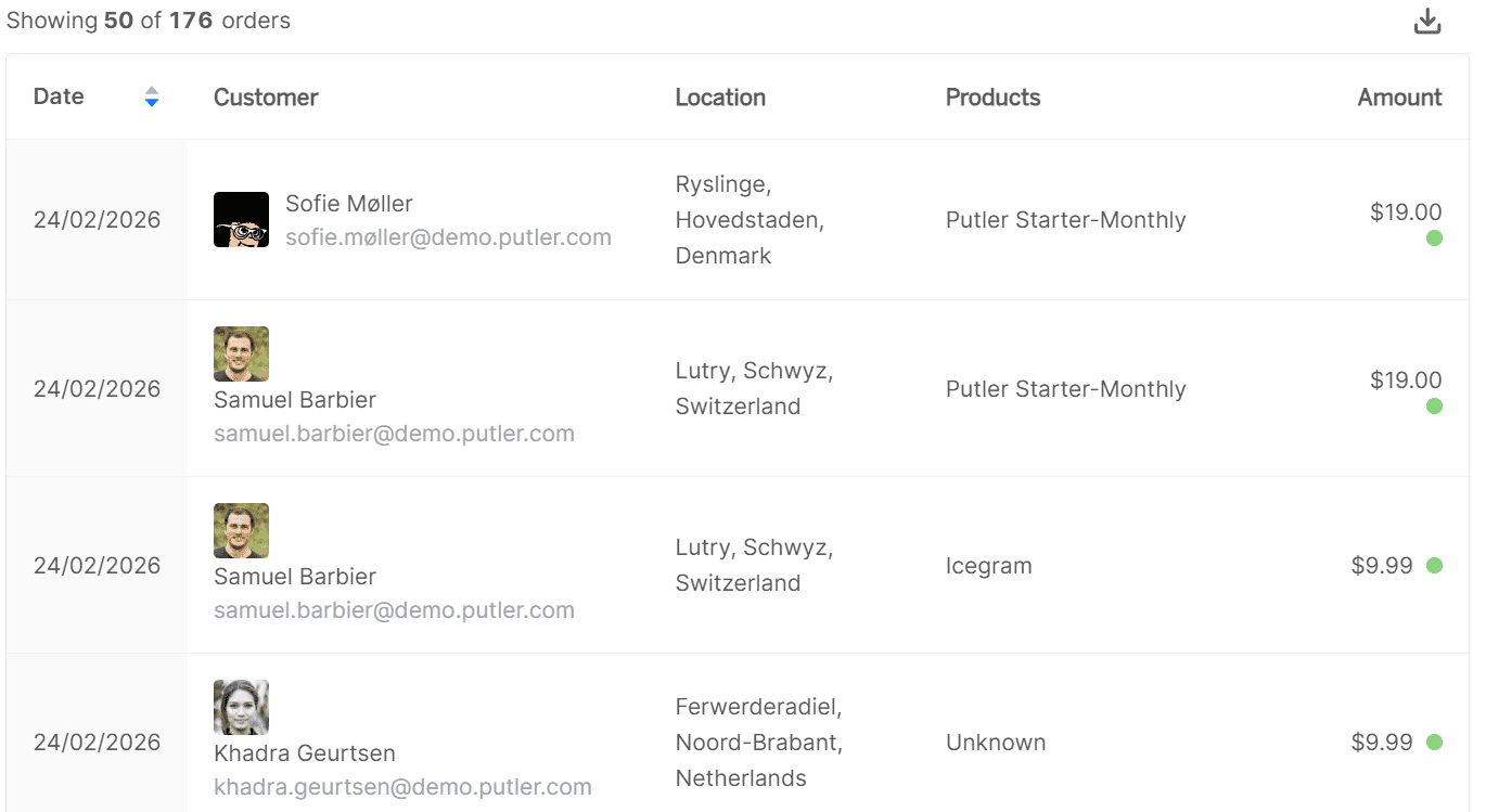
Now go deeper: the order list and transaction details
Sometimes you need to go granular.
Below the charts, the Sales Dashboard gives you a list of every individual order. Each one is expandable into a full details card showing: the payment method used, customer information, products purchased, and the transaction status.
Click any order and it opens into a Transaction Details Card with three sections:
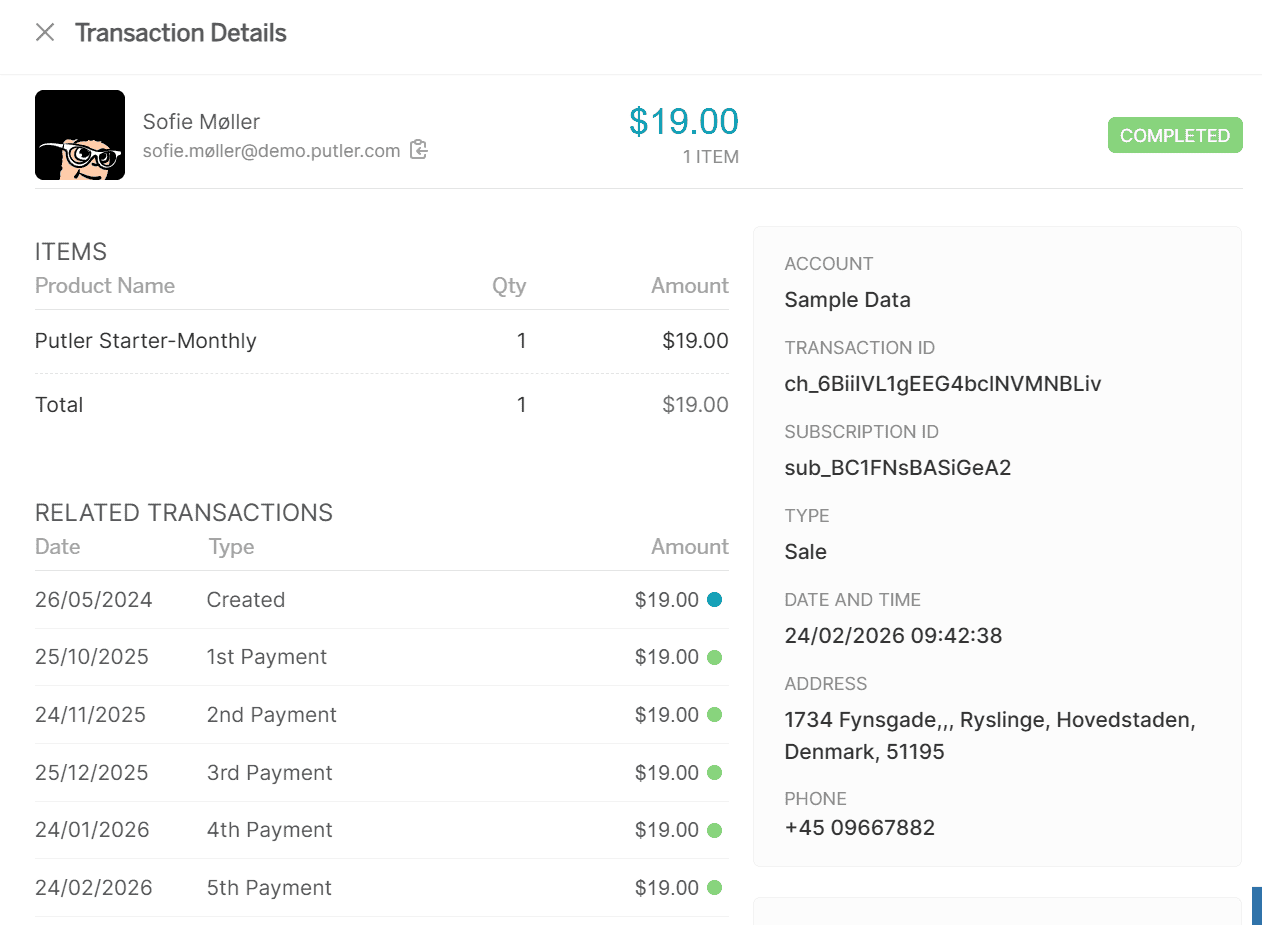
Item details: Product name, quantity, and amount for each line item. When a customer writes in about a wrong order, you’re looking at the answer before they finish the sentence.
Transaction details: Which account the payment came through, unique transaction ID, transaction type (purchase, refund, etc.), exact date and time, plus the customer’s address and phone number. Everything your finance team needs for reconciliation in one place.
Financial breakdown: Subtotal, commission, shipping, fees, tax, discounts, and the final net amount. If a customer asks “why was I charged $127 instead of $99?” the shipping, tax, and fees that made up the difference are all right here.
This is where your support team lives when someone writes in asking “where’s my order?” or “why was I charged twice?” Instead of logging into Stripe, then checking Shopify, then cross-referencing PayPal, the answer is right here. One click, full details.
The order list turns “something happened” into “here’s exactly what happened.”
Slicing the data: filters that actually help
The Sales Dashboard comes with four predefined filters you can apply to everything — the metrics, the charts, the heatmap, the order list:
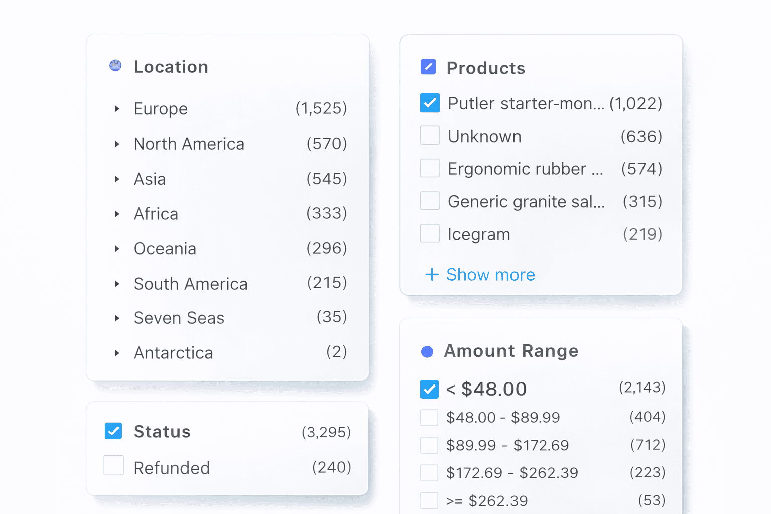
Location: Breaks sales down by geography, from continent to country to county. Want to see if your German customers buy at different times than your US customers? Filter by country and the Sales heatmap updates. Want to know which city drives the most revenue? This is where you find out.
Products: Lets you isolate sales for a specific product. Maybe your sales heatmap looks average across all products, but when you filter for your flagship product, a sharp pattern emerges. Different products can have completely different buying rhythms.
Status: Filters by transaction type — completed sales, refunds, or specific statuses. Useful when your finance team needs a clean view of only completed transactions, or when you want to see refund patterns separately from sales.
Amount ranges: Groups transactions by size. Putler categorizes your sales into different brackets automatically, so you can identify your most profitable range. Are most of your orders between $50 and $100? Or do you have a bimodal pattern with lots of small orders and a few very large ones? This changes your pricing and bundling strategy.
Once you have the view you need, export to CSV or push directly to Mailchimp. The dashboard is designed to take you from “I wonder…” to “here’s who to target.”
What this actually changes about how you run your store
It’s easy to talk about data and dashboards. Here’s what it looks like in practice.
Before the Sales Dashboard, you’d check your Stripe or PayPal balance, see that revenue is roughly where you expected, and move on. Timing decisions were gut-based. Location patterns were unknown. Refund spikes went unnoticed until someone mentioned it in a meeting.
After, your Monday morning takes about two minutes. You open the dashboard, check net sales against your daily average, glance at the sales heatmap to confirm patterns are holding, scan refunds and disputes for anything unusual, and you’re done. You know where you stand.
When it’s time to plan a campaign, you pull up the sales heatmap, see that Wednesday 2 to 5 PM is your strongest window, and schedule your email drop for 1:45 PM. You filter by location, notice that Australian customers have a completely different peak (your evening, their morning), and set up a separate send for that segment.
When a product launch underperforms, you filter the dashboard by that product, check the sales heatmap, and discover you launched it during one of your weakest time slots. Next launch, you time it differently.
None of this is complicated. It’s just visible now.
Final words
Most store owners know their revenue total. Very few know the patterns inside it: when sales happen, where they come from, how they cluster by time and geography, and what the refund trends look like underneath.
Putler’s Sales Dashboard makes all of that visible in one place. The sales heatmap alone is worth the setup. Everything else (the metrics, the filters, the order-level detail) turns raw transaction data into decisions you can actually make.
- Customer Profiles: How to Know Everything About Every Customer with Putler
- Product Analysis for eCommerce: How to Find Which Products Actually Drive Revenue
- eCommerce Transaction Management: One Dashboard for Every Payment, Refund, and Report
- Your eCommerce Dashboard: One Screen to Replace Five Tabs and Thirty Minutes
- eCommerce Data Consolidation: How Putler Connects and Cleans Data from 17+ Sources