You already know product analytics matters. But knowing which products are actually driving your revenue, which ones are getting refunded at a worrying rate, and which ones have quietly stopped moving? That’s a different challenge altogether.
This guide walks you through Putler’s product analytics dashboard, what it shows, and how to use it to make smarter decisions for your store.
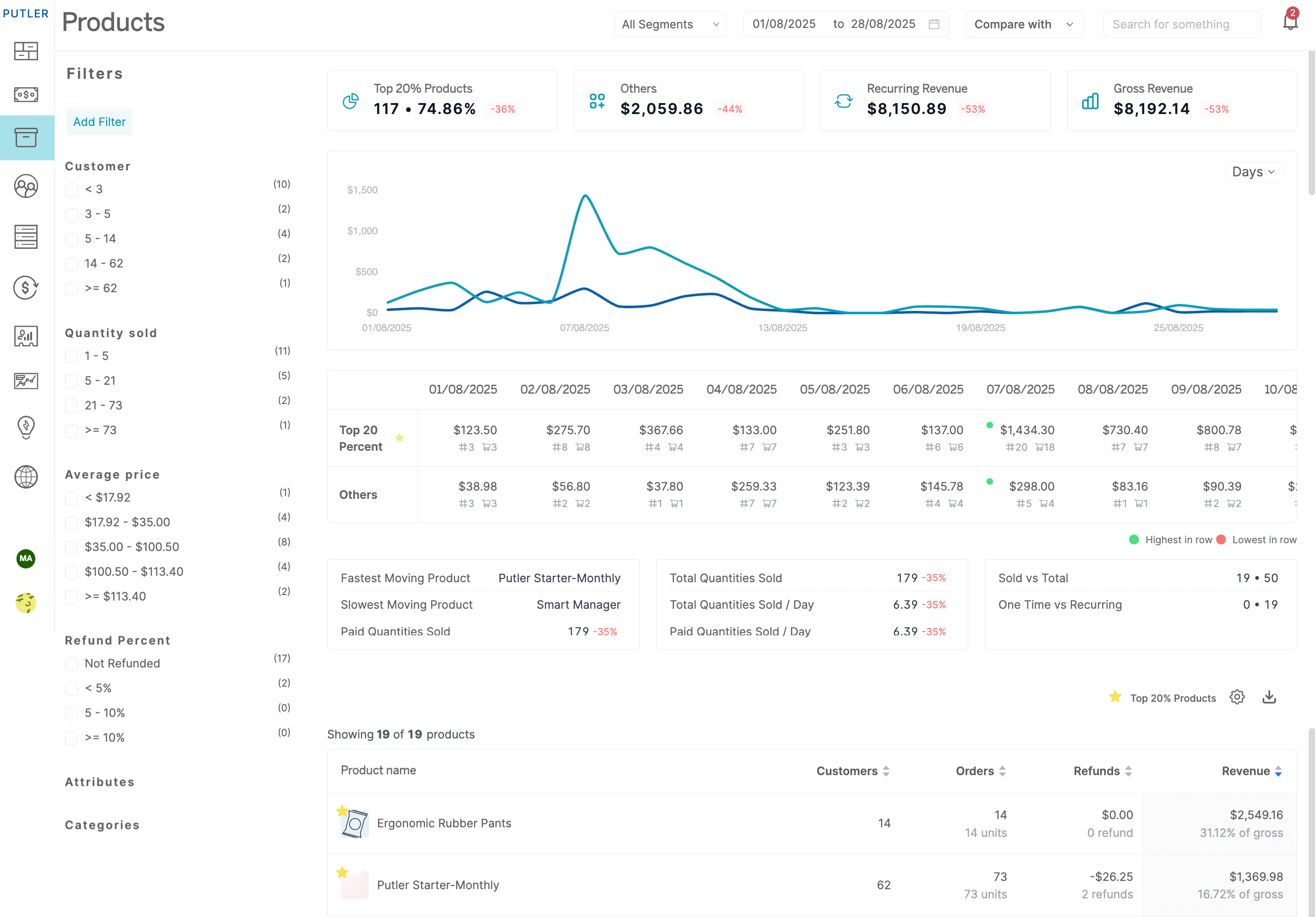
Products Dashboard
Putler’s Products Dashboard gives you a single, organized view of everything happening across your product catalog.
From top performers to slow movers, refund rates to revenue splits, it is all here without any manual work on your end.
Grow your product sales by data driven insights
Take a look at what it looks like in action.
Single or Multi-Product Store? Putler’s Products Dashboard Handles Both With Ease
Whether you run a lean single-product store or manage a catalog with hundreds of SKUs, the Products Dashboard adapts to your scale without any extra configuration.
Better product analytics within seconds
Putler lets you have better control over your products and take wiser decisions.
- Facets: Use pre-defined filters to narrow down product data and get interesting insights.
- Product-based metrics: All important product KPIs at a glance.
- Summary & chart: Get graphs as well as numerical reports and make better sense of your data.
- In-depth Reports: Get the broader picture of your product data.
FACETS
Think of facets as your shortcut to meaningful product data. Instead of scrolling through your entire catalog, you zero in on exactly what you need in just a few clicks.
Facets are nothing but pre-made filters that help you narrow down data.
You can filter data based on various parameters and have a deeper understanding of your product data.
Types of Product Facets available in Putler:
- Quantities Sold
- Number of Customers
- Customer Location
- Average Price
- Refund Percent
Here are ways you can use facets to make better business decisions
Each facet solves a specific visibility problem. Here is what each one shows you and how to actually put it to work.
Filter by Quantities Sold
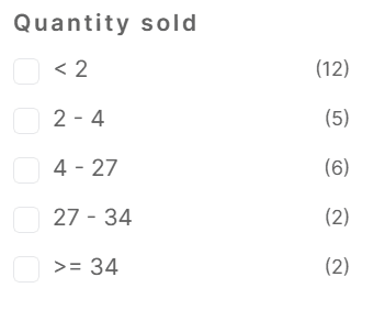
This filter is useful when you have a multi-product store. As the number of products on your store increase, it becomes difficult to keep a track of what got sold how many times.
This filter tracks how your products have been performing and creates buckets so you can keep a track of the quantities within a few clicks.
It calculates and recalculates these buckets as per the date range that you select.
Filter by Number of Customers
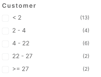
Similar to the quantity sold, a business owner is also interested to know how many customers have purchased their product.
This filter gives you a count of the number of customers which when clicked will show you the products that fall in this bucket.
High revenue and wide reach are not always the same thing. A product might look strong on paper but be carried entirely by a handful of repeat buyers. This filter helps you spot that difference.
Filter by Customer Location
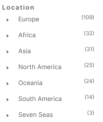
This facet is a common facet in all dashboards. It will show you the top countries with total quantities where your products are sold.
On selecting the country, all products sold in the selected country for the selected date range will get loaded in the grid besides.
If a specific product sells significantly better in one country, that is a signal worth acting on. It changes how you approach ad targeting, regional pricing and which products to highlight in location specific campaigns.
Filter by Average Price
Pricing is an important factor that determines sales. And as business owners, we keep experimenting with it.
At times we have had so many price variations we tend to forget which price range actually worked and by how much. To make the math simpler, Putler’s Average Price facets segregate data based on the price.
On click of it, you will know which product got sold in that range and by how much.
Based on this information, you can better decide which range works for your audience and which doesn’t.
Filter by Refund Percent
Just like pricing, refunds are also important. Every business owner should know which product is getting refunded and then attempt to find the reason why.
Now to know which product is getting refunded you don’t have to go hunting in the database. Putler makes it simple by filtering out the refund percent of your products.
On clicking the refund percent you can see which product got refunded and then take curative measures to reduce the refunds.
A product with a consistently high refund rate is a margin problem. It compounds every time you run a promotion. Catching it early gives you time to investigate whether it’s a product quality issue, a misleading description or a fulfillment problem.
Explore ways to use these filters
Summary & Chart
A leaderboard tells you who won. This tells you by how much and what it means for the rest of your catalog.
Instead of giving you a simple chart of your top products, Putler gives you a comparison chart and summary table of revenue contribution, orders and quantities sold by top 20% of your products vs the rest of the products.
Take a look at both the Summary table and the chart here:

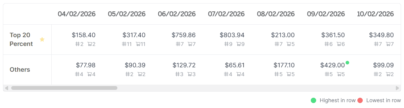
In most stores a small group of products carries the majority of revenue. Knowing exactly which ones sit in that group changes where you invest your time, ad budget and promotional energy.
Use this view regularly and you will always know where to double down and where to pull back.
Product-based metrics
Beyond the filters, Putler calculates a set of product-specific KPIs automatically so you always have a pulse on what your catalog is doing.
Products are a major element of your business and they deserve product specific metrics.
Putler processes all your business data and gives you key product based metrics like:
- Top 20% revenue (amount and percentage contribution)
- Qty. Sold
- Fastest Moving Product
- Slowest Moving Product
- Qty. sold per day
- Products Sold vs Total
- One time vs Recurring
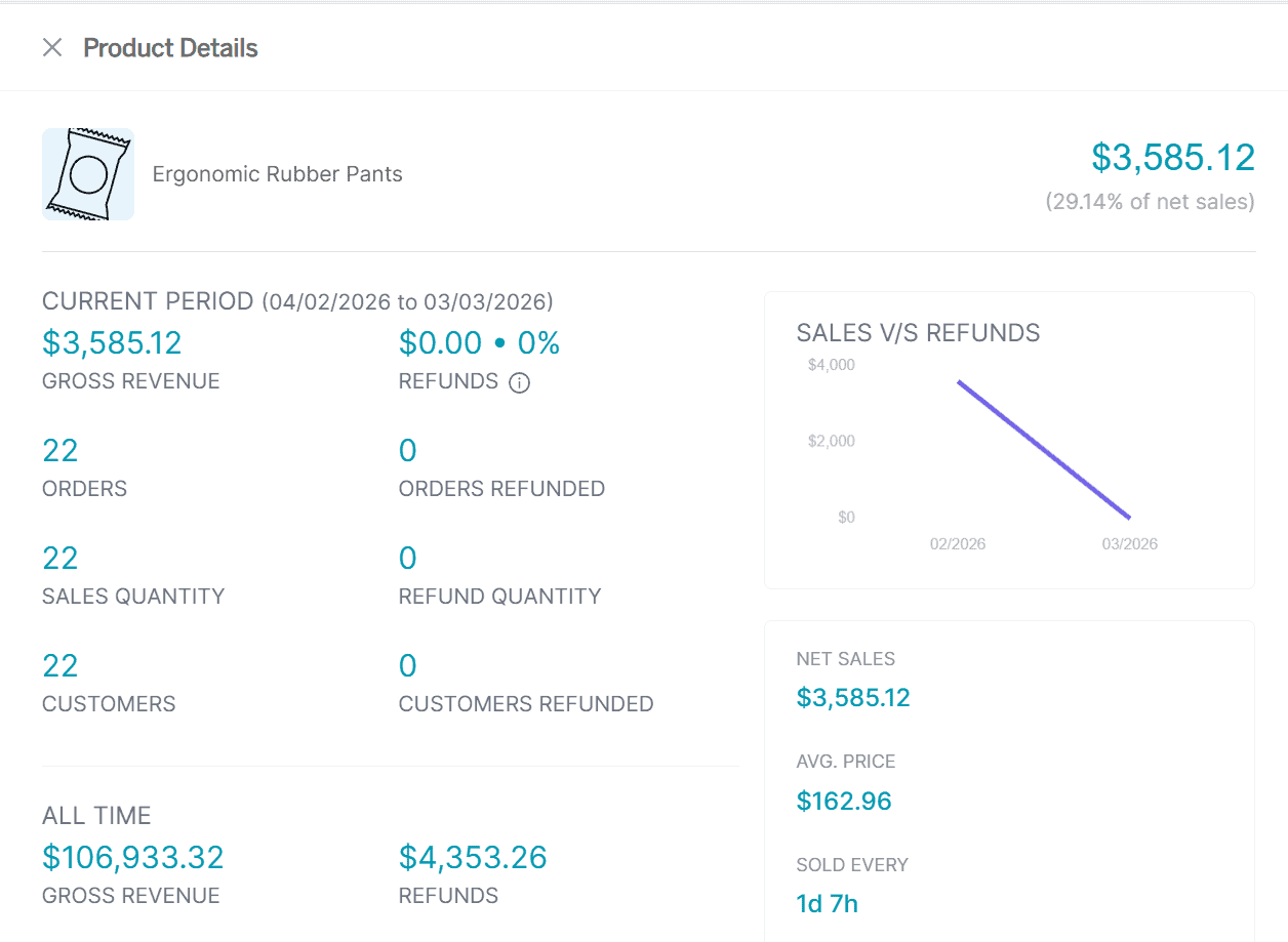
In-depth Product Reports
The facets and metrics give you the big picture. This is where you go when you need to understand a specific product in detail.
Just like Sales and Customer reports, Putler provides an in-depth report for every product on your store.
This report helps you see how the product has been performing in a single glance.
You can see the revenue contribution, refunds, customers who have bought the product, day-wise quantity sold, and more.
Everything you would normally piece together from multiple reports is already here, automatically pulled for every product in your store.
Frequently Asked Questions
What is Putler’s Products Dashboard?
Putler’s Products Dashboard is a product analytics view that pulls data from all your connected stores and payment gateways. It shows key product metrics, performance trends, refund rates and customer purchasing data without manual exports or spreadsheets.
Can Putler track products across multiple stores?
Yes. If you sell across Shopify, WooCommerce, Etsy or other platforms, Putler consolidates product data from all sources into one dashboard. You can view combined performance or filter by individual data source.
What does the 80/20 product chart show?
The Summary and Chart section compares your top 20% of products by revenue against the remaining 80% of your catalog. It breaks this down by revenue contribution, total orders and quantities sold so you can see exactly where the real value in your catalog sits.
How does the Refund Percent filter help?
It surfaces products with above-average refund rates automatically. Once you know which product has a problem you can investigate the cause whether that is product quality, sizing, descriptions or fulfillment.
Does Putler show which products are frequently bought together?
Yes. Putler includes frequently bought together data within product intelligence. This is useful for building bundles, upsell sequences and cross-sell campaigns based on actual purchase behavior.
Can I export product data from Putler?
Yes. You can filter your product data using facets and export the resulting list for use in email campaigns, ad targeting or reporting.
Over To You
Now that you know what the Products Dashboard can show you, the next step is simple.
Product analytics only works if you act on what it shows you. Putler’s Products Dashboard gives you the filters, metrics and reports to stop guessing and start making decisions based on what your data is actually telling you.
Take a look at the Products Dashboard and start with the one metric or filter that’s most relevant to where your store is right now.