Most eCommerce businesses know their products inside out. Ask them about their best-selling item, and they’ll tell you without blinking.
Ask them about their best customer? Silence.
Not because they don’t care. Because the data is scattered.
Putler’s Customers Dashboard changes that. It builds a complete, detailed customer profile for every customer automatically, using the transaction data you already have.
It’s one of the core features of Putler.
Let’s walk through exactly what you see when you open it.
First thing you see: is your customer base actually healthy?
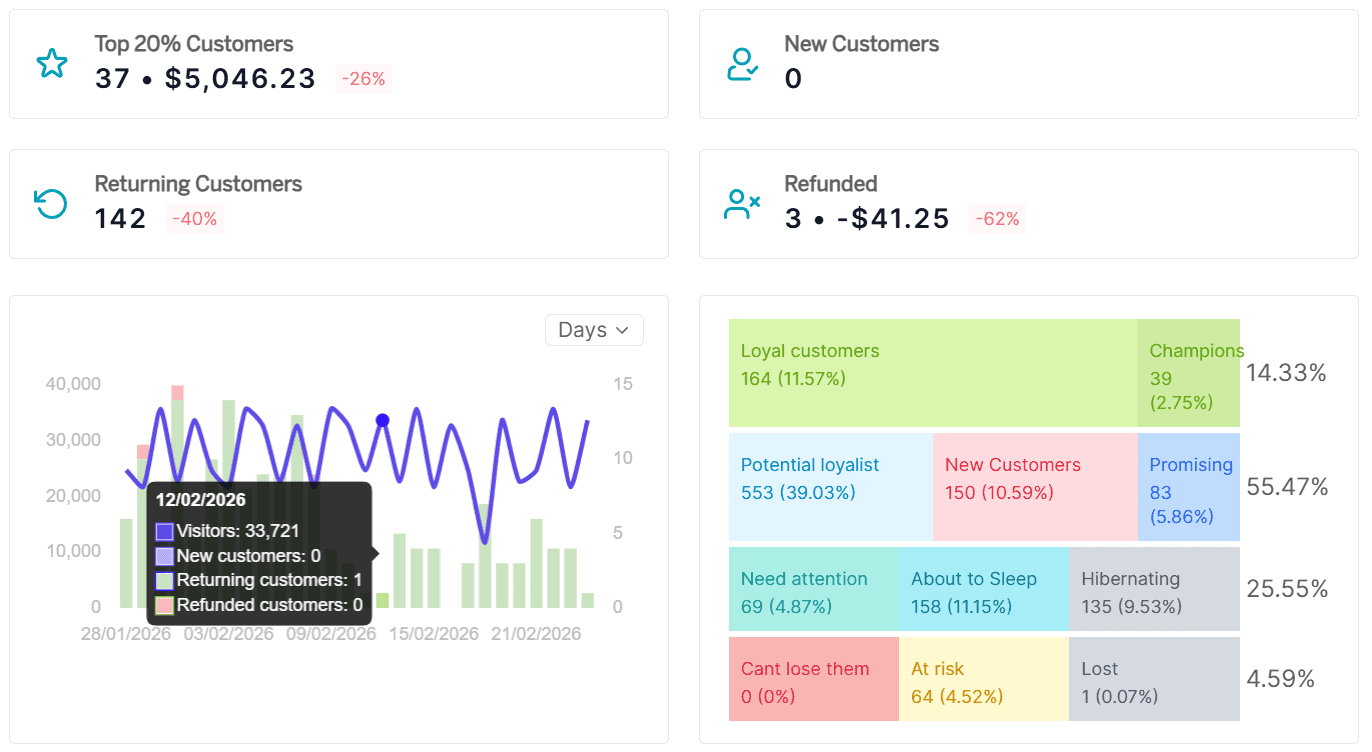
You open the Customers Dashboard, and the first thing waiting for you is a row of metrics across the top. Not vanity numbers. Diagnostic ones.
Top 20% customers: The small group carrying roughly 80% of your revenue (the Pareto principle, applied to your real data). If you don’t know who these people are by name, this is where you start paying attention.
New vs returning customers: Is your growth coming from fresh acquisition or from people who already trust you enough to come back? Most store owners can’t answer this confidently. Putler shows you the exact numbers of new and returning customers based on orders placed in the selected date range.
Refunded customers: Both the count and the total amount deducted, shown together. Are you losing one-time low-spend buyers, or are valuable customers walking away? The answer changes what you do about it entirely.
Below these, you get SaaS and revenue metrics: average LTV, average revenue per customer, acquisition rate per day, total revenue, and a free vs paid and one-time vs recurring breakdown.
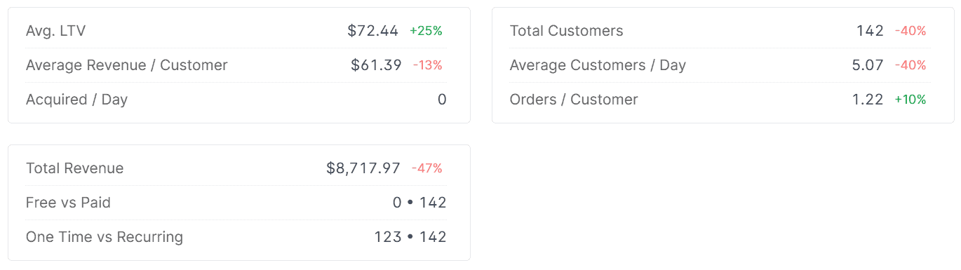
If you run a mixed business (subscriptions and one-time sales), this is where both sides show up in one place.
And then there’s the breakdown chart.
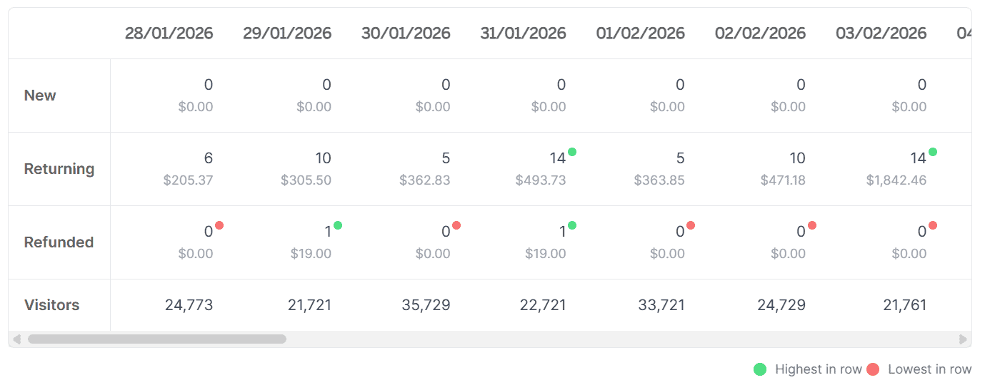
It plots new, returning, and refunded customers over time, viewable by days, months, or years. A slow decline in returning customers. A seasonal spike in refunds. A drop in acquisition after a campaign ended.
These trends are invisible in raw numbers but obvious the moment you see them on a timeline.
That’s your health check. Takes about 10 seconds. Now scroll down.
Right below: the customer list
Underneath the metrics and charts, you’ll find a list of every customer who’s ever transacted with you. Each row shows their name, location, products purchased, last purchase date, and revenue generated.
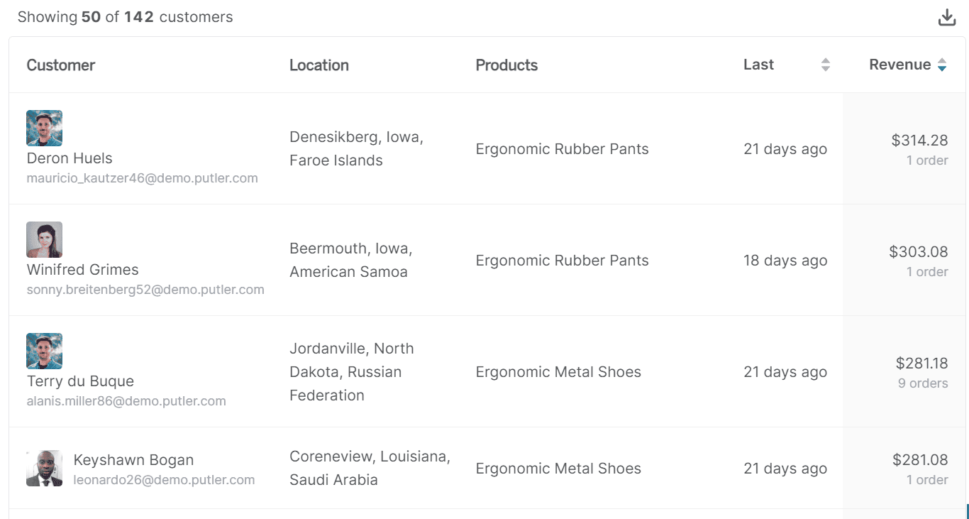
You can sort by last purchase date to see who’s been active recently, or by revenue to float your highest-value customers to the top. It’s a working list, not a static report. The kind of view you actually keep open during the day.
Need a specific subset? Apply any of Putler’s predefined filters (we’ll get to those in a moment) or build a custom segment. Once you have the list you need, export it as CSV or push it directly to Mailchimp.
The export includes full details: name, email, country, address, phone, and transaction count.
But the real magic happens when you stop looking at the list and start clicking into it.
Click any name: this is what an enriched customer profile looks like
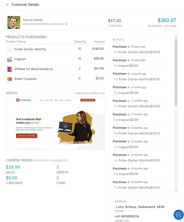
This is the part that surprises most people the first time they use Putler.
You click a customer’s name expecting the usual: an email, maybe an order total. Instead, you get a full details card that feels more like a briefing than a transaction log. Everything on it is pulled and assembled automatically from your connected data sources.
Personal information and demographics: Name, email, contact number, location with geocoded address data. Everything your support team needs to identify someone and reach out, without hunting through three different platforms.
Purchase history: Every product they bought, every date, every amount paid. Not a “3 orders” summary line. The full timeline. You can tell in seconds whether this is someone who bought once and disappeared, or someone who’s been coming back every month for two years.
Activity feed: Product names, timestamps, refund activity, dispute records, amounts. When your support team needs to know exactly what happened with a specific order at a specific time, this is where they look. No tab switching, no digging through payment gateway dashboards.
Website: This one catches B2B sellers off guard. Putler maps the customer’s main site from their email domain and shows it right on the card. A ticket from someone@acmecorp.com? Your team instantly sees who they’re dealing with. No Googling required.
Social profiles: Available where linked, adding a layer of context beyond transactions. Useful when you want to understand who a customer actually is, not just what they bought from you.
Address details: Shipping and delivery basics covered, but quietly useful for marketing too. When you notice geographic patterns in your best customers, it changes how you think about targeting and localization.
Current period sales, orders, refunds, and items: A quick pulse on what this customer has been doing in the active period, sitting right at the bottom of the card. No separate report needed.
None of this was manually entered. The moment you connected your data sources, Putler created a card for every customer who’s ever transacted with you.
Now you’re looking at a customer profile. Here’s what you can do from it.
Most analytics tools stop at “here’s your data.” Putler asks a more useful question: What do you want to do about it?
From any customer card, you can issue a full or partial refund without logging into PayPal or Stripe. Your support team doesn’t even need access to your payment gateway accounts. They handle everything directly in Putler.
For a team processing dozens of refunds weekly, this alone saves hours.
You can send an email directly from the customer profile, add internal notes your team will see next time they open this customer, and tag them however makes sense for your business (VIP, wholesale, influencer, high-risk, whatever you need).
Finding exactly the right customers (without a spreadsheet)
So far, we’ve looked at browsing the list and clicking into individual customer profiles. But what happens when you need to find a specific group and do something with them?
This is where Putler’s seven predefined filters come in. They sit right on the dashboard and work across your entire customer base:
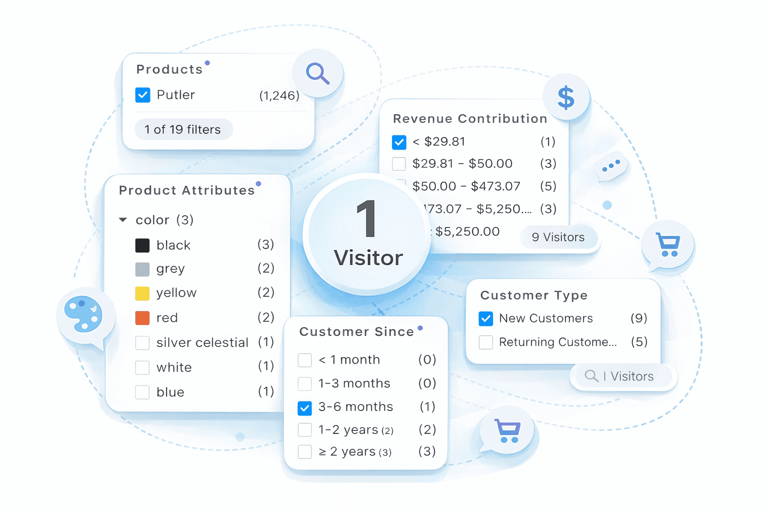
Location: Continent down to country, county, and even locality level (if you collect addresses during checkout). Filter your German customers, export the list, and you can run geo-targeted Facebook ads, create a lookalike audience, send region-specific festive offers, or decide whether adding local currency support is worth the investment.
Product: Everyone who bought a specific product surfaced instantly. If Products A and B are frequently bought together, filter customers who bought A but not B. That’s your upsell list, ready to export. You can also filter buyers of a specific product to send a targeted feedback email or give them early notice about a complementary launch.
Product attribute: Narrow by variations like size, color, material, or format. If hardcover mysteries outsell everything else in your bookstore, now you know where to focus inventory and ad spend.
Revenue contribution: Your biggest spenders separated from one-time low-spend buyers in one click. Focus retention efforts, priority support, and premium offers on the people who actually move the needle.
Customer since: Filter by acquisition date. Last 90 days gives you your recent cohort. Two-plus years gives you your loyalty base. Helpful for understanding whether customers acquired during a Black Friday campaign have the same long-term value as organic customers.
Customer type: New vs returning, split cleanly. Simple but essential when you want to run different campaigns for each group.
Number of orders: Your most frequent buyers, surfaced instantly. Someone with 10+ orders deserves early access to new launches and loyalty perks. This filter finds them in seconds.
Each filter works on its own. But the real power is custom segments where you combine multiple filters with AND/OR logic.
Something like: “Returning customers in Germany who spent over $200 in the last 90 days and bought from the accessories category.” Four filters combined. In most tools, that’s a CSV export and a spreadsheet formula session. In Putler, it’s a few clicks. Save the segment for reuse, export to CSV, or push directly to Mailchimp.
How customer profiles connect to RFM segmentation
If you’ve been exploring the Customers Dashboard, you’ve probably noticed a color-coded grid sitting on it. That’s Putler’s RFM segmentation.
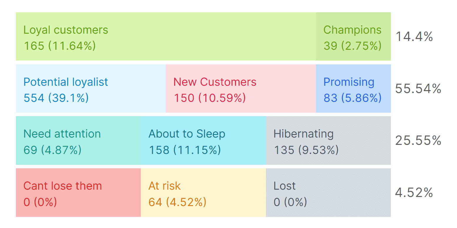
RFM (which stands for Recency, Frequency, and Monetary value) automatically groups your entire customer base into 11 segments: Champions, Loyal Customers, Potential Loyalists, At Risk, Lost, and six others. Each based on when they last bought, how often they buy, and how much they spend.
One finds the pattern. The other tells you the story behind it.
Final words
Most eCommerce businesses have customer data. It’s just scattered across platforms, locked inside payment gateways, and usable only if someone has time to manually piece it together. (Spoiler: nobody does.)
Putler turns all of that into a dashboard that diagnoses your customer base in seconds, a list you can sort and filter to find exactly who you need, enriched customer profiles that tell you the full story of every customer, and actions you can take without leaving the screen.
- How Online Businesses Can Increase Customer Lifetime Value
- Customer Retention Strategies: Proven Tactics to Keep Customers Coming Back
- Top Customer Retention Metrics Every Business Should Track
- Mastering Repeat Purchase: Turning One-Time Buyers into Loyal Customers
- eCommerce Analytics 101: A Complete Beginner’s Guide