
eCommerce analytics is how you turn raw store data into decisions that actually grow revenue. Most store owners already have the numbers sitting in front of them: sales, traffic, customer lists. What’s missing is a clear way to read them.
This guide breaks down eCommerce analytics in plain terms: the key metrics that matter, how to make sense of reports, the ecommerce reporting tools worth using with current verified pricing, and how to turn what you find into real decisions that grow a store across any of the major ecommerce platforms.
What is eCommerce analytics?

eCommerce analytics is the process of collecting and analysing data from an online store to understand how the business is performing. It turns raw numbers like website visits, sales, and customer actions into insights that inform better decisions.
Think of it this way: eCommerce data analytics is the difference between knowing revenue went up and knowing why it went up, which product drove it, which customer type bought it, and whether it will repeat next month.
What this looks like in real life
Practical examples of what eCommerce analytics can show:
Sales patterns: A store might discover it gets 40% more sales on weekends, or that certain products sell better during specific months.
Product performance: Analytics reveals which items are top sellers and which barely move, informing what to stock more of and what to discontinue.
Customer behaviour: Tracking shows where people drop off during checkout: maybe at shipping costs, or at the payment step.
Return insights: If customers keep returning a specific product, the data shows that pattern so the underlying issue can be investigated and fixed.
Who uses eCommerce analytics?
Different roles need different types of data.
Store owners use it for big-picture decisions: overall growth, seasonal trends, and which parts of the business are most profitable.
Marketing teams rely on it to see which advertising channels work best, how much it costs to acquire new customers, and which campaigns actually drive sales.
Operations teams use the data to manage inventory, track shipping performance, and keep popular products in stock.
Why eCommerce analytics is crucial for growing a store
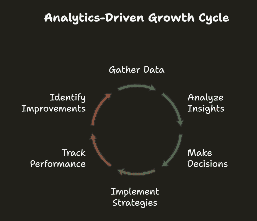
Running an online store without analytics means moving forward with no clear view of where the obstacles are.
From gut feeling to data-backed decisions
In the early days of eCommerce, many store owners made decisions based on hunches: “I think this product will sell well,” “maybe we should discount everything by 20%.” Intuition still has its place, but successful stores today lean on actual data to guide those choices.
Once a store shifts from intuition to data, the next step is usually learning proven growth strategies. The Analytics for Small Business guide covers exactly how to make that shift.
Business benefits: revenue, retention, and less guesswork
A few real, verified results from stores that put analytics to work:
Platform migration and analytics: DeBra’s, an Australian lingerie and swimwear retailer, saw a 215% revenue increase after migrating to BigCommerce and integrating better analytics and marketing tools.
Mobile experience optimisation: Mainline Menswear achieved a 55% higher conversion rate and 243% higher revenue per session after building a Progressive Web App and using analytics to guide the rebuild, a result independently documented in Google’s own web.dev case study.
Multi-channel customer messaging: Tata CLiQ Luxury used RFM segmentation to sort customers into 10 categories, including Champions, Loyal, and Hibernating, and reported a 159% increase in revenue generated from its messaging campaigns specifically, per CleverTap’s own published case study.
These are vendor-published results, worth reading as evidence the underlying techniques work, not as a guaranteed outcome for any given store.
Top eCommerce KPIs and metrics every store should track
eCommerce metrics can feel overwhelming. There are hundreds of things a store could track, but the truth is simpler: not everything needs monitoring.
Before the list, two terms worth separating because they get confused constantly.
A metric is any measurable data point from a store: total visitors, order count, refund rate. It measures activity.
A KPI (Key Performance Indicator) is a metric chosen to track against a specific business goal. Revenue is a metric. Revenue growth of 20% this quarter is a KPI. The difference matters because KPIs are the numbers that should drive actual decisions.
Here are the eCommerce KPIs that actually move the needle, grouped by what they tell you.
| Category | Metric | What it tells you |
|---|---|---|
| Sales Metrics | Total Revenue | Total income from all sales in a period. |
| Average Order Value (AOV) | Average amount spent per order. Higher AOV means customers are buying more per visit. | |
| Monthly Recurring Revenue (MRR) | Predictable monthly revenue, especially relevant for subscription-based stores. | |
| Year-over-Year Growth | How this period compares to the same period last year. Filters out seasonal noise. | |
| Product Performance | Best-selling Products | Top products by revenue or units sold. Shows where to focus inventory and promotion. |
| Inventory Turnover | How fast stock moves. Slow turnover ties up cash in unsold products. | |
| Slow-moving Inventory | Products sitting too long. Flag for discounting or discontinuation. | |
| Product Page Conversion Rate | What percentage of people who view a product actually buy it. | |
| Customer Value and Churn | Customer Lifetime Value (CLV) | Total revenue a customer generates over their entire relationship with a store. |
| Customer Acquisition Cost (CAC) | What it costs on average to acquire one new customer. Should be well below CLV. | |
| Churn Rate | Percentage of customers who stop buying over a given period. | |
| Repeat Purchase Rate | Percentage of customers who buy more than once. A strong indicator of loyalty. | |
| Traffic and Conversion | Website Traffic | Total visitors. Most useful when broken down by source: organic, paid, email, and direct. |
| Conversion Rate | Percentage of visitors who complete a purchase. Industry average sits around 2 to 3%. | |
| Cart Abandonment Rate | Percentage of shoppers who add items but don’t complete checkout. Global average is around 70%. | |
| Subscription Metrics | Monthly Churn Rate | Percentage of subscribers who cancel in a given month. |
| Customer Retention Rate | Percentage of subscribers who stay active. The inverse of churn. | |
| Average Revenue per User (ARPU) | Average monthly revenue generated per active subscriber. |
The value of focusing on these core metrics is fast diagnosis. When revenue dips, a quick check shows whether it’s a traffic problem, a conversion issue, or a customer retention challenge, three very different problems that need three very different fixes.
How to visualise data with eCommerce dashboards and reports
A dashboard is a visual interface that displays the most important metrics in one place. The goal isn’t to show everything. It’s to surface the right things quickly enough to act on them.
Daily, weekly and monthly eCommerce reporting
Daily reports are a quick health check: yesterday’s sales, traffic, and any major spikes or drops. This takes five minutes and is mostly about catching problems early rather than making big decisions.
Weekly reports are where patterns start to emerge. Did Tuesday’s email campaign drive sales through the weekend? How did this week’s traffic compare to last week? Weekly reporting gives enough data to see direction without enough noise to mislead.
Monthly reports are the strategic compass. This is where customer acquisition costs, lifetime value trends, and growth targets get reviewed. These reports inform bigger decisions: whether to increase ad spend, which product lines to expand, where retention is slipping.
What a good eCommerce dashboard actually includes
A good dashboard doesn’t try to show everything. It shows the right things:
- The big number at the top: The main KPI everyone cares about, usually revenue or orders.
- Trend lines, not just snapshots: How things are moving over time, not just where they are today.
- Context and comparisons: This month versus last month, this year versus last year.
- Segmentation that matters: Revenue by product, by channel, and by customer type.
- Alerts for the weird stuff: When something moves significantly outside its normal range, that needs to surface immediately.
For examples, see the Product dashboard, Customer dashboard, and Sales dashboard.
Advanced eCommerce analytics techniques
Once the basics are in place, a few techniques separate experienced operators from beginners.
Cohort analysis
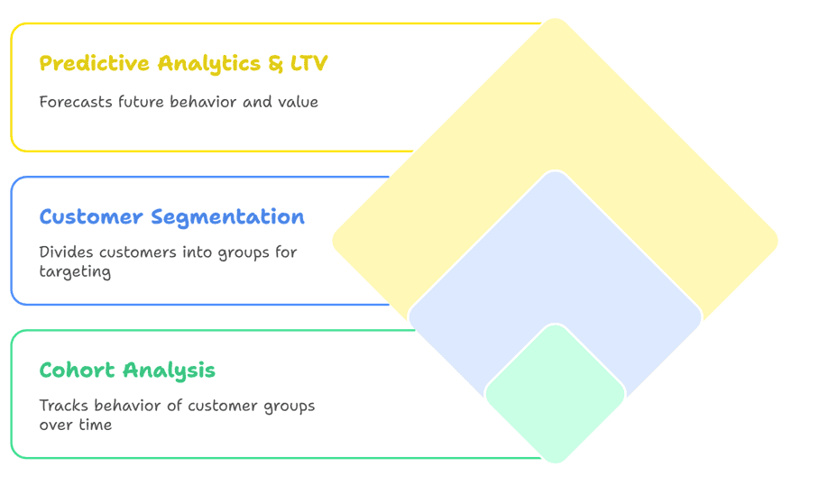
Cohort analysis groups customers by when they first bought, then tracks their behaviour over time. Instead of treating all customers as one flat group, this shows whether customers acquired during a specific campaign or season behave differently from those who came through other channels.
One documented example: Tula used cohort analysis to identify when customers naturally make repeat purchases, then timed replenishment emails to arrive just before that date with added incentives.
Customer segmentation
Instead of treating all customers the same, segmentation groups them by behaviour, value, and purchasing patterns. The most widely used method is RFM analysis: Recency, Frequency, and Monetary value. It scores each customer across three dimensions to show exactly where they sit in their relationship with a store.
For a deeper look at grouping customers by how they actually behave, the Behavioral Segmentation guide breaks down the full approach.
Here’s how the three main RFM categories work in practice:
- Champions: Recent buyers who spend big and buy often. Reward with exclusive access and early product launches.
- Loyal customers: Frequent buyers who spend moderately. Encourage higher spending with bundles and tiered offers.
- At-Risk: Previously strong customers who haven’t bought recently. Win back with targeted discounts and direct re-engagement campaigns.
Predictive analytics and customer lifetime value
Predictive analytics uses historical data to forecast what customers are likely to do next: whether they’ll purchase again, which products they’ll buy, and when they’re about to churn.
Customer Lifetime Value (CLV) prediction is the most actionable application of this for most store owners. Knowing how much a customer is likely to spend over their entire relationship with a brand makes it possible to set a sensible ceiling on acquisition spend.
A commonly cited teaching example illustrates the mechanics well, even though it isn’t an official Starbucks disclosure: a widely circulated case exercise averages a small sample of customer receipts to estimate roughly $5.90 in spend per visit, then extends that across estimated visit frequency and customer lifespan to model a full CLV. It’s worth knowing as a calculation method rather than citing as verified Starbucks data, since the exact figures trace back to an illustrative classroom exercise, not a company disclosure.
Operational analytics
Operational analytics covers the behind-the-scenes work that shapes the customer experience, and customers notice when it goes wrong.
Inventory tracking and stockouts
A customer getting excited about a product only to find it’s out of stock kills momentum fast.
Analytics should track inventory velocity: not just how much stock exists, but how fast it’s moving. Pairing velocity data with seasonal sales patterns makes it possible to time purchasing decisions with real precision instead of relying on gut feel.
Fulfilment speed and refund trends
Fulfilment speed affects considerably more than shipping satisfaction alone.
Slow fulfilment consistently correlates with higher refund rates, more customer service volume, and lower repeat purchase rates. It’s a domino effect.
Track average time from order placement to shipment, and watch the trend over time. A sudden spike in refunds isn’t only about product quality. It could signal fulfilment issues, shipping damage, or a website problem that caused customers to order the wrong variant.
Return rate analysis
Most people assume a certain return rate is just the cost of doing business. Digging into the why behind every return pattern is where the real fixes live.
Are customers returning because the product doesn’t match its description? That’s a website content issue. Recurring sizing problems? That points to better size charts or more detailed photography. Returns concentrated on specific colours or variants? Product images may not be colour-accurate enough.
Each of these is a fixable problem, but only if the analytics surfaces the pattern clearly enough to act on.
Shipping delays and conversion impact
Shipping delays don’t just make existing customers unhappy. They actively hurt future conversion rates in ways that are easy to overlook.
When delays become frequent, review scores drop and negative mentions increase. Potential customers who haven’t yet ordered start to hesitate when they see those complaints, even after the underlying issue is resolved.
Tracking promised delivery dates against actual delivery dates, and watching how shifts in shipping performance correlate with conversion rate changes over the same period, usually surfaces a clearer relationship than expected.
Marketing analytics and eCommerce attribution
This is where campaigns actually making money get separated from the ones that just look good on paper. Marketing Analytics ties spend back to real sales, not just clicks and impressions.
Ad campaign performance
Advertising metrics can be misleading without careful reading. A campaign with thousands of clicks and high engagement can still bring in zero actual sales.
A quick snapshot of the ad metrics that matter:
Return on Ad Spend (ROAS): Spend $100 on ads and make $300 in sales, and ROAS is 3:1. The key nuance is timeframe. Some customers buy immediately, others take weeks to convert, so short measurement windows can dramatically understate a campaign’s true return.
Customer Acquisition Cost (CAC): What it costs on average to acquire one paying customer. CAC only makes sense in relation to CLV.
Compare CAC to Customer Lifetime Value:
- Good math: $50 to acquire a customer worth $200 lifetime is a win.
- Bad math: $200 to acquire a $50 customer means it’s time to pivot.
Email campaign insights
Open rates and click rates are the metrics most people track for email, but the real insights come from going one level deeper.
Different customer segments respond very differently to the same email. VIP customers often prefer content and early access over discount codes. Newer subscribers usually need an incentive to take action. Timing matters too: certain days and time slots consistently outperform others depending on the audience’s habits.
Segmenting email performance by customer type and purchase behaviour, rather than looking at aggregate open rates, is where email analytics starts paying for itself.
eCommerce tracking across channels
Attribution is the challenge of figuring out which marketing touchpoints deserve credit for a sale. It sounds simple until customer behaviour actually gets mapped out.
A typical customer journey:
- Day 1: A shopper sees an Instagram ad and doesn’t buy.
- Day 3: She searches the brand, visits the site, and still doesn’t buy.
- Day 10: She gets an email newsletter, clicks through, browses, and leaves.
- Day 17: She sees a retargeting ad and finally purchases.
Which channel gets credit for that sale?
Different attribution models give different answers:
- First-touch: Instagram gets credit for starting the journey.
- Last-touch: The retargeting ad gets credit for closing it.
- Multi-touch: Partial credit distributed across every step.
The smarter approach is to focus on bigger patterns:
- Channel combinations: Do certain channel pairs consistently outperform either channel alone?
- Cross-pollination: Does email performance improve when social ads run at the same time?
- Preparation effect: Do customers acquired through organic search have higher lifetime value than those from paid?
The goal isn’t perfect attribution. It’s understanding how marketing channels work together as a system rather than as separate competing efforts.
Best eCommerce analytics tools and reporting software
Pricing below is checked directly against each vendor’s current pages rather than reused from older comparisons, since analytics tool pricing shifts often and several widely repeated figures for these tools online are stale or describe the wrong product entirely.
-

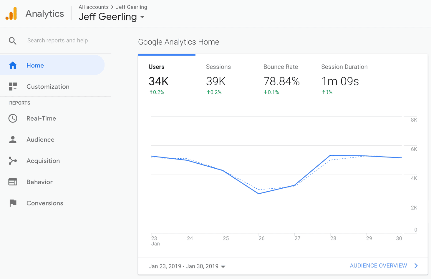
Google Analytics 4 is the strongest free starting point, since it’s free and covers most of what a growing store needs. It handles everything from small starter stores to high-volume catalogues, tracking traffic, conversion events, product performance, and customer acquisition sources out of the box. The Google Ads integration is a real plus for stores already using Google’s advertising tools.
-

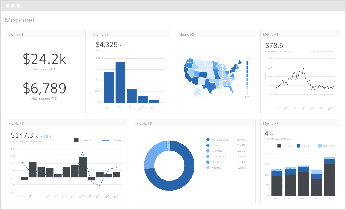
Mixpanel is built for understanding exactly how users behave on a site: which buttons people click, how they navigate through checkout, exactly where they drop off. Pricing is event-based, not a flat monthly fee: free up to 1 million events per month, then the Growth plan charges roughly $0.28 per 1,000 events, reaching around $2,520/month at 10 million events. Enterprise pricing starts around $25,000/year.
-

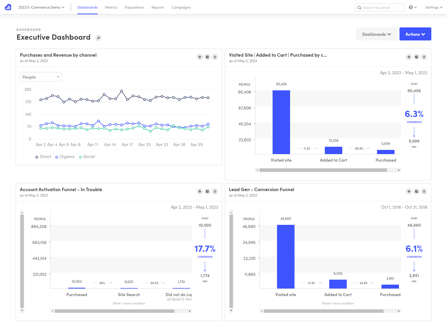
Kissmetrics tracks individual customers over time, showing their complete journey from first visit to loyal buyer. Pricing here needs a clear caveat: two different products currently use the Kissmetrics name. The original platform (person-level tracking, funnel and cohort reports) runs roughly $199 to $850+/month depending on event volume, with no public flat-rate tier. A separate, newer product at the same domain offers a free workspace and a $99/month Growth plan with different, AI-chat-based features. Confirm which product a quote refers to before comparing prices elsewhere.
-

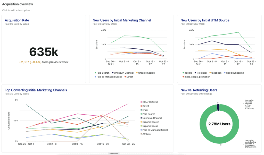
Heap, now part of Contentsquare, captures user behaviour automatically without requiring every event to be defined upfront, so past interactions can be analysed retroactively even without planning that specific tracking at launch. The free plan covers up to 10,000 monthly sessions with 6 months of data history. Paid tiers (Growth, Pro, Premier) are sales-gated with no published flat price; real-world reporting puts Growth around $3,600/year.
-

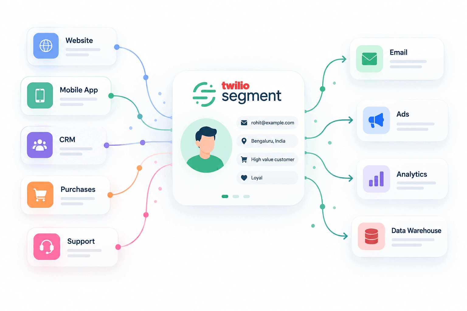
Segment (now Twilio Segment) acts as a central hub when a business has multiple tools that need to share data consistently. It’s not doing the analysis itself; it’s making sure every other tool gets fed the same clean, consistent customer data. A free plan covers up to 1,000 monthly tracked users, and the Team plan starts at $120/month for up to 10,000 monthly tracked users, scaling from there.
| Tool | Starting price | Best for | Learning curve | Key strength |
|---|---|---|---|---|
| Google Analytics 4 | Free | Foundational eCommerce tracking | Medium | Free with deep Google integration |
| Mixpanel | Free to 1M events, then ~$0.28/1K events | Funnel and event analysis | High | Detailed user interaction sequences |
| Kissmetrics | $199-$850+/mo (original product) | Customer journey and retention | Medium | Individual customer-level tracking |
| Heap (Contentsquare) | Free up to 10K sessions/mo | Automatic event capture | Low | Retroactive analysis, no manual setup |
| Segment | Free up to 1K users, $120/mo at 10K | Multi-tool data integration | High | Unified consistent data across platforms |
How to act on eCommerce data
Knowing the numbers is only useful if there’s a plan for when they move. This is the section most analytics guides skip, and for beginners it’s arguably the most important one.
Here are the four most common scenarios and what each one actually calls for.
Conversion rate drops: First check whether traffic changed at the same time. If traffic held steady but fewer people are buying, the problem is on the site: a broken checkout step, a price change that landed badly, a product page that lost a key image. If traffic dropped alongside conversion, the issue is in acquisition channels rather than the store itself.
Cart abandonment spikes: A sudden increase almost always points to friction at or just before checkout. Check whether shipping costs are now appearing later in the funnel than before. Check whether a discount code field is creating expectation without delivery. Check whether the payment gateway had any downtime during the period the spike began.
Revenue drops without a traffic drop: This is usually an AOV problem or a product mix shift. Check whether top-selling products have changed, whether a high-value product went out of stock, or whether a promotion attracted lower-value orders than usual. A product performance report will surface this pattern within minutes.
Returning customer rate declines: When fewer existing customers come back, the question is whether they left unhappy or just drifted. Check refund rate and review data for the same period; unhappy customers leave signals. If the data looks neutral, the issue is likely visibility between purchases, exactly where RFM analysis becomes directly actionable: the At-Risk segment shows precisely who needs a reason to return.
eCommerce data privacy and compliance
Setting up analytics tracking without understanding the privacy obligations that come with it is a common mistake. Two frameworks affect most online stores, and neither is optional for a store serving customers in those regions.
GDPR (General Data Protection Regulation): Applies to any store selling to customers in the European Union regardless of where the store is based. Under GDPR, explicit consent is required before placing analytics cookies on a visitor’s browser. A cookie consent banner needs to offer a genuine choice, not a pre-ticked box or a banner that requires clicking through to opt out. Analytics data collected without proper consent is non-compliant.
CCPA (California Consumer Privacy Act): Applies to stores selling to California residents that meet certain size or revenue thresholds. CCPA gives customers the right to know what data is collected, request its deletion, and opt out of its sale. A clear privacy policy and an accessible opt-out mechanism are required.
Practical first step: Install a reputable cookie consent management tool. Make sure it blocks analytics scripts until consent is given; displaying a banner while scripts run regardless is not compliant. Review the privacy policy whenever a new analytics tool is added, since every tool that processes personal data needs to be disclosed.
Why Putler is built for eCommerce growth
Putler was designed to solve the exact headaches covered above: fragmented data, missing customer insights, and endless manual reporting.
Putler integrates with 17+ eCommerce stores and payment gateways. Whether selling across multiple storefronts or processing payments through several gateways at once, everything consolidates into one unified view. For anything custom-built, the Putler API can integrate practically anything needed.
Which data sources actually matter before connecting anything.
Putler treats three kinds of sources differently.
- Shop platforms (Shopify, WooCommerce, Etsy, Amazon, and the rest of the 17+ supported): bring in the actual product and order data, what sold, to whom, and for how much.
- Payment gateways (Stripe, PayPal, and others): fill in the transaction side, refunds, disputes, and payments that sometimes happen outside a shop platform entirely.
- Google Analytics (GA4): adds the traffic layer, which pages and campaigns brought the visitor in. On its own, GA4 shows behaviour, not revenue. It has no idea what anyone bought.
None of these three replace each other. A store connecting only GA4 sees traffic with no sales data behind it. A store connecting only a shop platform sees sales with no idea where the customer came from. The dashboards below only get useful once at least one shop platform or payment gateway is connected. GA4 is the layer on top of that, not a substitute for it.
Mailchimp works the other way. It’s not a data source Putler pulls from, it’s an export destination Putler sends to. Once a shop or payment source is connected and customers get sorted into RFM segments, any segment can be pushed straight to a Mailchimp audience for targeted campaigns.
Connecting most of these takes a couple of minutes each: a sign-in and an authorize click for most sources. A few, Shopify among them, need a one-time token setup instead of a simple login.
Dedicated dashboards for every business need
Putler has 10+ dedicated dashboards with handpicked KPIs. Here are a few of them.
Products dashboard: track product performance at a glance.
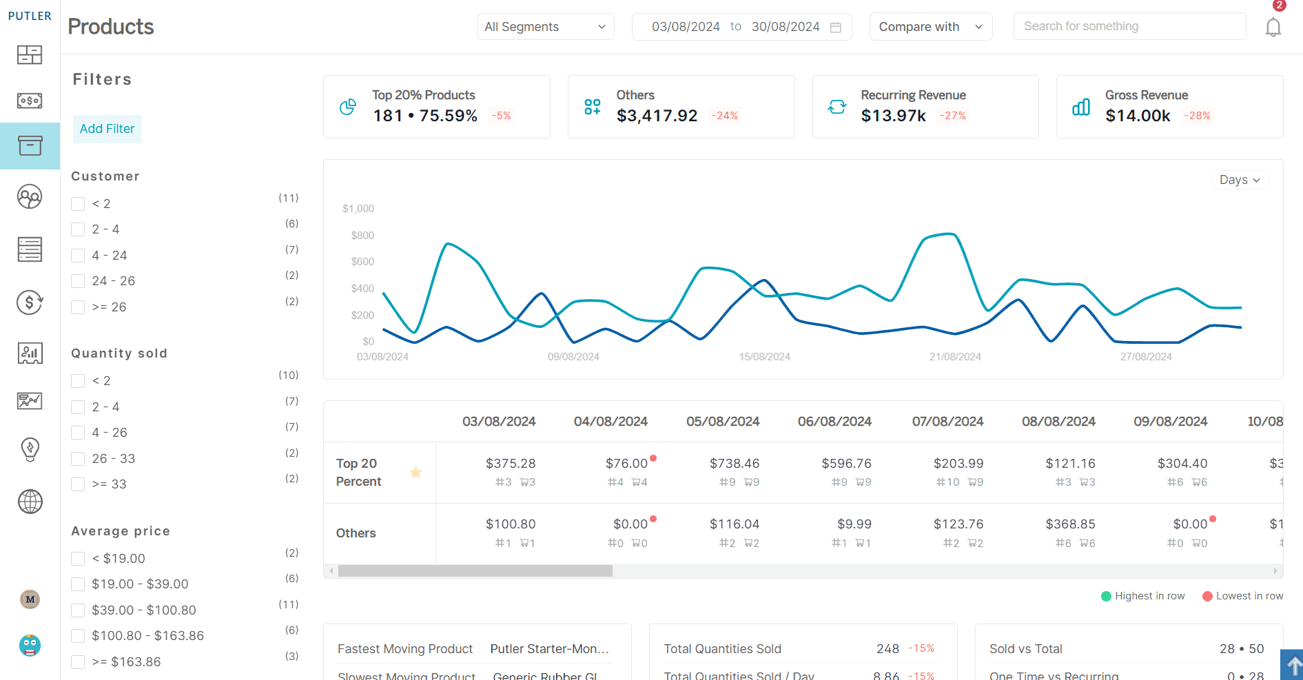
Putler’s product dashboard shows which products are the actual money-makers versus the ones just taking up space. It surfaces the top 20% revenue generators, tracks what’s moving fast or slow, and flags high-return products before they drain profits. The segmentation surfaces buying patterns, seasonal trends, and which items customers purchase together.
Customers dashboard: know exactly who drives revenue.
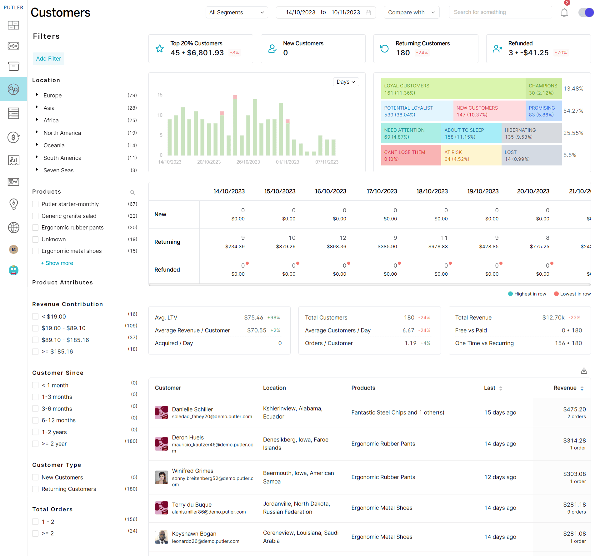
Putler identifies the 20% of customers responsible for 80% of sales and segments them by location, loyalty, and behaviour. RFM analysis automatically sorts customers into categories like Champions, At-Risk, and Hibernating, so it’s clear who needs attention and what kind.
Sales dashboard: see revenue performance in real time.
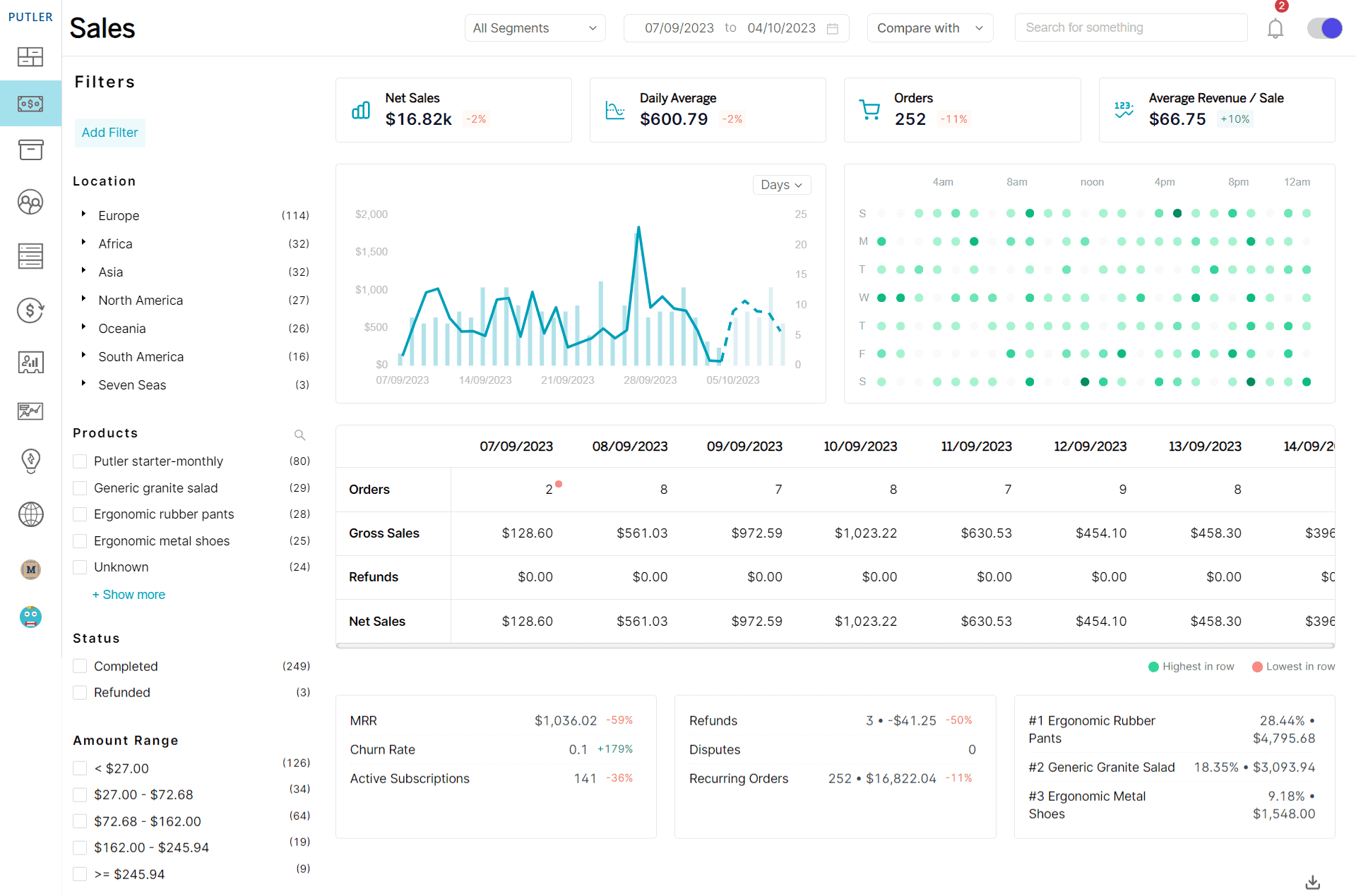
Putler gives instant visibility into daily sales, order volumes, and revenue trends in one place. The sales heatmap shows exactly when customers buy most, helping time promotions accurately. Sales can be segmented by location, product, and customer type to spot profitable patterns and underperforming areas.
Subscriptions dashboard: monitor recurring revenue health.
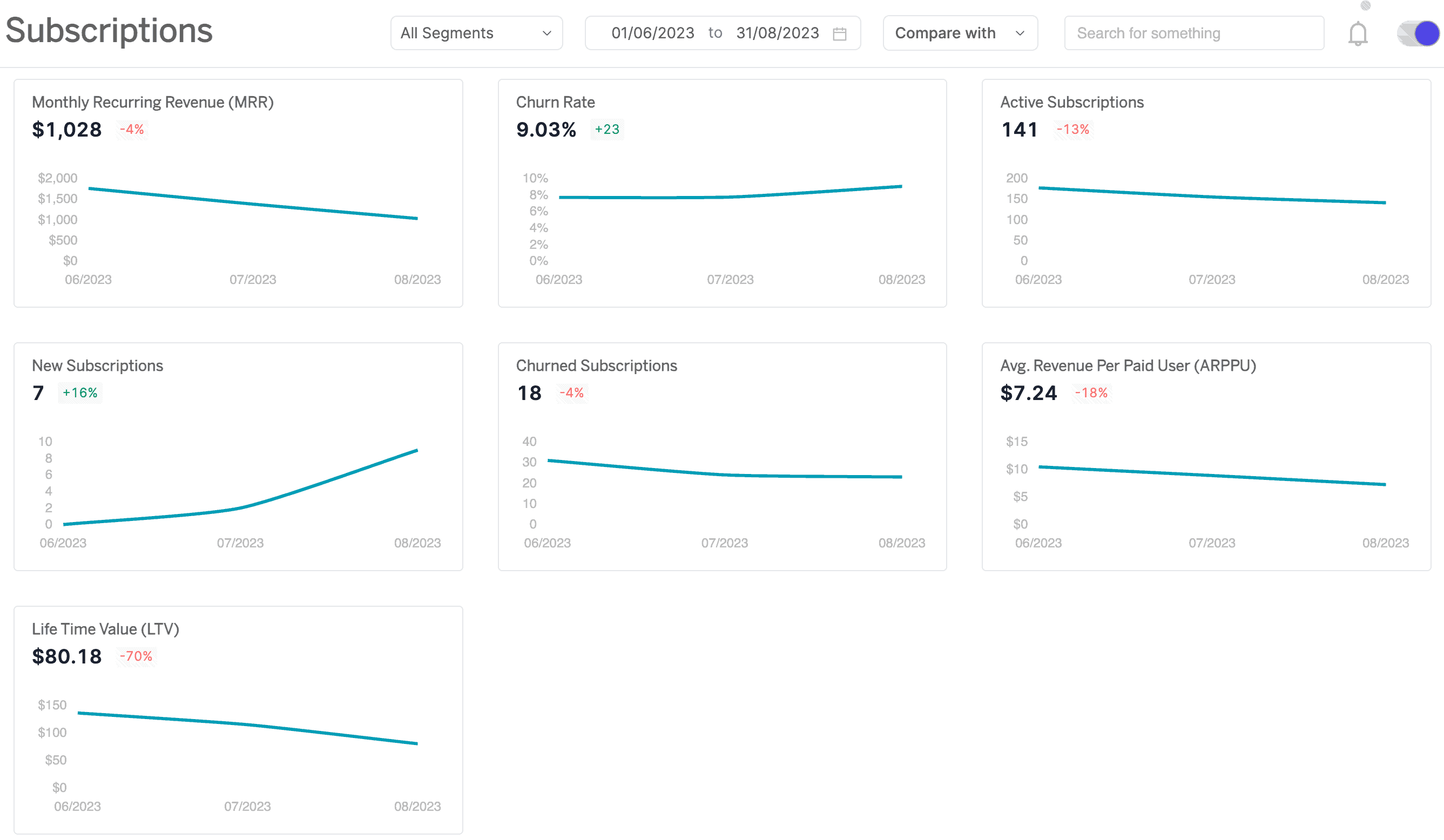
Putler tracks Monthly Recurring Revenue including new signups, upgrades, and cancellations, showing growth patterns clearly. The churn rate shows which customers are leaving and when, while ARPU shows what each subscriber contributes on average, replacing manual calculations with automated insights that guide pricing and retention strategy.
Start making eCommerce analytics work
The stores winning in eCommerce today aren’t the ones with the most data. They’re the ones that look at their data regularly, understand what it’s telling them, and act on it. Start with the metrics that matter most for where the store stands right now, build a reporting rhythm worth sticking to, and when deeper insight across customers, products, and revenue becomes the priority, that’s exactly what Putler is built for.
FAQs
Which eCommerce analytics tool is the best?
The best eCommerce analytics tool depends on specific needs and stage. GA4 is the strongest free starting point for traffic and conversion tracking. Mixpanel goes deeper on funnel behaviour. Kissmetrics is best for individual customer journey tracking, at a premium price point. Putler is most valuable for store owners who need consolidated reporting across multiple stores and built-in RFM segmentation. Here are some of the best eCommerce analytics tools to help find the right fit.
What are the key concepts in eCommerce analytics?
eCommerce analytics covers five core areas: customer behaviour tracking, sales and revenue analysis, customer segmentation, marketing attribution, and lifetime value measurement. Together these give a complete view of how customers find a store, what they do when they arrive, how much they’re worth over time, and which marketing efforts are actually driving that value.
What is the difference between eCommerce metrics and KPIs?
A metric is any measurable data point from a store: total sessions, order count, refund rate. A KPI is a metric actively tracked against a specific business goal. Revenue is a metric. Revenue growth of 20% this quarter is a KPI. KPIs are the numbers that should drive actual weekly decisions.
What are the most important eCommerce KPIs to track?
For most store owners the essential ones are conversion rate, average order value, customer acquisition cost, customer lifetime value, cart abandonment rate, and repeat purchase rate. These six together give a clear picture of whether a store is healthy and where the biggest improvement opportunities are.
How often should eCommerce reports be reviewed?
A layered approach works best. Check the daily report for anything unusual like traffic drops, order spikes, or payment errors. Review the weekly report for campaign performance and short-term trends. Use the monthly report for strategic decisions about spend, product mix, and retention. Quarterly, look at year-over-year patterns and channel profitability.
What is a good conversion rate for an eCommerce store?
The industry average sits between 2% and 3% for most eCommerce stores, though this varies considerably by product category, traffic source, and price point. Rather than benchmarking against an industry figure, tracking a store’s own conversion rate over time and improving its specific baseline consistently matters more.
What is the best free eCommerce analytics tool?
Google Analytics 4 is the strongest free option available. It covers traffic, conversion tracking, product performance, and customer acquisition data at no cost, and integrates with Google Ads and Search Console for a more complete picture of marketing performance.
This guide is a fantastic starting point for anyone new to eCommerce analytics. I appreciate how it breaks down complex metrics into easy-to-understand concepts. As someone who’s felt overwhelmed by data before, the focus on actionable insights is exactly what I needed. Looking forward to applying these tips to my own store!
Glad this helped. When you start applying it, share what shifts for you. Curious to see what moves the needle first.