
There’s a moment every eCommerce owner hits sooner or later.
It usually happens on a Monday morning.
You open Stripe to check weekend sales. The number looks good. Then you open Shopify, and it’s slightly different. Then PayPal, which tells a third story entirely.
You pull up Google Analytics for traffic numbers, but those don’t match anything either.
So you open the spreadsheet you built three months ago to “consolidate everything,” realize it’s two weeks out of date, and spend the next hour copy-pasting numbers between tabs.
By the time you have a rough picture of what happened over the weekend, it’s lunch.
This is not an analytics problem. This is a time problem. A clarity problem. A “making decisions based on incomplete, conflicting information” problem.
Putler exists because this moment shouldn’t exist.
This guide covers everything Putler can do for your business. Not organized by menus and screens, but by the problems you’re probably dealing with right now and how each one gets solved.
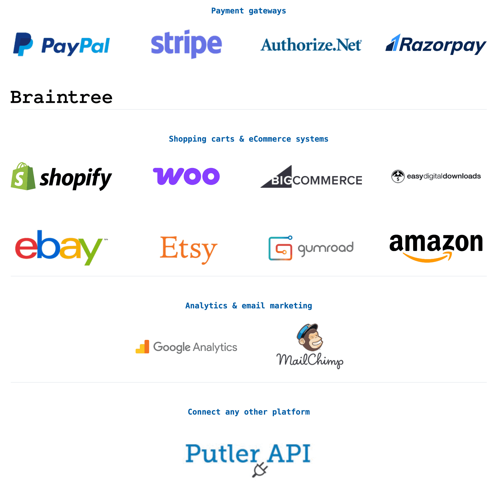
The foundation: getting all your data into one place
Before anything else works, your data needs to live in one place. And it needs to be clean.
That sounds obvious. But if you’ve ever tried to reconcile numbers across platforms, you know how quickly “obvious” turns into “impossible.” Here’s what typically goes wrong:
- Your cart platform and payment gateway both record the same transaction, so you’re counting revenue twice
- You sell in euros, pounds, and dollars, but your reports only show one currency
- Stripe timestamps are in UTC, your Shopify store runs on EST, and your spreadsheet uses whatever timezone your laptop was set to when you built it
- A customer pays through PayPal on your WooCommerce store, but the WooCommerce order ID and the PayPal transaction ID don’t match up cleanly
Duplicates get merged. Currencies get converted across 36+ supported currencies. Time zones get aligned. Mismatches get resolved.
You don’t configure any of this. You connect your sources, and the cleanup happens in the background.
When you need to know how your business is doing right now
There’s a question you probably ask yourself more often than you’d admit: is everything okay?
Not “what were last quarter’s numbers.” Not “how did our Black Friday go.” Just… right now, today, this week. Are sales on track? Did anything break overnight? Is revenue trending up or drifting down compared to last month?
The frustrating part is that answering this simple question usually requires checking four or five different places.
You log into your payment gateway for today’s sales. You check your eCommerce admin for order counts. You scan your email for refund notifications or dispute alerts. You might open GA for traffic.
And even after all that, you’re assembling the picture in your head because no single screen shows it all.
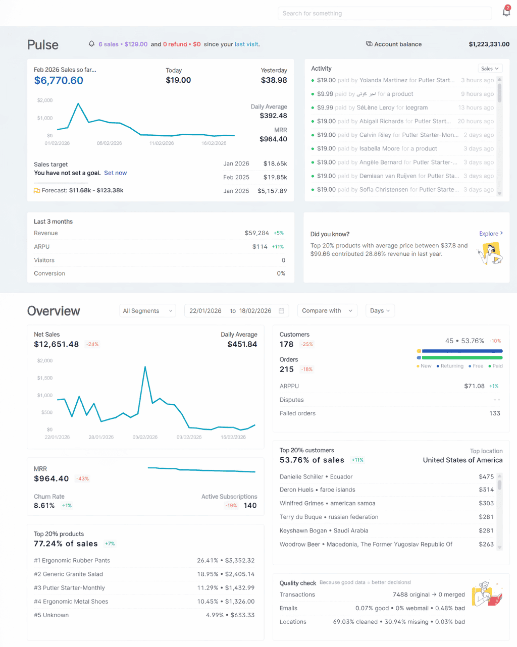
Putler’s Home Dashboard is that single screen.
When you log in, here’s what you see without clicking into anything:
- This month’s sales alongside daily figures, a 3-day trend, and a year-over-year comparison, so you can tell immediately if today is normal, better, or worse
- A live activity feed that logs every sale, refund, dispute, transfer, and failed transaction as it happens
- A three-month side-by-side of your visitors, conversion rate, ARPU, and revenue, so you’re not just seeing today in isolation
- Forecasted sales for the rest of the period, based on your historical data, with the ability to set and track a target
- A quick subscription health check showing MRR, churn rate, and active subscriptions (if you run a recurring model)
- Your top 20% customers and top 20% products by revenue, so you always know where the real money is coming from
The whole point is that you shouldn’t need to go digging. The things you check most often should be waiting for you the moment you open the tool. That’s what this screen does. Ten seconds, one glance, and you know where you stand.
Finding the patterns hiding inside your sales data
Knowing your total revenue is useful. Knowing why that revenue looks the way it does is where the real decisions happen.
Most store owners can tell you how much they made last month. Very few can answer:
- What time of day do we sell the most?
- Which city generates the highest average order value?
- Why did sales spike on a random Wednesday but flatline on Saturday?
That information exists inside their data. They just don’t have a way to see it.
This is where Putler’s Sales Heatmap becomes one of those features you didn’t know you needed until you see it once.
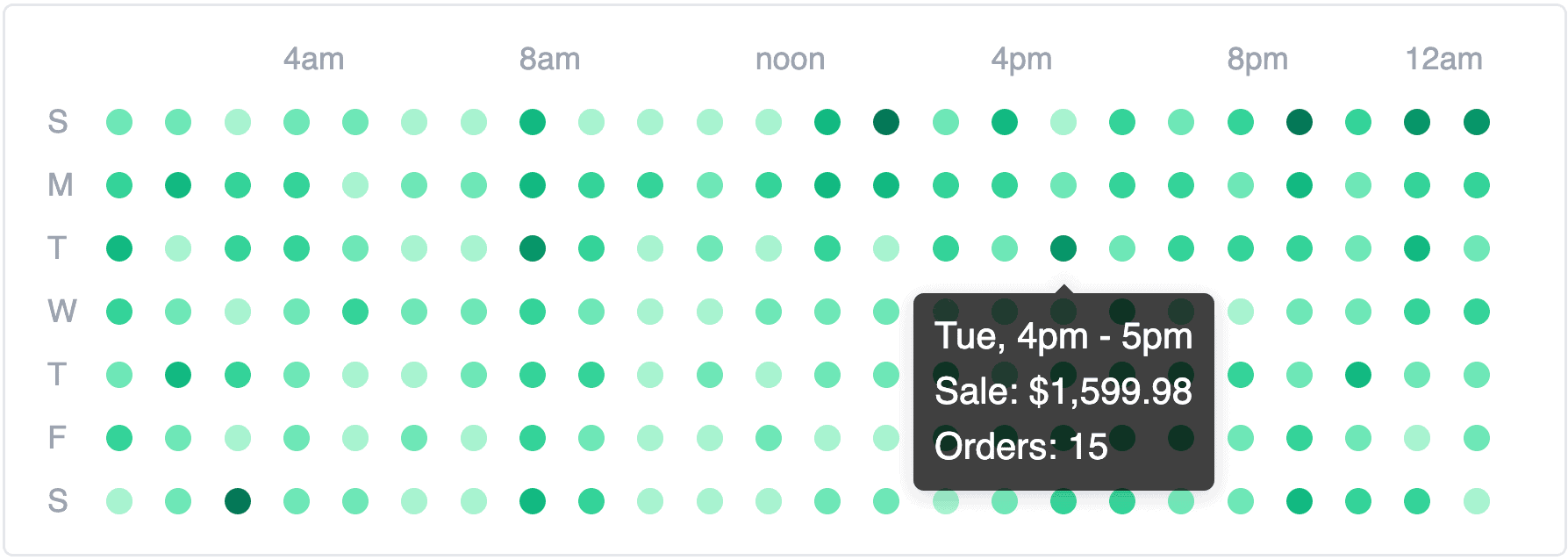
Picture a grid. Days of the week down the left. Hours across the top. Every cell color-coded by revenue. Darker means stronger sales. Lighter means quiet. In one glance, you see your entire weekly sales rhythm.
And it almost always looks different from what you’d expect.
Once you see the pattern, the actions become obvious:
- Schedule emails to land right before peak hours
- Time flash sales for high-traffic windows
- Stop running ads during dead zones
Same decisions you were making before, just backed by data instead of gut feeling.
Beyond timing, Putler lets you slice sales by location (down to city level), product, order status, and amount range. Every order is traceable to a full details card. Build custom segments from any filter combination and export to CSV or Mailchimp.
Figuring out which products actually earn their shelf space
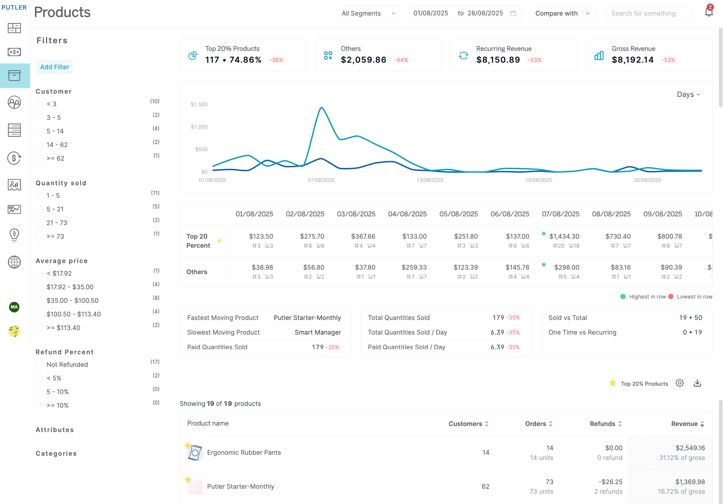
Here’s a stat that surprises most store owners the first time they see it: roughly 20% of your products generate about 80% of your revenue.
The other 80%? They’re taking up marketing budget, homepage real estate, and your attention without pulling their weight. The problem is that without the right data, every product looks equally important.
Putler makes the split visible instantly. Your top 20% are star-marked in a Product Leaderboard and separated visually in an 80/20 Breakdown Chart. No guesswork. No exporting to a spreadsheet and sorting manually.
But knowing which products perform is only half of it. The more interesting question is why. Click on any product, and you get:
- Its full sales history, so you can spot seasonal patterns
- Refund rate and average time to refund, so you can flag quality issues early
- Predicted sales for the current month
- Which variations (size, color, material) actually sell, and which sit there
- Which other products are frequently bought alongside it
The outcome here is simple. You stop spreading your energy evenly across your entire catalog and start making sharper decisions: promote what works, bundle what pairs, fix what’s underperforming, and drop what’s dead.
Understanding who your customers actually are (and what to do about each one)
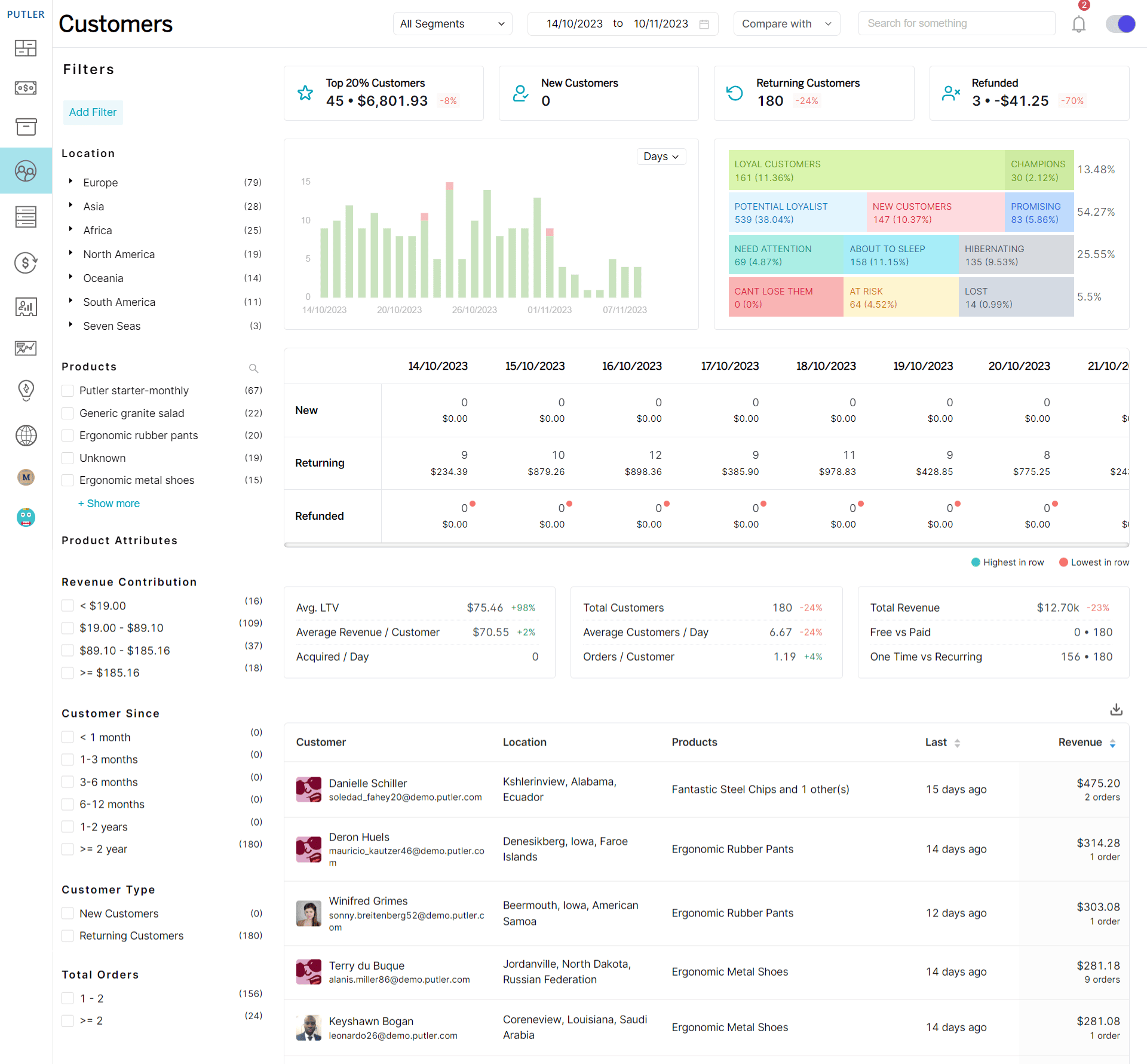
Products don’t buy themselves. Behind every transaction is a person, and most eCommerce businesses know surprisingly little about them.
Think about it. Can you answer these right now, without checking anything?
- Who are your top 10 most valuable customers by lifetime spend?
- How many customers haven’t ordered in 60+ days who used to buy monthly?
- What percentage of your revenue comes from returning buyers vs first-timers?
If that felt uncomfortable, you’re not alone. Most store owners can’t answer these because their customer data is scattered across payment gateways, eCommerce backends, and maybe a CRM that’s half-updated.
Putler fixes this with enriched customer profiles.
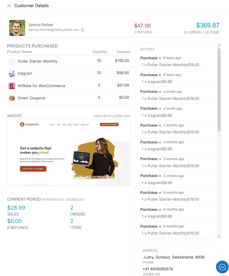
Click any customer, and you get a complete picture built automatically from your transaction data: personal details, order history, refund records, revenue contribution, how long they’ve been a customer, and even their website screenshot and social profiles where available.
No manual entry. No CRM syncing.
That’s useful on its own. But the real power comes from what Putler does with this data at scale.
RFM segmentation
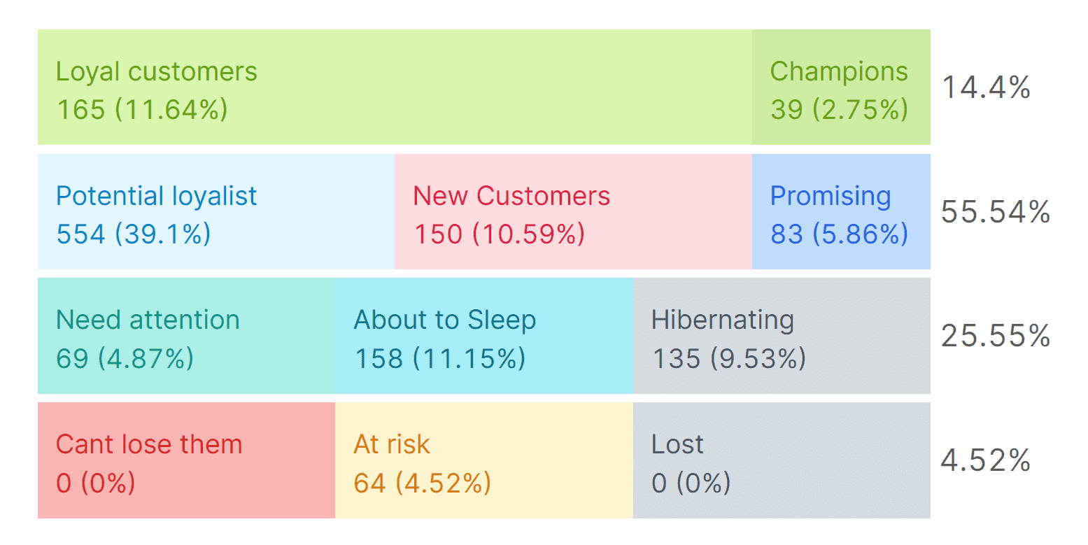
RFM segmentation groups your entire customer base into 11 automatic segments based on three things: when they last bought (Recency), how often they buy (Frequency), and how much they spend (Monetary). Champions, Loyal Customers, At Risk, About to Sleep, Lost, and six others.
Each segment comes with a clear action:
- Champions get loyalty rewards and early access
- At Risk customers get a win-back email before they disappear
- Lost customers get one reactivation attempt, then you stop spending on them
The workflow is three clicks. Pick a date range, click a segment, export to Mailchimp or CSV. Five minutes, and you’ve gone from “send the same email to everyone” to “send the right message to the right group.”
This is the feature most Putler users point to when asked what changed their marketing. It deserves its own deep dive, and it has one.
Getting your finance and support teams out of the chaos
This one isn’t glamorous. But if you’ve ever spent a Friday afternoon pulling transaction exports for your accountant, or watched your support team bounce between PayPal, Stripe, and Shopify to process a single refund, you know it matters.
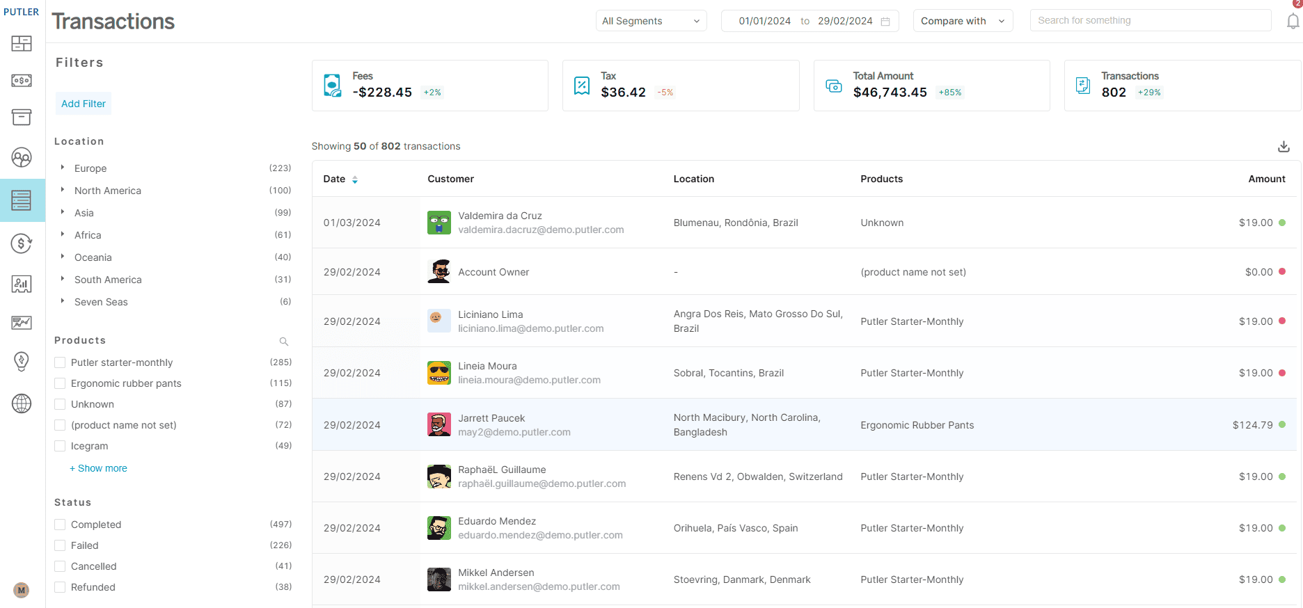
Putler puts every transaction in one searchable, filterable list. This takes the complexity out of transaction management.
The filters go deep:
- Location: down to the city level
- Type: sales, refunds, disputes, transfers, failures
- Status: completed, pending, failed
Build any combination, export to CSV. That’s your audit trail, your tax prep, your dispute documentation.
Two things worth calling out specifically:
Instant refunds: let your support team process full or partial refunds directly from Putler. No logging into payment gateways. No switching tabs. For a team handling 20+ refund requests a week, this saves hours.
Team access: lets you invite unlimited members with two permission levels. Admin sees everything. Support sees only what they need for customer-facing work. No per-seat charge.
Not every section in this guide is about growth insights and marketing intelligence. Sometimes the win is just making Tuesday less painful for the people on your team who deal with the operational side of running a store.
Planning forward instead of only looking backward
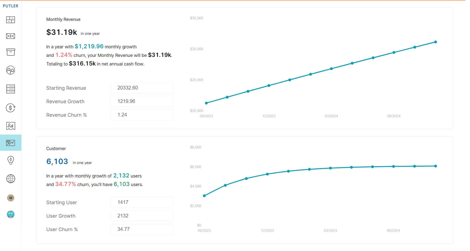
Every report you’ve ever pulled tells you what already happened. Last month’s revenue. Last quarter’s churn. Last year’s holiday performance. Useful for context, but not great for answering the question that actually keeps you up at night:
Is what I’m doing right now going to be enough?
Putler’s Time Machine flips the direction. Three forecasting tools live here:
Revenue forecast: Takes your historical growth rate and churn, then projects your revenue month by month for the next 12 months.
Customer Forecast: Does the same for your customer base.
10X Growth Forecast: The most interesting one. It reverses the math. Instead of showing where you’re headed, it tells you what you’d need to get to 10X your current revenue.
There’s also a Performance Comparison Report that lets you put any two things side by side: two time periods, two customer segments, two stores, two teams. All metrics on one page.
Connecting your website traffic to actual revenue
Google Analytics can tell you that 12,000 people visited your store last week. What it won’t tell you is how much those visitors were worth.
And that’s the gap most store owners live in. They optimize for traffic, celebrate pageview milestones, and pour money into channels that bring visitors. But visitors don’t pay the bills. Customers do.
Putler approaches this from two angles.
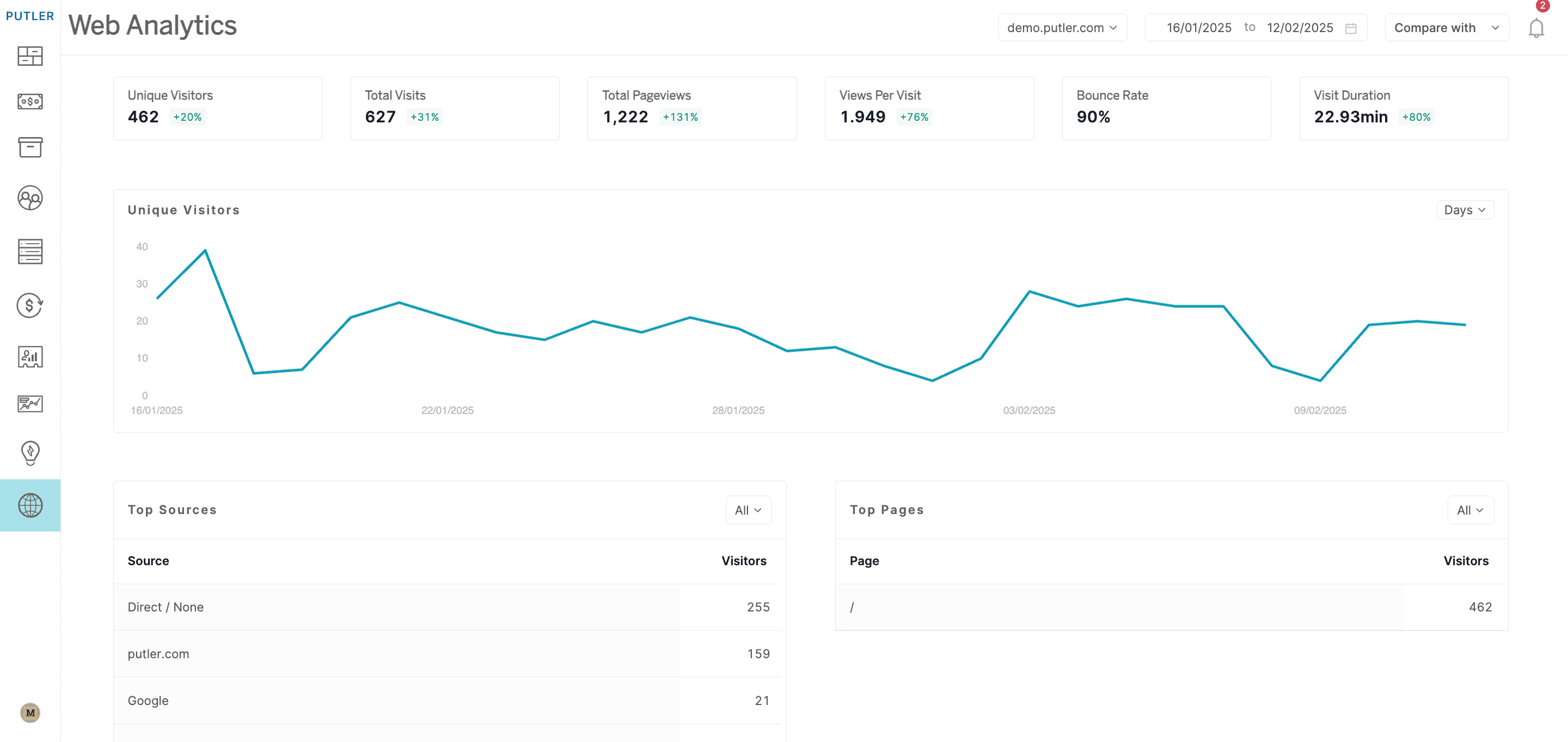
First, a built-in web analytics tool that works without Google Analytics entirely. Add your domain, set your timezone, done. You get unique visitors, pageviews, bounce rate, session duration, traffic sources, device data, and real-time activity. Privacy-first, no third-party cookies, no consent banner headaches.
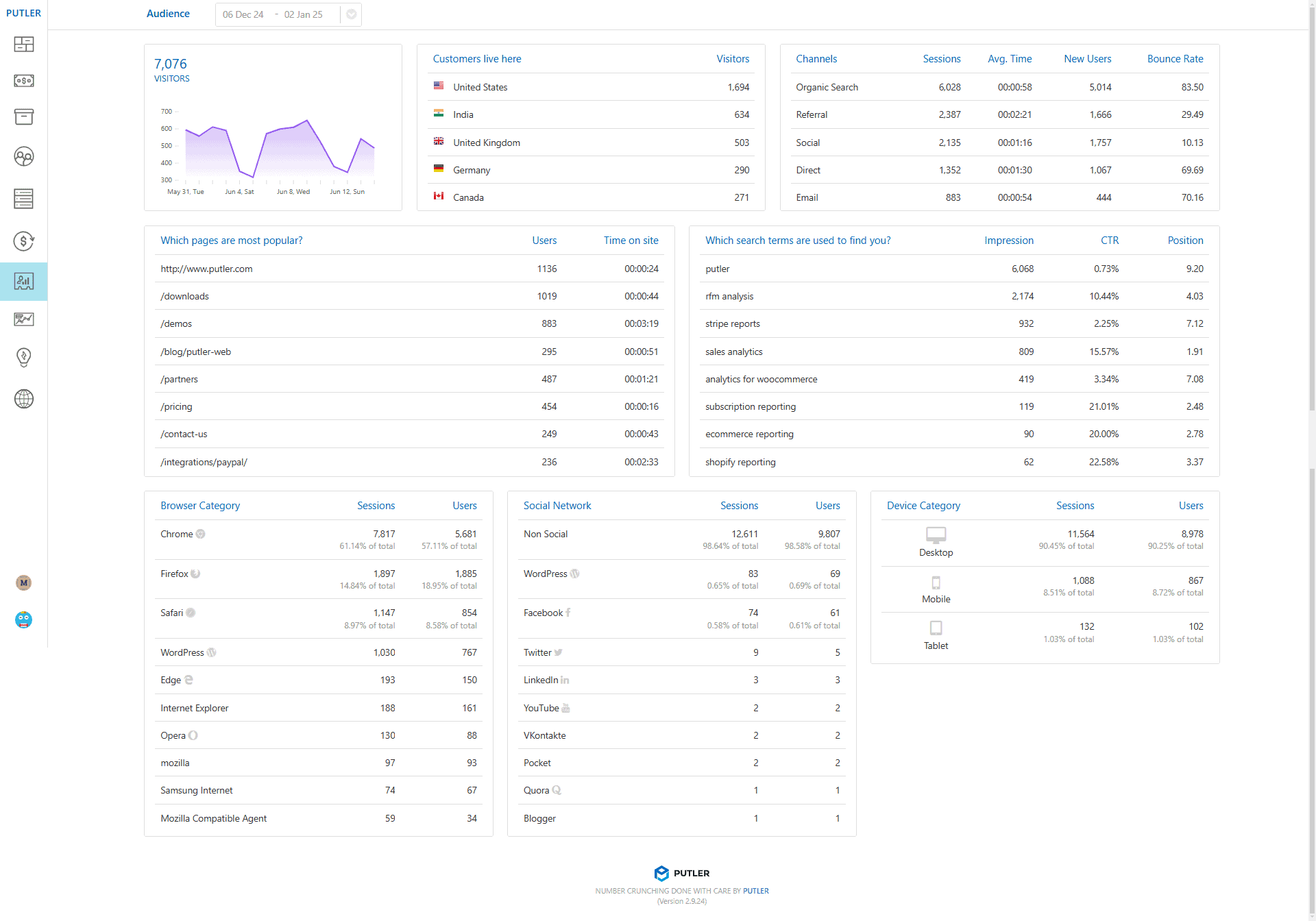
Second, an Audience layer for people who do use GA. This is where it gets interesting. Putler connects your Google Analytics and Search Console data to your actual transaction data. So instead of just seeing “10,000 visits from organic search,” you see:
- Revenue per visitor across channels
- Conversion percentage by traffic source
- Top pages ranked by revenue impact, not just views
- Which search keywords actually lead to purchases
That last point changes how you think about SEO entirely. The keyword bringing 500 visitors with a 6% conversion rate is more valuable than the one bringing 5,000 visitors who bounce. But you’d never know that from GA alone.
The everyday tools you’ll use across everything
We’ve covered the big problems. But there’s a layer of features that doesn’t belong to any single section because you’ll use them everywhere.
Instant search: The one you’ll notice first. Start typing a customer name, product, or order number and Putler finds it across your entire dataset before you finish the word. Once you get used to it, going back to searching inside Stripe or Shopify feels painfully slow.
Custom segments: Work on every screen. Combine any filters with AND/OR logic, save the segment, reuse it, export it. Build a segment like “customers in Germany who spent over $200 in the last 90 days and bought from the accessories category” in a few clicks. Try doing that in your payment gateway.
Putler Copilot: Currently in beta, it lets you skip the dashboards entirely. Ask a question in plain English — something like “what was my top-selling product last quarter?” — and get an answer pulled from your data. It’s early, but it’s a direction worth watching.
Other things that work quietly in the background:
- Multi-currency: 36+ currencies, auto-converted
- Multi-store: All stores, all platforms, one view
- Weekly email reports: Performance summary in your inbox, no login needed
- Chrome extension: See customer profiles inside your helpdesk or CRM
- AI growth tips: Daily suggestions based on your actual data
- Sales alerts: Notifications when something unusual happens
- Inbound API: Push data from custom or unsupported platforms
- Notes, tags & email: Add context to any record, email customers directly
So why Putler over everything else?
There are plenty of analytics tools out there. Most of them do one thing well and ignore the rest.
Baremetrics and ChartMogul handle subscriptions but not one-time sales. Shopify Analytics only works within Shopify. Google Analytics tracks traffic but doesn’t connect it to revenue. Triple Whale is built for DTC brands running heavy paid ads.
Putler is the odd one out because it doesn’t pick a lane. eCommerce and SaaS. One-time and recurring. Shopify and WooCommerce and PayPal and Stripe, all in the same view. With RFM segmentation out of the box, 17+ integrations, and pricing that starts at $20/month.
It’s not trying to be the flashiest tool in the category. It’s trying to be the one where you actually find your answers.
- How Online Businesses Can Increase Customer Lifetime Value
- Sales Analytics: How to Track and Improve Your Store Performance
- Sales Forecasting: Methods, Tools and Best Practices
- Customer Retention Strategies: Proven Tactics to Keep Customers Coming Back
- eCommerce Analytics 101: A Complete Beginner’s Guide
- The Best Web Analytics Tools for Your Website