
Sales performance analysis is the work of turning raw sales data into decisions you can act on. Done well, it tells you which products are carrying the business, which customers are quietly leaving, and where the next 10% of revenue is hiding. Done badly, it produces a deck nobody reads.
This article walks through how to analyze sales performance end to end. It covers the seven-step framework, the metrics that actually drive decisions, the methods that work, the mistakes to avoid, and the tools that make the process repeatable. Each step uses examples from real eCommerce and SaaS scenarios.
Sales analytics is one of the core disciplines inside Putler’s complete sales analytics platform, and the framework below is the same one Putler uses internally to help thousands of stores make sense of their numbers.
What sales performance analysis actually means
Sales performance analysis is the process of examining sales data to understand what’s driving results, what’s holding them back, and what to change next. The definition is simple. The execution is where most teams stop short.
The most common mistake is treating sales reporting and sales analysis as the same thing. They aren’t.
- Sales reporting answers “what happened?” Revenue was up 8% last month.
- Sales analysis answers “why did it happen and what should change?” Revenue was up 8% because the loyalty email sequence pushed returning customer rate from 22% to 36%, and that segment now needs its own retention plan before churn catches up.
A useful way to picture this is in three layers:
- Descriptive analysis: What happened. Revenue, conversion rate, AOV for the period.
- Diagnostic analysis: Why it happened. Segmentation, comparisons, root cause work.
- Predictive analysis: What’s likely next. Forecasts, cohort projections, trend extrapolation.
Most teams operate fluently in layer one and call it analysis. That’s why the same problems repeat quarter after quarter. You can describe a slump in detail without ever explaining it, and a problem you can’t explain is one you can’t fix.
A simple test for whether you’re doing real analysis: after looking at any metric, can you answer the “so what” question? If win rate dropped from 24% to 19% and the only response is “we should improve win rate,” that’s reporting.
If the response is “win rate dropped because the new pricing tier doubled deal size and stretched the cycle by 11 days, so reps are losing momentum on follow-ups in week three,” that’s analysis.
Why analyzing sales performance is harder (and more important) in 2026
Sales analysis has gotten harder in two ways. Quotas are getting missed more often, and the data needed to fix that is more scattered than ever.
Some numbers worth holding in mind:
- Salesforce’s State of Sales report found that 67% of sales reps don’t expect to meet quota, and 84% missed it the previous year.
- A widely cited Brevet study reports that 84% of sales training is forgotten within three months, which means even teams investing in enablement lose the ground they gain.
- WebFX’s 2026 eCommerce marketing benchmarks put median customer acquisition cost at $156 and the average at $242, so every wasted decision costs more than it used to.
- IRP Commerce’s March 2026 market data shows the average eCommerce conversion rate at 1.64%, down 7.36% year over year.
Three structural problems sit underneath those numbers:
Data fragmentation: A typical online business now runs on Shopify or WooCommerce, plus a payment gateway like Stripe or PayPal, plus marketplaces like Amazon and Etsy, plus GA4 for traffic, plus an ad platform or two, plus a CRM, plus an email tool. Each system reports a different revenue number. None of them agree.
More dashboards, less clarity: Adding tools hasn’t solved the problem. It’s multiplied it. Teams now spend more time reconciling reports than analyzing them, and platform-reported revenue routinely inflates actual sales by 30 to 60% because the same transaction shows up in two or three places.
Slower feedback loops: Quarterly reviews are too late. By the time a problem shows up in a quarterly report, the cohort that caused it has already churned and the budget that fueled it is already spent.
The cost of bad analysis compounds. Misread metrics lead to misallocated budgets. Misallocated budgets lead to wasted CAC. Wasted CAC lengthens payback periods.
Longer payback periods mean less cash for the next quarter’s experiments. The teams that figure out how to analyze sales performance properly aren’t doing more work. They’re doing the same work with cleaner inputs and sharper questions.
The 7-step framework on how to analyze sales performance
Most “how to analyze sales performance” guides give you a list of metrics and call it a process. Metrics aren’t a process. The framework below is what separates teams that turn data into revenue from teams that turn data into slides.
Each step builds on the one before it. Skip a step and the next one breaks.
Step 1: Define the question before touching the data
Most analysis fails because the question is too broad. “How are sales doing?” is not a question. It’s a vibe.
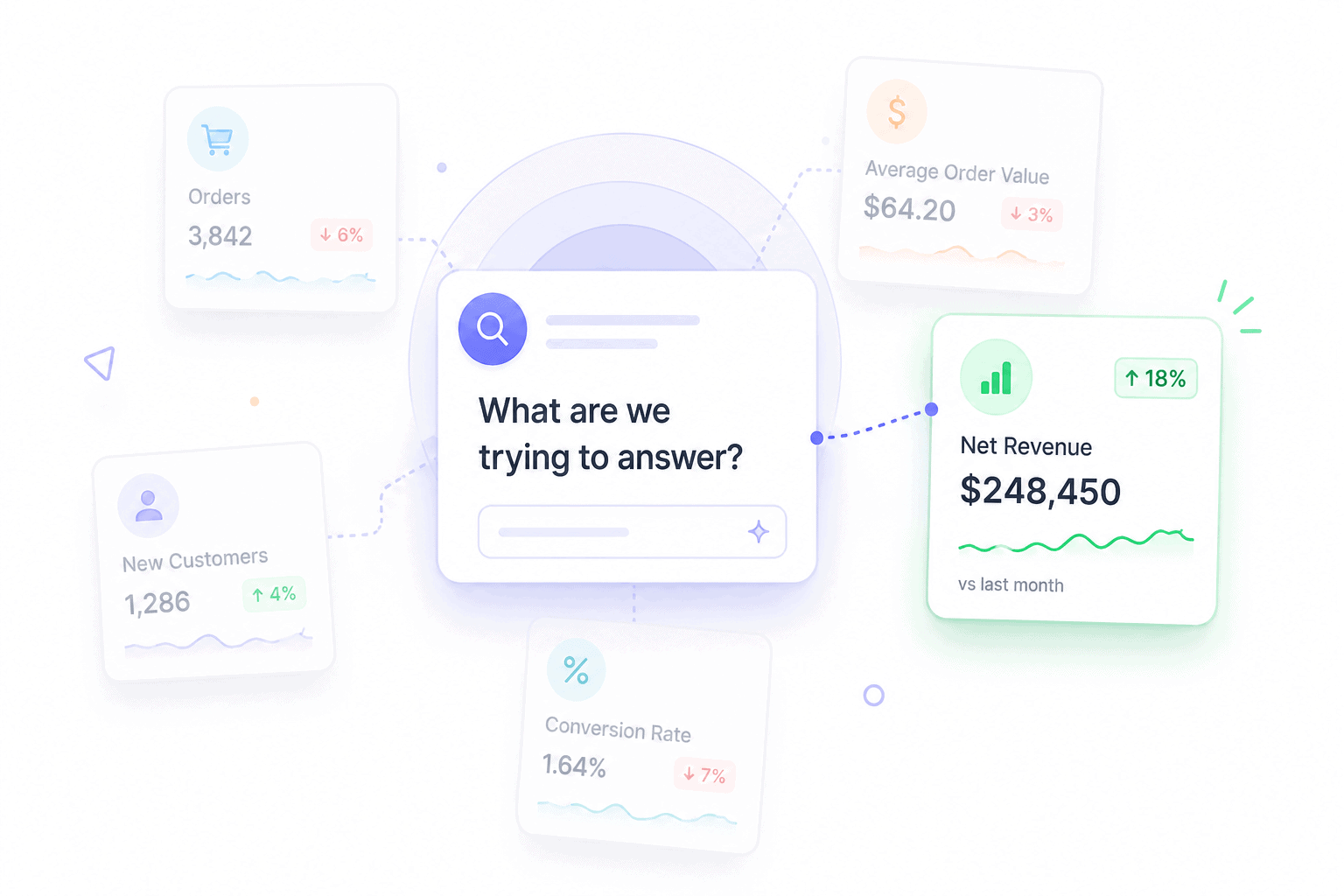
A real analytical question has three properties:
- Specific: Names a metric, segment, and time window
- Comparative: Asks how something changed against a baseline
- Actionable: The answer would change a decision
Compare these two:
- Vague: “Why did revenue drop last quarter?”
- Sharp: “Why did the $50 to $100 AOV bracket shrink 22% from May to July, while the under-$50 bracket grew 14%?”
The sharp version tells you exactly which data to pull, which segments to compare, and what success would look like. The vague version sends you on a four-hour dashboard tour with nothing to show at the end.
Step 2: Map every source of sales data and check its hygiene
Sales data lives in more places than most teams realize. The standard list for an eCommerce or SaaS business:
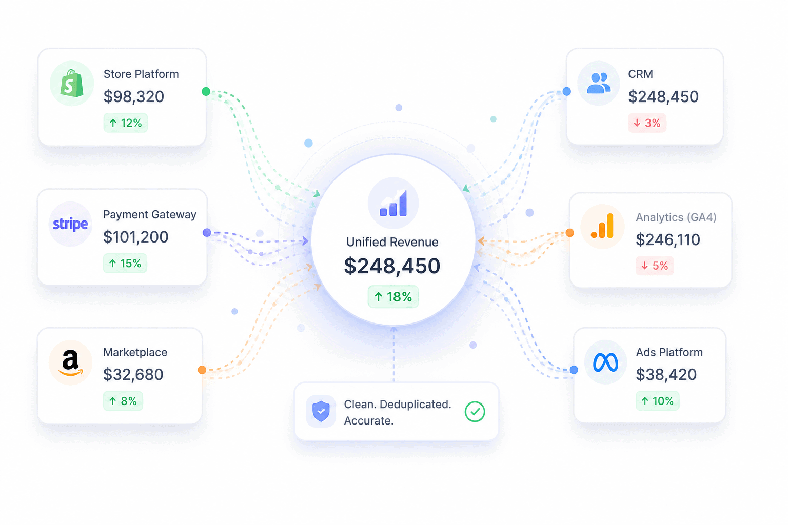
- Payment gateways (Stripe, PayPal, Braintree, Razorpay)
- Store platforms (Shopify, WooCommerce, BigCommerce)
- Marketplaces (Amazon, Etsy, eBay)
- CRM (Salesforce, HubSpot, Pipedrive)
- Web analytics (GA4, Search Console)
- Email and ad platforms (Mailchimp, Meta Ads, Google Ads)
- Refund and dispute logs
Clean data means four things:
- Deduplicated: A sale that appears in both Stripe and WooCommerce is counted once
- Currency-normalized: Every transaction converted to a single base currency
- Timezone-aligned: Every timestamp on the same clock
- Refund-adjusted: Net revenue, not gross, with refunds attributed to the original sale
Skip this step and the rest of the framework collapses. Platform-reported revenue routinely inflates actual sales by 30 to 60% because the same transaction shows up in multiple systems. Analysis built on inflated revenue produces inflated conclusions.
Step 3: Pick the right metrics for the question
Different questions need different metrics. Pulling every available number is the fastest way to learn nothing.
Map the question type to the metric category:
- Revenue questions: net sales, gross sales, AOV, ARPU, gross margin, refund rate
- Conversion questions: conversion rate, cart abandonment rate, win rate, sales cycle length
- Customer questions: CAC, CLV, retention rate, churn rate, RFM segments
- Activity questions: site sessions, add-to-cart rate, demo bookings, email click rate
The other framing that matters is leading versus lagging indicators. Lagging indicators (revenue, win rate, CLV) tell you what already happened. Leading indicators (sessions, add-to-cart rate, demos booked) predict what’s coming. Healthy analysis tracks both, because lagging indicators alone always show problems too late to fix.
Step 4: Segment before drawing any conclusion
Aggregate numbers lie. Almost every meaningful insight lives one layer below the headline metric.
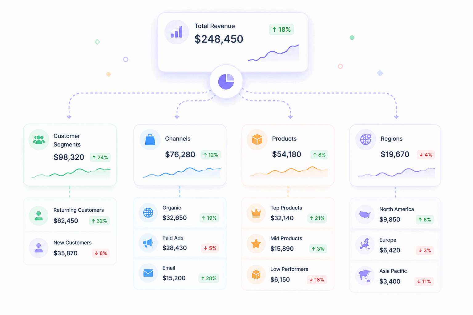
Standard segmentation cuts:
- By product or SKU: Which items drive revenue, which drag margins
- By channel: Direct vs marketplace vs paid vs organic
- By customer cohort: New vs returning, first-time vs repeat
- By region or currency: Where growth is concentrated
- By acquisition source: Which campaigns produce profitable customers
A real example. Total revenue looks flat month over month. Segment it and the picture changes: new customer revenue is up 30%, returning customer revenue is down 25%.
The flat headline is hiding a retention problem that will surface as a churn crisis in 60 days. The aggregate number told you nothing useful. The segmented view told you exactly what to fix.
Step 5: Compare against goals, history, and benchmarks
A number on its own means nothing. A 2.4% conversion rate is good or bad depending on what it’s compared to.
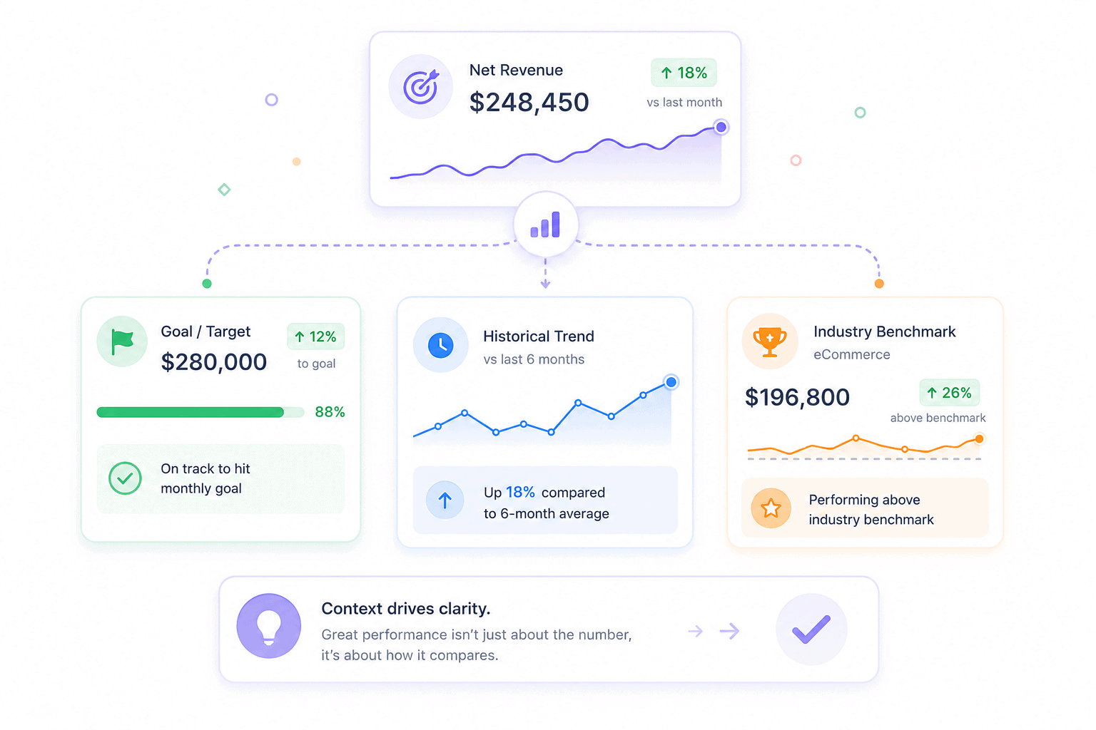
Three comparison angles, all required:
- Against your own targets: Are you on track for the quarter?
- Against your historical baseline: Is performance better or worse than your own past?
- Against industry benchmarks: How does this compare to peers?
Useful benchmarks to anchor against: the average eCommerce conversion rate sits at 1.64% as of March 2026, average cart abandonment hovers at around 70% across studies tracked by Baymard Institute, and the average B2B sales win rate sits near 21%.
Your numbers aren’t good or bad in isolation. They’re good or bad relative to the right reference point.
Step 6: Diagnose the why, not just the what
This is where most analysis stops too early. Spotting a drop is reporting. Explaining it is analysis.
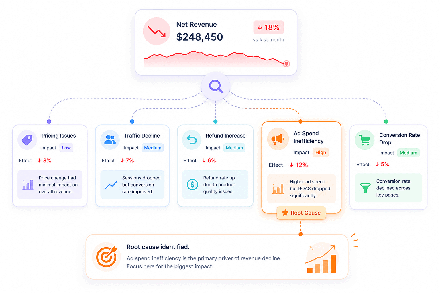
A useful diagnostic checklist when something moves:
- What changed in the same period? Pricing, product mix, ad spend, traffic source, seasonality
- Which segment moved the most? The aggregate change usually traces to one or two cohorts
- Did a leading indicator move first? A drop in add-to-cart rate three weeks ago often explains today’s revenue dip
- What didn’t change? Sometimes the cause is what’s missing, not what’s present
Example: revenue is down 12%. Don’t accept “the market slowed” as the answer. Pull the same window across CAC, conversion rate, AOV, ad spend, traffic source mix, and refund rate. The cause shows up where one of those numbers moves harder than the others.
Step 7: Convert findings into one decision with a deadline
Analysis without action is reporting in disguise. Every analytical session should end with a single decision, owned by one person, due by a specific date, and verified by a specific metric.
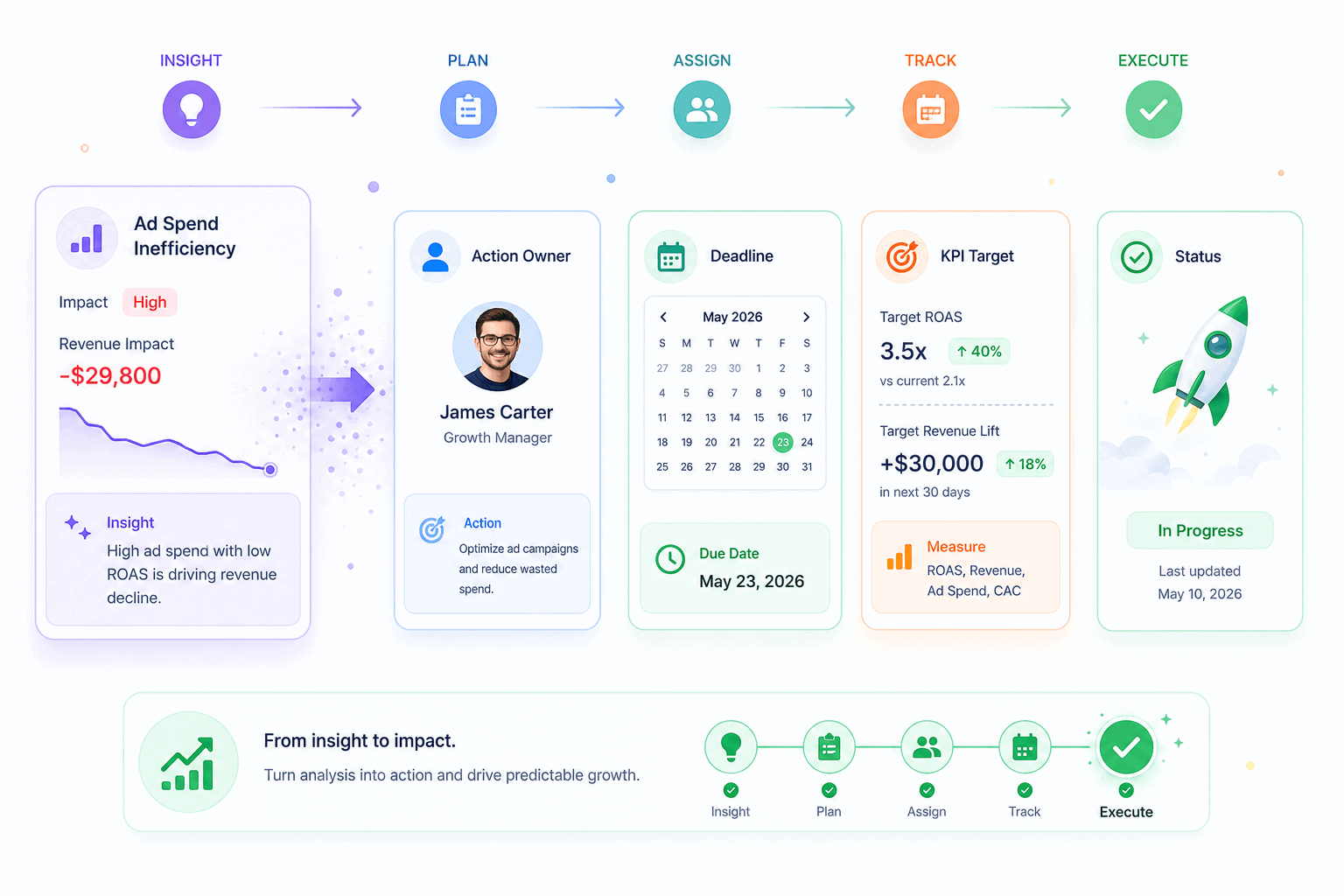
The format that works:
- Decision: What will change
- Owner: Who is responsible
- Deadline: When it ships
- Verification metric: How success will be measured
Example: “Move 30% of paid social budget to email retention by August 15. Owner: marketing lead. Verify with returning-customer revenue up 10% by September 15.”
That’s a complete analytical loop. Most teams stop at the insight. The insight is the cheap part. The decision and the verification are where the revenue actually comes from.
The sales performance metrics that actually drive decisions
There are roughly 200 metrics a sales team could track. Most teams should track 10 to 15. The list below covers the four categories that matter, with the metrics inside each one, what they tell you, and when to use them.
Revenue and profitability metrics
These metrics answer “how much money is the business making, and how much of it is real?”
- Net sales: Gross sales minus refunds and discounts. The honest revenue number. Always use net sales for forecasting.
- Average order value (AOV): Total revenue divided by total orders. Reveals whether the business is selling cheap items often or expensive items rarely.
- Average revenue per user (ARPU): Total revenue divided by total customers. The SaaS counterpart to AOV.
- Gross margin: Revenue minus cost of goods sold, as a percentage. A 30% gross margin business behaves very differently from a 70% gross margin business, even at the same revenue.
- Refund rate: Refunds as a percentage of gross sales. A creeping refund rate signals product, expectation, or fulfillment problems.
A sharp reading combines them. AOV up 15%, refund rate up 8%, gross margin flat? The price increase worked, but customers regret the purchase. That’s a positioning problem, not a pricing one.
Conversion and pipeline metrics
These answer “how efficiently does the business turn attention into revenue?”
- Conversion rate: Orders divided by sessions. The eCommerce average sat at 1.64% in March 2026, down 7.36% year over year.
- Cart abandonment rate: Carts created minus carts completed, as a percentage. Baymard’s running benchmark puts the average around 70%.
- Win rate: Closed-won deals divided by total deals. B2B win rates average around 21%.
- Sales cycle length: Days from first contact to closed deal. A lengthening cycle usually predicts a falling win rate.
A B2C store reads these differently from a B2B SaaS company. eCommerce teams live and die on conversion rate and cart abandonment. SaaS teams care more about win rate and cycle length. The same metric framework, different anchors.
Customer metrics
These answer “is the business building something durable, or renting growth from ads?”
- Customer acquisition cost (CAC): Total acquisition spend divided by new customers acquired. WebFX’s 2026 benchmarks put median eCommerce CAC at $156 and average at $242.
- Customer lifetime value (CLV): Average revenue per customer across their full relationship with the business.
- Retention rate: Customers retained over a period, divided by customers at the start.
- Churn rate: The inverse of retention. Especially critical for subscription businesses.
- RFM segments: Recency, frequency, monetary value scoring. Sorts customers into actionable groups like Champions, Loyal, At Risk, About to Sleep, and Lost.
The single most useful ratio in the list: CLV divided by CAC. A ratio above 3:1 means the business has room to scale spend. A ratio below 1:1 means every new customer loses money, and growth is masking the problem. Many businesses celebrate revenue growth without realizing they’re underwater on this ratio.
Activity and leading indicators
These answer “what’s coming next, before it shows up in revenue?”
- Site sessions and traffic source mix: Drops here predict revenue drops in 2 to 4 weeks
- Product page views: Demand signal, especially when paired with conversion rate
- Add-to-cart rate: Stronger predictor of next-month revenue than this month’s conversion rate
- Email click-through rate: Predicts retention revenue
- Demo bookings or trial signups: SaaS leading indicators that show up 30 to 60 days before MRR
Lagging indicators tell you what already happened. Leading indicators tell you what’s about to happen. Track both. Reacting only to lagging indicators is reacting to problems that are already 30 days old.
For a deeper view of which metrics matter by business type, the complete eCommerce analytics guide breaks down each one by use case.
Five proven methods to analyze sales data
Metrics tell you what to track. Methods tell you how to read them. The five methods below cover almost every analytical question an eCommerce or SaaS team will ever ask. Each one solves a specific class of problem.
Trend analysis: spotting patterns over time
Trend analysis plots a metric across time and looks for direction, seasonality, and inflection points.
When to use it:
- Tracking month-over-month or year-over-year revenue
- Spotting seasonal patterns (Q4 spikes, summer slumps)
- Identifying when a metric started moving and what else changed in that window
When it fails: short windows. A 14-day trend isn’t a trend, it’s noise. Trend analysis needs at least 90 days of clean data, and ideally a year, to separate signal from seasonality.
A useful pairing is the year-over-year overlay. Same week, same day-of-week, last year. That comparison strips out seasonality and shows whether the business is actually growing.
Pareto analysis: finding revenue concentration
Pareto analysis applies the 80-20 rule to sales data. In most stores, roughly 20% of products generate 80% of revenue, and 20% of customers generate 80% of profit.
The method:
- Rank products (or customers) by revenue contribution, highest to lowest
- Calculate the cumulative percentage at each row
- Mark the row where cumulative revenue crosses 80%
- Everything above that line is the vital few. Everything below is the trivial many.
The decisions this unlocks:
- Double down: Increase ad spend, inventory, and feature placement on the top 20%
- Cut costs: The bottom 50% of SKUs often consume more support and inventory cost than they earn
- Diversify carefully: A business where one product drives 60% of revenue is one supply-chain disruption away from a crisis
Pareto analysis is the fastest way to find leverage in a portfolio. Most teams discover their top three products account for more than they assumed, and their bottom 30% account for almost nothing.
Cohort analysis: separating signal from noise
Cohort analysis groups customers by a shared characteristic, usually their first purchase month, then tracks how that group behaves over time.
A standard cohort table:
- Rows: Acquisition month (Jan cohort, Feb cohort, Mar cohort)
- Columns: Months since acquisition (M0, M1, M2, M3)
- Cells: Retention rate or revenue per customer at each point
Why it matters: aggregate retention numbers hide the truth. A business can show 70% overall retention while every recent cohort is collapsing, because old, loyal cohorts inflate the average. Cohort analysis surfaces the rot before it shows up in headline numbers.
Cohort analysis is also the cleanest way to measure the impact of a product or marketing change. If the post-change cohorts retain better than the pre-change cohorts at the same maturity, the change worked.
Pipeline and funnel analysis: finding where deals leak
Funnel analysis maps the path from first touch to purchase and measures the drop-off at each stage.
The standard eCommerce funnel:
- Site visit
- Product page view
- Add to cart
- Checkout started
- Purchase completed
Cart abandonment averages around 70%. Checkout abandonment runs 15 to 25%. Knowing the industry benchmarks at each stage tells you which step is genuinely broken versus which one is just hard.
The standard B2B SaaS funnel runs longer:
- Lead captured
- Marketing qualified
- Sales qualified
- Demo or trial
- Proposal
- Closed-won
The same logic applies. The biggest drop is the bottleneck. Most teams pour resources into the top of the funnel when the real leak is at stage four. Funnel analysis exposes that mismatch.
Performance vs goal analysis: measuring against targets
Performance vs goal analysis compares actual results to the targets the team committed to. Done weekly, it’s the cheapest forecast accuracy improvement available.
A clean version uses SMART targets:
- Specific: “Increase quarterly returning-customer revenue”
- Measurable: “By 15%”
- Achievable: Based on historical baseline
- Relevant: Tied to a strategic priority
- Time-bound: “By end of Q3”
Run it weekly with three columns: target, actual, gap. The gap column tells you where to spend the next week’s effort. Quarterly reviews catch gaps too late. Weekly reviews catch them while there’s still time to close them.
For teams ready to bring these methods together in one place, the complete analytics dashboard guide walks through how to set up each view.
Common mistakes that break sales performance analysis
Most failed analysis efforts don’t fail because of bad math. They fail because of bad habits that creep in early and compound. The six below are the ones that show up across nearly every team that struggles with sales data.
Tracking 50 metrics instead of 5
The instinct is to track everything because every number feels important. The result is a dashboard nobody reads.
What goes wrong:
- Time spent maintaining the dashboard exceeds time spent acting on it
- No metric gets enough attention to actually move
- Team meetings turn into number recitals instead of decision sessions
- The signal disappears under the volume
A focused five-metric dashboard outperforms a 30-metric one every time. The metrics that don’t make the cut still exist in the underlying tools. They just don’t earn a spot on the daily view.
Confusing reporting with analysis
Pulling numbers and putting them in a slide is reporting. It’s a useful first step. It’s not the whole job.
The signs a team has stopped at reporting:
- Meetings end with “interesting” instead of “here’s what we’re changing”
- The same chart appears month after month with no narrative attached
- Nobody can explain why a metric moved, only that it did
- Insights get shelved without becoming decisions
Reporting describes. Analysis explains and decides. A team that mistakes one for the other will keep producing dashboards while the underlying business problems compound.
Ignoring data quality
Bad data produces confident wrong answers, which is worse than no answer at all.
The most common data quality problems:
- Duplicate transactions counted twice across payment gateway and store platform
- Refunds attributed to the wrong period
- Currency conversions inconsistent across sources
- Test transactions and internal orders mixed into customer data
- Different timezones across systems shifting daily numbers
A sales analysis built on dirty data is a sales analysis that produces wrong decisions with full confidence. Spending an hour fixing data quality saves a quarter of acting on bad conclusions.
Skipping segmentation
Aggregate numbers comfort. Segmented numbers inform.
A flat revenue line at the company level can hide:
- New customer revenue up 40%, returning customer revenue down 20%
- Mobile revenue collapsing while desktop carries the average
- One product growing while three others quietly bleed
- One channel exploding while the rest stagnate
Skipping segmentation means making decisions on numbers that average out the very signals that would change the decision. The first cut should always be at least three ways: by product, by channel, and by customer cohort.
No clear next action
The most common failure isn’t analytical. It’s organizational. The analysis ends with an insight, the meeting ends with nodding, and nobody owns the change.
A complete analytical loop ends with four things:
- Decision: What will change
- Owner: Who is accountable
- Deadline: When it ships
- Verification metric: How to know if it worked
Without those four, the insight evaporates by Friday. With them, the next analysis cycle starts with a measurable result instead of another open question.
Analyzing too late
The last mistake is timing. A monthly review that should be weekly. A quarterly review that should be monthly. By the time the problem appears in the report, the cohort that caused it has already churned and the budget that fueled it is already spent.
A useful cadence:
- Weekly: Top five metrics vs target, leading indicators, anomaly check
- Monthly: Trend analysis, Pareto refresh, cohort retention check
- Quarterly: Strategic review, benchmark comparison, framework adjustments
Late analysis is just expensive reporting. Real-time or near real-time data closes the loop while there’s still time to act.
Tools that make sales performance analysis easier
The right tool doesn’t replace the framework. It removes the friction that stops teams from running the framework consistently. Most sales analysis tools fall into four categories, each solving a different part of the problem.
- CRMs like Salesforce, HubSpot, and Pipedrive: Built for pipeline tracking and rep performance. Strong on deal-level analysis. Weaker on consolidated revenue across channels.
- BI platforms like Tableau, Looker, and Power BI: Powerful and customizable. Require a data team and a warehouse to be useful. Overkill for most stores under $10M in revenue.
- Spreadsheets (Excel, Google Sheets): Still the most flexible analysis tool ever built. The catch is manual data pulls, version control, and the moment a single broken formula corrupts a report.
- Unified analytics platforms like Putler, Glew, Polar, and Triple Whale: Built specifically for eCommerce and SaaS revenue. Pre-built dashboards, automatic data consolidation, no warehouse setup.
For multi-channel sellers, the unified platform category usually wins. Building consolidation logic in a spreadsheet or a CRM is technically possible. It’s also a part-time job nobody has the budget for.
Final thoughts on how to analyze sales performance
Sales performance analysis isn’t a tool problem or a metric problem. It’s a discipline. Sharp questions, clean data, focused metrics, real segmentation, honest comparisons, root-cause diagnosis, and one decision with a deadline.
Run that loop weekly and the business compounds. Skip steps and the same problems repeat. For multi-channel sellers who don’t want to spend the week reconciling spreadsheets, Putler runs the framework end to end on one dashboard.