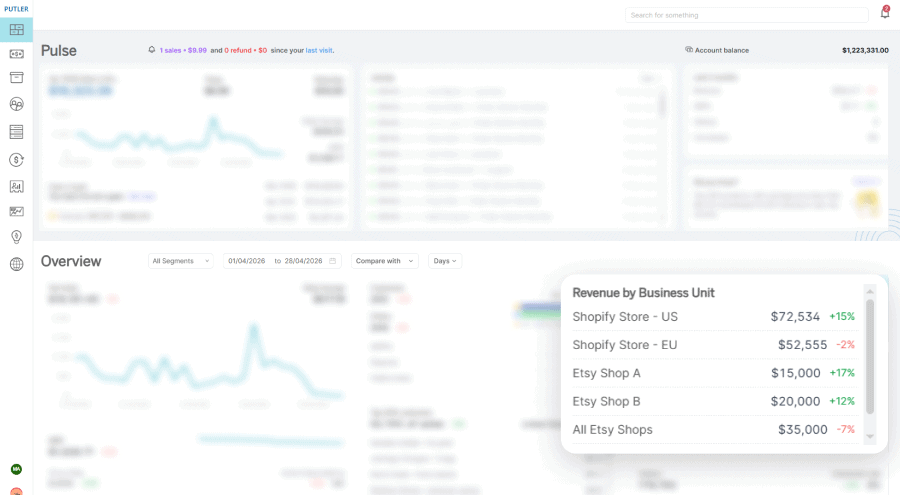
We just shipped a new block on the Putler Home Dashboard called Revenue by Business Unit. It shows revenue for every team you’ve created, all on one screen, sorted from highest earner to lowest.
We built it because we kept hearing the same thing from users running multiple stores, brands, or regions. Switching between teams just to compare numbers was slow and got in the way.
Revenue by Business Unit fixes that. You’ll find it on your Home Dashboard, right below Putler Copilot.
What Revenue by Business Unit shows you
Revenue by Business Unit is a new insight block that displays the revenue of each of your teams as a single, segmented list. Think of it as a leaderboard for your business units.
Each row in the block shows you:
- The team name
- The revenue it earned for the period you’ve selected
- The percentage change compared to the previous period
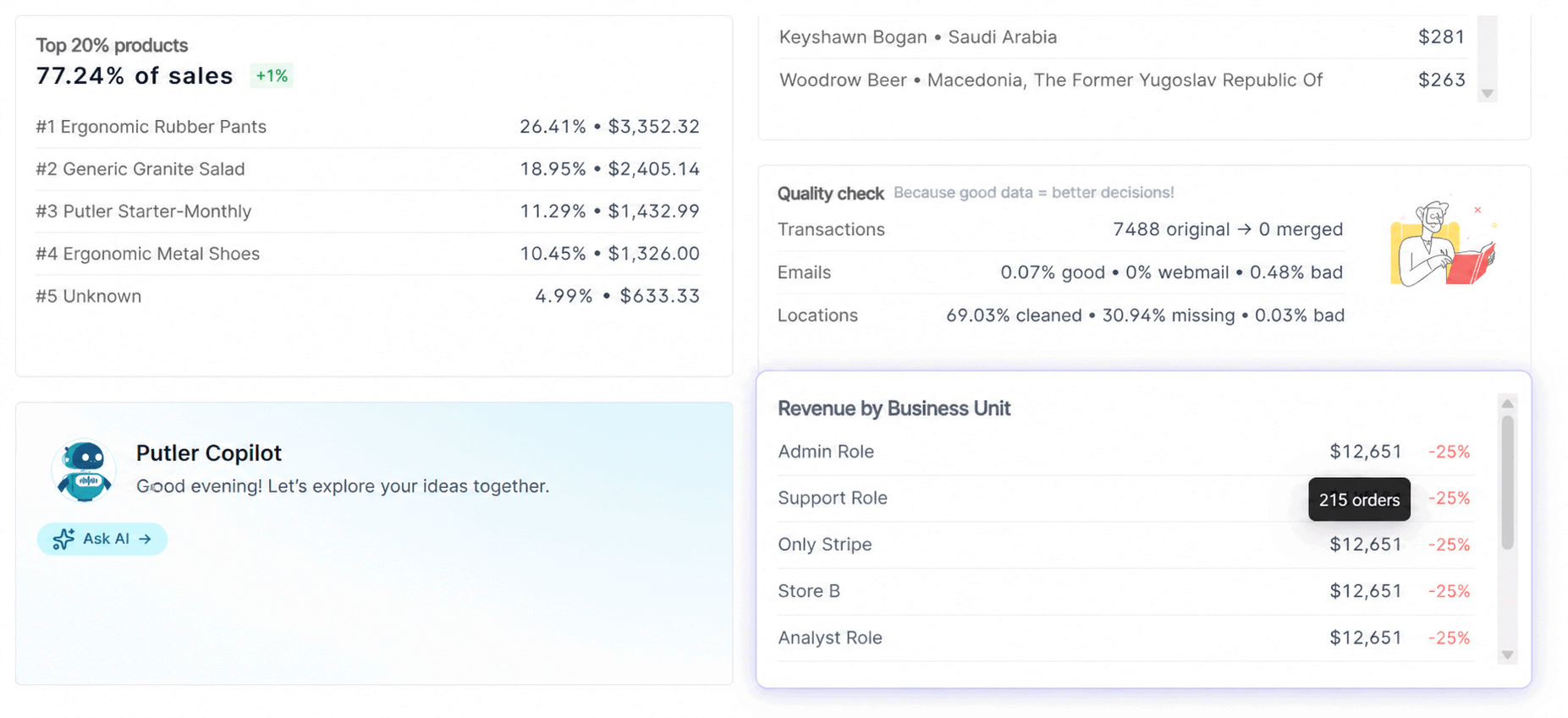
- The order count (visible when you hover over the revenue number)
Two metrics on one row, with the order count tucked away on hover so the block stays clean.
The list sorts by revenue in descending order. Your top earner sits at the top. Teams with zero revenue get pushed to the bottom. That ordering is intentional, and it keeps your attention on what’s actually moving.
A few things worth knowing up front:
- Self-teams only for now: Revenue by Business Unit currently shows only the teams you’ve created and assigned to yourself. Teams that someone else created and shared with you don’t appear here yet. We’re working on that and shared teams will come in a future update.
- Date range is yours to control: Adjust the date range at the top of the Home Dashboard and the entire block updates to match. Last 7 days, last 30 days, this quarter, custom range, all of it works.
- Percentage change is dynamic: It’s always calculated against the previous equivalent period. So if you’re viewing this month, the comparison is to last month. If you’re viewing last 90 days, the comparison is to the 90 days before that.
If you’ve already set up teams inside Putler, you don’t need to do anything to use this. Log in, scroll down on the Home Dashboard, and the block is there. If you haven’t set up teams yet, our Strategic Business Unit reporting docs walk you through it.
Why we built Revenue by Business Unit
For a while now, the workflow for users with multiple teams looked like this:
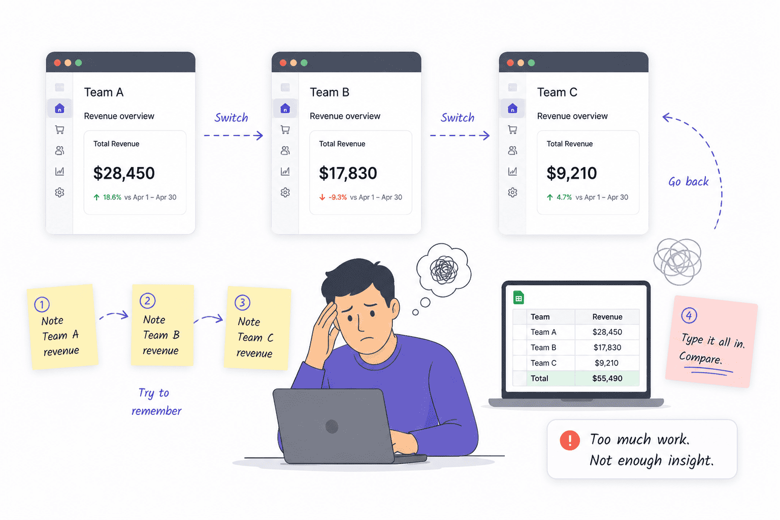
- Switch to Team A. Note the revenue.
- Switch to Team B. Note the revenue.
- Switch to Team C. Try to remember the first number.
- Open a spreadsheet. Type it all in. Compare.
By step three, you’d already forgotten Team A’s number. By step four, you’d given up on getting any insight from the comparison and were just trying to get through the task.
We watched enough users do this to know it was a problem worth solving directly on the Home Dashboard.
Revenue by Business Unit puts the comparison on one screen. No switching. No mental math. No spreadsheet.
You see your top performer, your laggard, and everyone in between, ordered by revenue contribution. The percentage change next to each number tells you who’s trending up and who’s slipping, all in the same glance.
There’s a smaller benefit we like more than we expected to. Teams with zero revenue get pushed to the bottom of the list. If you’ve ever set up a team for a store you stopped selling on or a side project that didn’t take off, you know how those zero rows clutter a dashboard. Now they sit out of the way, and your active business units have the spotlight.
This is also why we kept the block simple. Just two things:
- Revenue: for the period you’ve selected
- Percentage change: versus the previous equivalent period
That’s the whole block. If you want sales trends, customer insights, product-level breakdowns, or any of the deeper analysis Putler is built for, you can still click into the individual team for the full picture.
Revenue by Business Unit is the snapshot. The teams themselves are the deep dive. We didn’t want one to crowd out the other.
Five ways to use Revenue by Business Unit
The whole point of teams in Putler is that you get to define what a business unit means for you. We don’t impose a structure. Some users split by store location. Some split by sales platform. Some split by brand or product category.
Whatever way you’ve already organized your teams, Revenue by Business Unit reflects that exact split on the Home Dashboard.
Here are five common setups we see and what the block looks like in each.
1. Multi-location stores
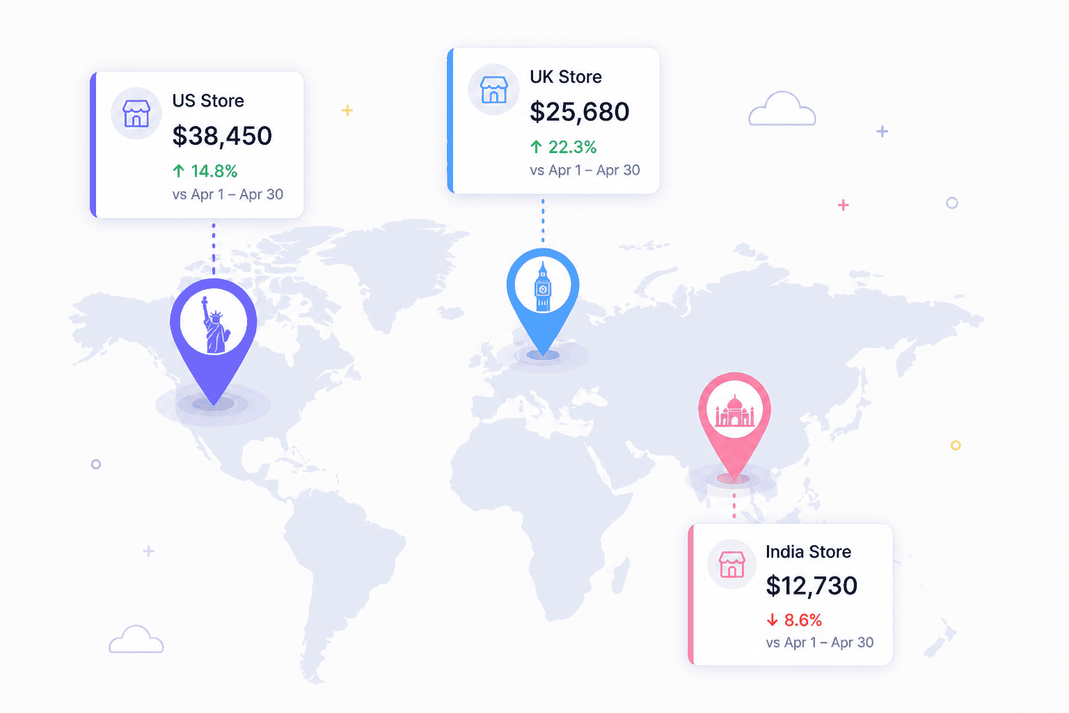
If you sell in different regions and have a team for each, this is the use case Revenue by Business Unit was practically built for.
A typical setup looks like:
- Team 1: US store
- Team 2: UK store
- Team 3: India store
The block shows you which region is pulling the most revenue, which one’s growing fastest, and which one’s slipping, all without context-switching. If your UK store suddenly drops 20% week-over-week, you see it the moment you open Putler. You don’t have to remember to check.
2. Multi-platform sellers
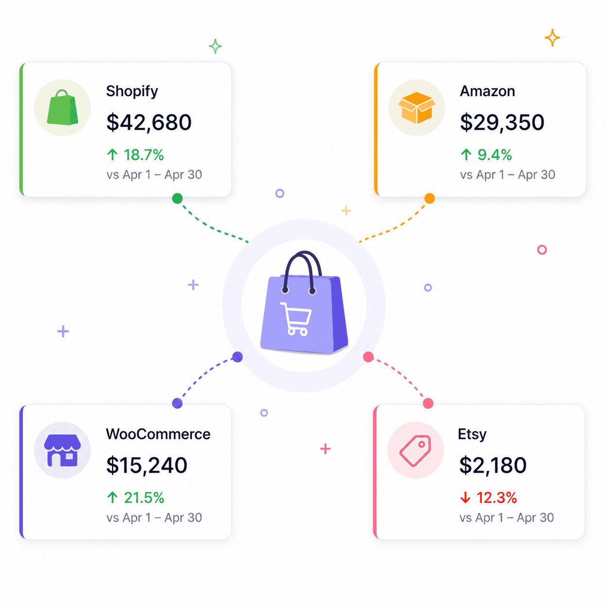
If you sell the same products across Shopify, WooCommerce, Amazon, and Etsy, you’ve probably wondered which channel is actually pulling its weight.
Set up one team per platform and Revenue by Business Unit gives you the answer in one view:
- Which channel earned the most this month
- Which channel is growing fastest in percentage terms
- Which channel might not be worth the effort it takes to maintain
That last one matters. We’ve talked to users who keep selling on a marketplace because they always have, only to realize after seeing the numbers side by side that it’s contributing 3% of revenue and eating up 30% of their time.
3. Multiple brands or product categories
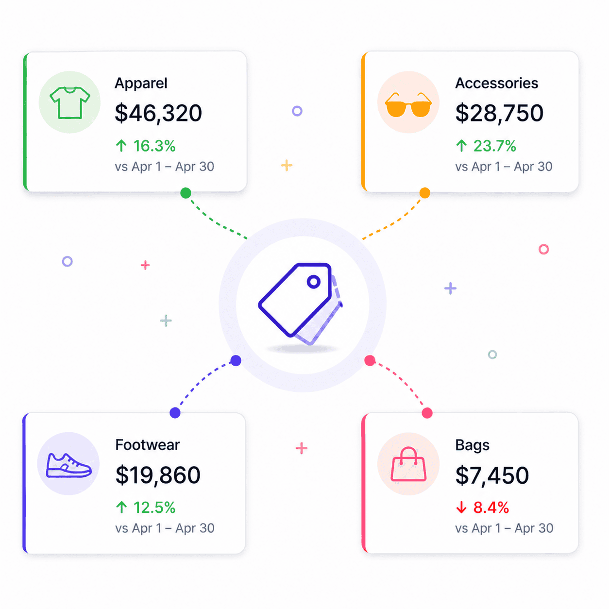
If you run more than one brand or your store sells across distinct categories, like apparel and accessories, you can split each into its own team.
Revenue by Business Unit then becomes a fast read on:
- Which brand is your cash cow this quarter
- Which category needs marketing attention
- Where to direct your next inventory purchase
For merchandising decisions especially, having the comparison on one screen is faster than pulling separate reports.
4. Agencies managing multiple clients
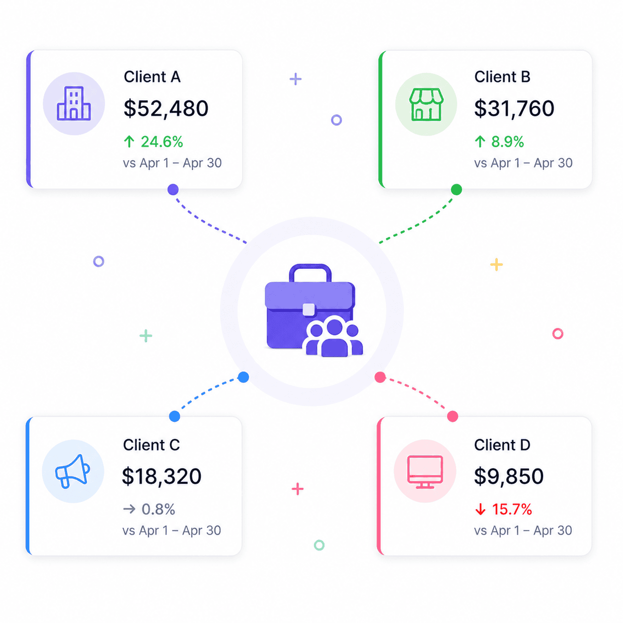
If you’re an agency using Putler to track multiple client accounts, every client probably has their own team.
Revenue by Business Unit turns the Home Dashboard into your client overview screen:
- See client-wise revenue at a glance
- Spot which clients are trending down before they ask
- Prioritize your attention based on actual revenue movement
It’s a faster way to start a Monday than logging into each client one by one.
5. Teams already organized as Strategic Business Units
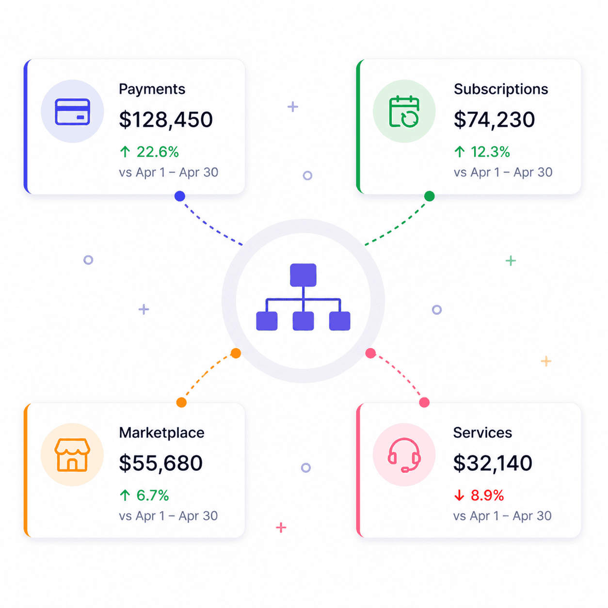
If you’re already using Putler’s Strategic Business Unit setup to mirror your internal company structure, Revenue by Business Unit is the unified view you’ve been missing.
You get:
- Cross-SBU comparison without switching
- One snapshot of how each unit is performing
- Less friction in your daily and weekly performance tracking
For business owners running their company through SBUs, this turns the Home Dashboard into your highest-level performance summary.
Revenue by Business Unit vs going deeper into a team
Here’s the mental model we’ve been using internally, and it might help you too.
Revenue by Business Unit is the snapshot. It tells you which units are doing well and which aren’t. That’s it. That’s the whole job.
Individual teams are the deep dive. Click into a team and you get everything Putler does for a single business: sales trends, customer behavior, product-level insights, subscription metrics, refund rates, web traffic, the lot.
The two work together. You don’t pick one over the other.
A typical workflow looks like:
- Open Putler in the morning
- Glance at Revenue by Business Unit
- Notice one team is down 15% week-over-week
- Click into that team to find out why
- See it’s a single product with a sudden refund spike
- Take action
Without Revenue by Business Unit, step three never happens. You only catch the problem when you happen to switch to that team for an unrelated reason. With it, the problem surfaces itself.
If you regularly compare teams in detail, like comparing two payment gateways or two stores side by side across multiple metrics, Putler’s Performance Comparison feature is built for that exact job. Revenue by Business Unit gets you to the question. Performance Comparison gets you to the answer.
How to start using Revenue by Business Unit
If you already have teams set up in Putler, you don’t need to do anything. The block is live on your Home Dashboard right now.
Here’s how to find it:
- Log in to your Putler account
- You’ll land on the Home Dashboard by default
- Scroll down past Putler Copilot
- Revenue by Business Unit is right there, with all your self-created teams listed
That’s it. No setup, no configuration, no toggle to enable.
If you want to explore everything else Putler does alongside this, our complete features overview is the best starting point.
- Sales dashboard and sales heatmap: find your best selling hours
- Customer profiles: see every customer’s full history in one view
- SaaS metrics dashboard: MRR, churn, LTV, and ARR explained
- Revenue forecasting: project the next 12 months of sales
- Data consolidation: fix duplicate transactions across platforms