
You’ve got a catalog. Maybe 50 products, maybe 500. And you’re treating them all roughly the same: equal shelf space on your website, similar attention in your email campaigns, evenly distributed ad budget.
But here’s the thing. Roughly 20% of your products are generating about 80% of your revenue. The other 80%? They’re soaking up marketing spend, homepage real estate, and your decision-making energy without earning their place.
The problem isn’t that you don’t care. It’s that you can’t see it. You are lacking proper product analysis.
Your Shopify admin shows revenue per product, sure. But it doesn’t tell you which products are quietly dragging your margin down with high refund rates.
It doesn’t show you which variations actually sell and which ones collect dust. It doesn’t surface the bundle opportunities hiding in your transaction data.
So you end up treating every product as equally important. And that means the ones that matter most don’t get the attention they deserve.
Putler’s products dashboard solves this in a way that changes how you think about your catalog, and your entire approach to product analysis.
It’s one of the core features of Putler.
Here’s the walkthrough, following the same journey you’d take the first time you open it.
Which products are actually carrying the business?
This is the first question any solid product analysis has to answer. Open the dashboard and you see a product leaderboard: every product you sell, listed and sortable.
Your top 20% are star-marked. These are the products generating the bulk of your revenue. Seeing that star next to some product names (and not others) is a surprisingly clarifying moment.
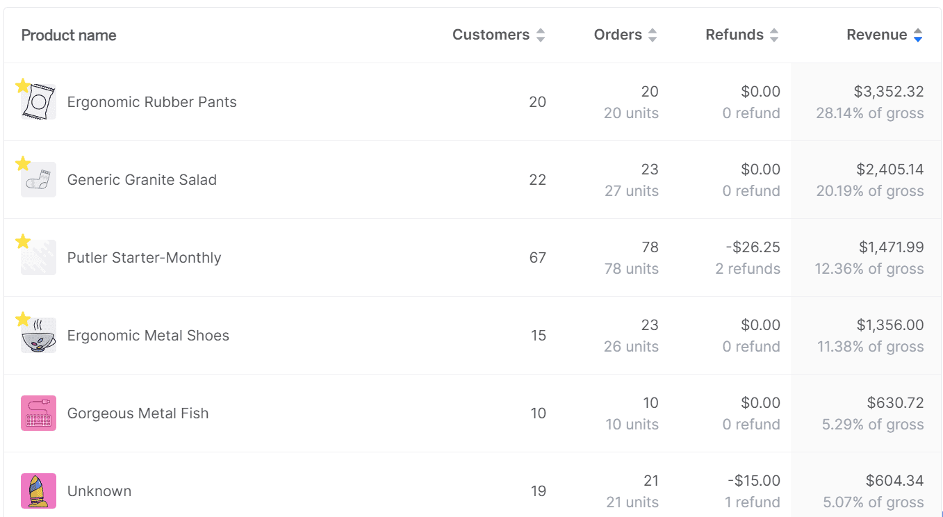
Most store owners discover that products they assumed were important aren’t in the top 20%, and products they’d overlooked are quietly doing the heavy lifting.
Above the list, an 80/20 breakdown chart tracks how the split changes over time.
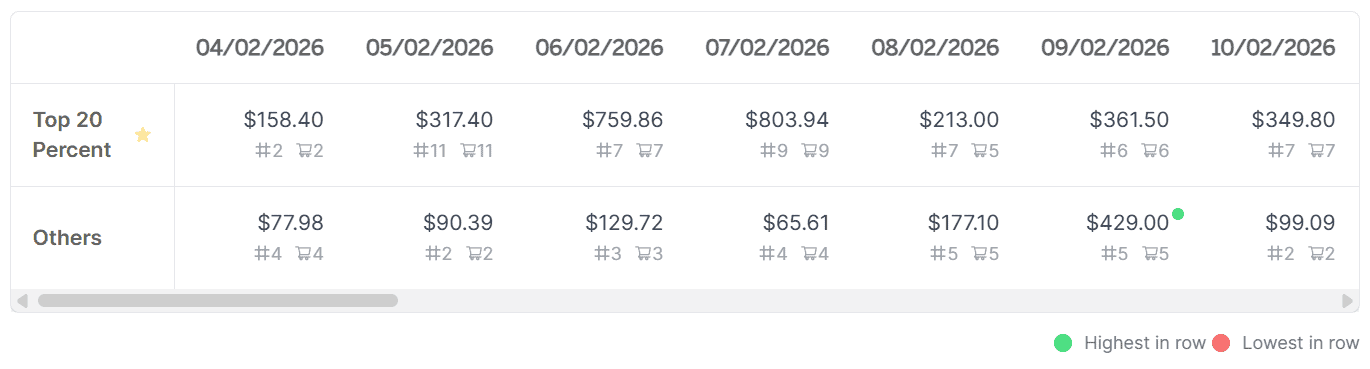
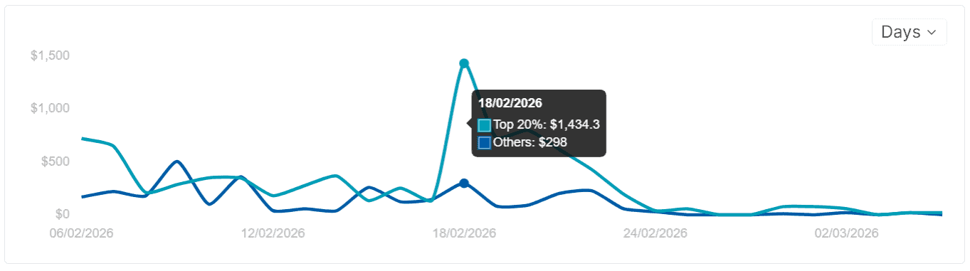
Is your revenue becoming more concentrated in a few products? Or is it spreading out more evenly? Both have strategic implications, and the trend line shows you which direction you’re headed.
The dashboard also separates total revenue (gross, including refunds, shipping, and taxes), recurring subscription revenue vs one-time sales, and revenue from the top 20% vs everything else.
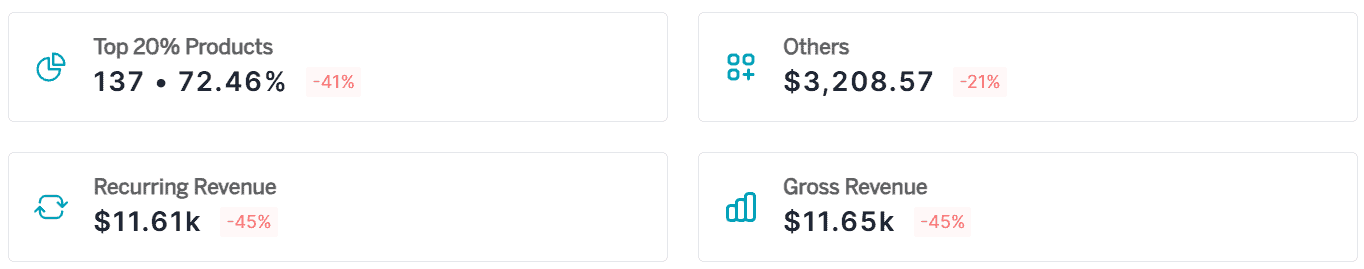
If you run a mixed business, you stop guessing which side is growing and which is flattening.
Why is a product performing the way it is?
Knowing which products carry your revenue is useful. But the deeper layer of product analysis is understanding why. Why does Product A outsell Product B three to one? Why did your best seller last quarter start declining this month?
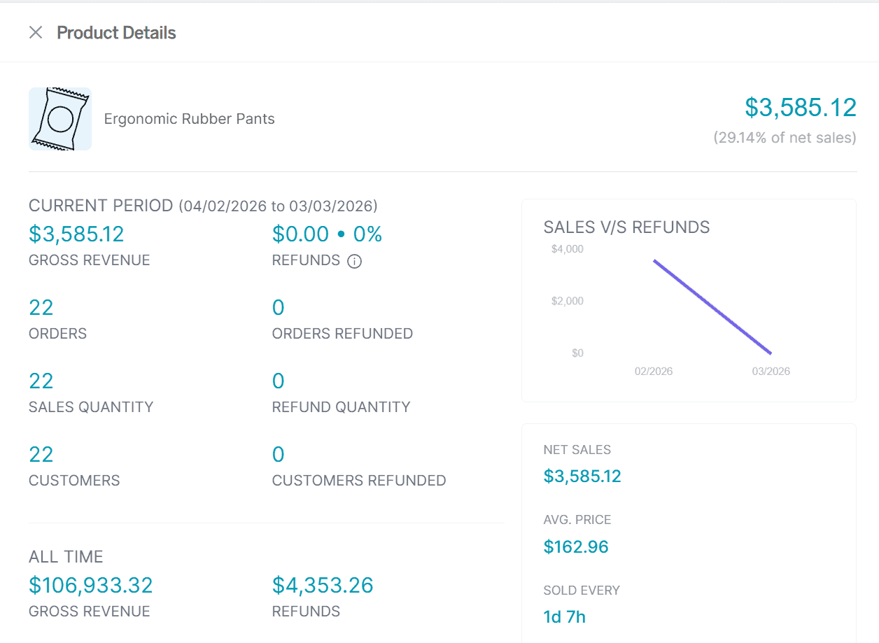
Click any product name and a detailed intelligence card opens. Not a summary line. A full briefing:
Customers who purchased: Everyone who’s bought this product, listed and exportable. Launch a V2? Email everyone who bought V1. Running a feedback campaign? Target only the people who actually used the product.
Revenue generated: The total contribution of this one product to your business. When you see that one product accounts for $47,000 and another for $300, the decision about where to focus your next campaign becomes obvious.
Refund rate and average time to refund: If a product has a 20% refund rate when your store average is 5%, something’s wrong. Sizing issues, misleading descriptions, quality problems. The average time to refund tells you how quickly buyers give up on it. These numbers live nowhere else in your stack.
Net predicted sales: What Putler forecasts this product will generate by the end of the current month, based on your historical data. Useful for inventory planning and for catching underperformance early: if the prediction is way above actual sales mid-month, something changed.
Average time to sell: How frequently this product moves. “Every 3 days and 11 hours” means a steady seller. “Every 45 days” means a slow mover you might be overstocking. This single metric can reshape your reorder schedule.
Sales history: A timeline of performance over time. Spot seasonal patterns (December spike?), identify when a decline started, or check whether a recent marketing push actually moved the needle.
Frequently bought together: Which products customers tend to buy alongside this one, with purchase frequency. If 40% of people who buy Product A also buy Product C, that’s a bundle opportunity most store owners miss because the data is scattered across platforms. You can export this list directly from the card and build upsell funnels around it.
Product variations: An all-time breakdown of which variations (size, color, material) actually sell. If size M outsells size XL ten to one, that changes your inventory ordering. If the blue version has twice the refund rate of the red, something’s wrong with the blue. Most eCommerce platforms only show totals for the parent product. Putler breaks it down by each variation, so you can make decisions at that level: what to reorder, what to shelve, what new variations to introduce.
People who bought this: Other products purchased by customers who bought this product (across different orders, not just the same cart). This shows broader purchase patterns and customer journey paths that “frequently bought together” doesn’t capture.
How do I find the products that need attention right now?
You can’t click through 500 products one by one. Good product analysis requires the right filters — not more scrolling. That’s where the predefined filters come in. Five ways to slice your catalog and surface exactly what needs attention:
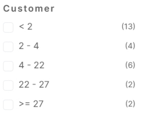
Customer count: How many unique buyers each product has. Find the products that sell to many customers vs the ones bought repeatedly by a few. Different strategies apply to each.
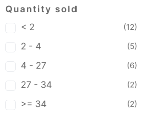
Quantity sold: Total units moved. Your highest-revenue product might not be your most-sold if you have high-ticket items moving in low volume. This filter shows both sides.
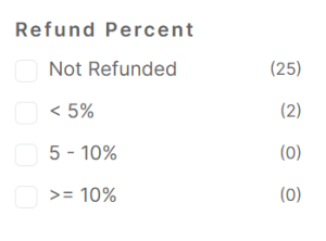
Refund percentage: Instantly surfaces the problem products. Sort by highest refund rate and you’ve found the items costing you money in returns, complaints, and reputation damage. Fix these first.
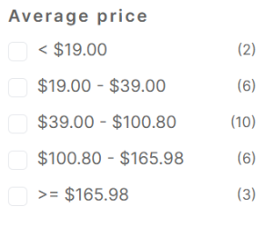
Average price: Groups products by price tier. Most of your sales probably cluster in one range. If there’s an untapped premium tier that a few products are quietly proving works, this is where you spot the opportunity.
Attributes: Filters by variation (size, color, material, category). How are all your “medium” shirts performing across designs? How does your “organic” line compare to standard? This takes variation reporting from a per-product view to a catalog-wide view.
Beyond the predefined filters, you can build custom segments with deeper rules: combine purchase behavior with price ranges and refund thresholds. Save any segment for future use.
What decisions does this actually change?
Without this data, product decisions run on gut feeling and aggregated totals. Revenue went up? Everything must be fine. But underneath that total, three products might drive 70% of the growth while five others are declining. You’d never know.
That’s exactly the gap that structured product analysis fills. With the Products Dashboard, the conversation shifts:
For marketing: You stop spreading ad budget evenly and start concentrating on the products that actually convert. The star-marked top 20% get the homepage placement, the email features, the paid promotion. The rest get evaluated: can they be improved, bundled, or dropped?
For product development: Variation reports tell you which versions to keep and which to discontinue. If every customer who buys the basic plan also buys the add-on, maybe that add-on should be included by default.
For pricing: The average price filter shows where revenue concentrates. If 80% of orders fall in the $30 to $60 range but your best margins are above $100, there’s a pricing or positioning opportunity you’re not seeing.
For inventory: Sales history, average time to sell, and variation breakdowns tell you what to reorder, what to reduce, and what to stop stocking entirely. Decisions that used to require a spreadsheet session now take a few clicks.
For customer outreach: The “customers who purchased” list on each product card is a ready-made audience. Launching something new? Export the buyers of the most similar existing product and give them early access. Spotted a quality issue? Filter those buyers and reach out proactively before complaints pile up.
The bottom line
Most store owners know their total revenue. Very few know which products actually earn it, which ones are quietly losing money through refunds, and which variations nobody buys.
That’s the real value of ongoing product analysis, and Putler’s Products Dashboard makes it actionable. The 80/20 split alone changes how you think about your catalog.
The individual product cards give you intelligence (predicted sales, refund rates, bundle opportunities, variation breakdowns) that lives nowhere else in your analytics stack. And the filters let you find the products that need attention without scrolling through your entire inventory.
- Sales Analytics: How to Track and Improve Your Store Performance
- How Online Businesses Can Increase Customer Lifetime Value
- Customer Retention Strategies: Proven Tactics to Keep Customers Coming Back
- Sales Forecasting: Methods, Tools and Best Practices
- eCommerce Analytics 101: A Complete Beginner’s Guide