

Most retail dashboard examples you’ll find online are screenshots of software. Useful for seeing what a tool looks like, less useful for working out what belongs on your own dashboard.
This article covers both. It starts with the dashboard types retailers actually build, what goes on each one, and who uses it. Then it covers the metrics that belong on a retail dashboard and the formulas behind them. It closes with where dashboards stop being enough, and what you use instead.
I’ve watched a lot of retailers build dashboards nobody opens after week three. The pattern is always the same, and it isn’t a tooling problem.
What is a retail dashboard?
A retail dashboard, sometimes called a retail business dashboard, is a visual interface that pulls sales, inventory, customer, and financial data into one screen so retailers can monitor performance and act without running reports.
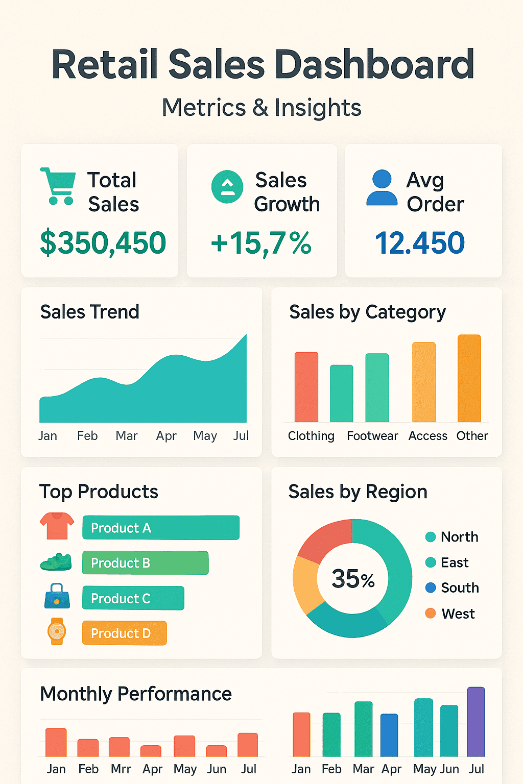
The useful ones share three properties:
- Every number has an owner: somebody is responsible for acting when it moves
- Every number has a comparison: a target, a prior period, or a benchmark, because a figure alone tells you nothing
- Every number has a decision attached: if nothing changes based on what it shows, it’s decoration
That third property is where most retail dashboards fail. They get built to display everything available rather than everything actionable, and then quietly stop being opened.
What belongs on a retail KPI dashboard
Retail dashboards draw from four metric families. Knowing which family a number belongs to tells you which dashboard it goes on.
- Sales and revenue: total sales, like-for-like sales growth, average transaction value, units per transaction, sales by channel and region
- Inventory and merchandising: inventory turnover, sell-through rate, GMROI, days inventory outstanding, stockout rate, shrink
- Customer: conversion rate, retention rate, customer lifetime value, repeat purchase rate, basket size
- Financial: gross margin percentage, net margin, operating expenses, cash flow
Three of these deserve their formulas spelled out, because they’re the ones retailers most often track incorrectly.
Sell-through rate:
Sell-Through Rate = (Units Sold ÷ Units Received) × 100A rate approaching 100% means you’re at risk of stockouts. Below 50% suggests weak demand or overordering.
GMROI:
GMROI = Gross Margin ÷ Average Inventory CostAbove 1 means you’re selling merchandise for more than it cost. Below 1 means you’re losing money on that inventory. It’s the sharpest single measure of whether a product earns its shelf space.
Basket size:
Basket Size = Total Units Sold ÷ Number of TransactionsWorth pairing with average transaction value. Basket size rising while ATV falls means customers are buying more cheap items, not spending more.
Retail dashboard examples: eight types and what goes on each
These are the retail business dashboard types retailers actually build. Each one answers a different question for a different person, which is why combining them into a single screen rarely works.
Retail sales dashboard
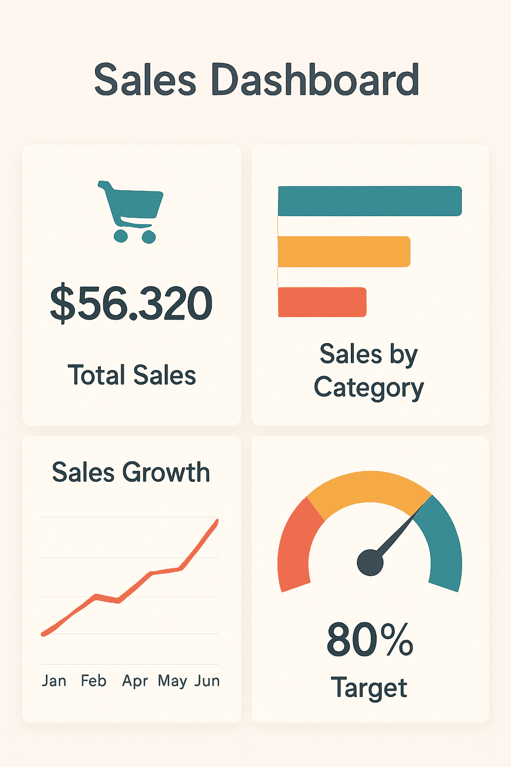
Answers: is the business hitting revenue targets, and where is the gap coming from?
Who uses it: commercial leads, store managers, ecommerce managers. Checked daily or weekly.
What goes on it: total sales against target, like-for-like sales growth, average transaction value, units per transaction, sales by channel, sales by region or store, sales by product category, growth versus prior period.
The mistake to avoid: showing total sales without segmentation. A regional drop and a category-wide drop look identical on an aggregate line, and they need completely different responses.
Inventory dashboard
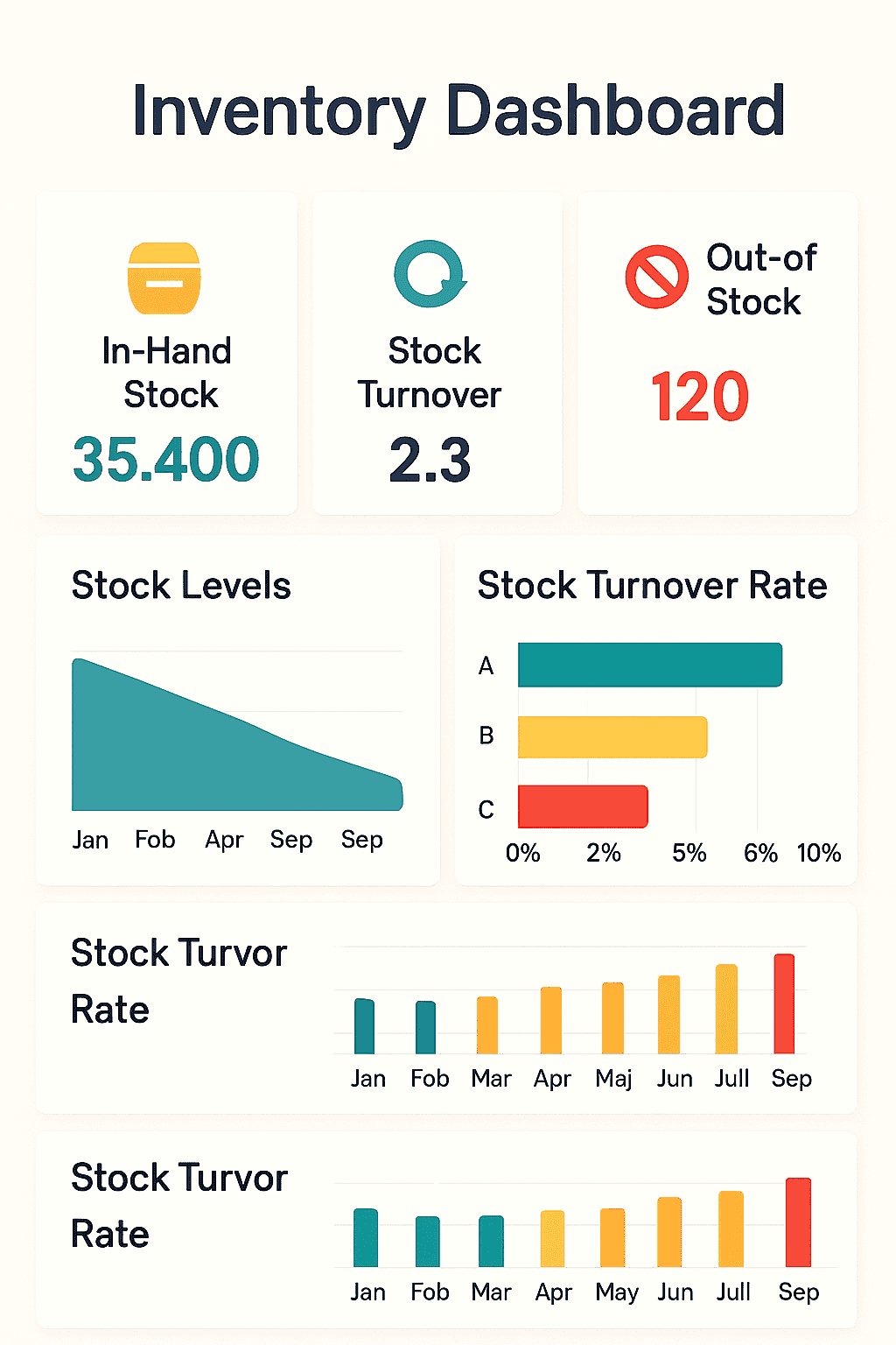
Answers: is stock moving fast enough, and is it earning its cost?
Who uses it: merchandising and operations. Checked weekly, reviewed monthly.
What goes on it: inventory turnover, sell-through rate by SKU, GMROI, days inventory outstanding, stockout rate, shrink, stock on hand against reorder points.
The pairing that matters: turnover and GMROI together. High turnover on low-margin stock looks like efficiency and isn’t. GMROI above 1 means the inventory earns more than it costs, however fast it moves.
Retail store performance dashboard
Answers: which locations are executing well, and which need intervention?
Who uses it: area and regional managers. Checked weekly.
What goes on it: net sales and gross profit by store, sales per square foot, sales per employee, conversion rate by location, basket metrics, footfall where available, discount rate by store.
Why it exists separately from the sales dashboard: store comparison needs normalisation. A high-revenue flagship and a small-format store aren’t comparable on total sales, but they are on sales per square foot and conversion.
eCommerce dashboard
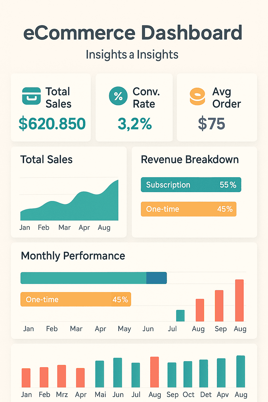
Answers: is the online store converting, and where are visitors dropping out?
Who uses it: ecommerce and digital marketing teams. Checked daily.
What goes on it: conversion rate, sessions and traffic sources, average order value, cart abandonment rate, revenue per visitor, top-performing pages, checkout funnel completion.
The distinction from a sales dashboard: sales dashboards tell you what was bought. eCommerce dashboards tell you about the people who didn’t buy, which is where most of the recoverable revenue sits.
Customer segmentation dashboard
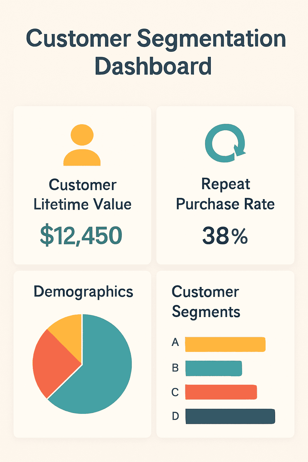
Answers: who are the customers worth keeping, and who’s slipping away?
Who uses it: marketing and CRM. Reviewed monthly.
What goes on it: RFM segments, customer lifetime value, repeat purchase rate, new versus returning split, retention and churn by cohort, revenue contribution by segment. This is where you segment your customer base into groups that behave differently.
The number that changes behaviour: revenue concentration. Most retailers find a small share of customers drives a disproportionate share of revenue, and discover those customers receive exactly the same emails as everyone else.
Financial dashboard
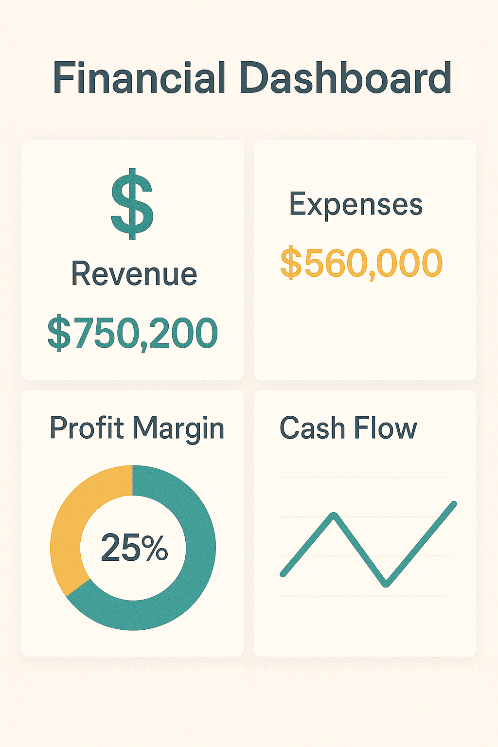
Answers: is the business profitable, not just busy?
Who uses it: finance and ownership. Reviewed monthly.
What goes on it: gross margin percentage, net margin, operating expenses, cash flow, margin by category and channel, discount and markdown impact.
The pairing that matters: revenue against gross margin. Revenue growth with margin compression is a common and expensive pattern, and it’s invisible on any dashboard showing revenue alone.
Marketing dashboard
Answers: which channels bring customers worth having?
Who uses it: marketing. Checked weekly.
What goes on it: spend and ROAS by channel, customer acquisition cost, CAC by channel, new customers acquired, campaign conversion rates, email engagement.
The number most retail marketing dashboards miss: lifetime value by acquisition channel. Channel A can produce cheaper customers than Channel B and still be the worse investment if those customers never return.
Executive dashboard
Answers: is the business healthy overall?
Who uses it: leadership. Reviewed monthly or quarterly.
What goes on it: a small set pulled from every other dashboard, covering total and like-for-like sales, gross margin, inventory turnover, customer retention, cash position. Usually eight to ten numbers.
The rule: if it doesn’t change a strategic decision, it doesn’t belong here. This is the dashboard most damaged by adding things.
Where a retail dashboard stops being enough
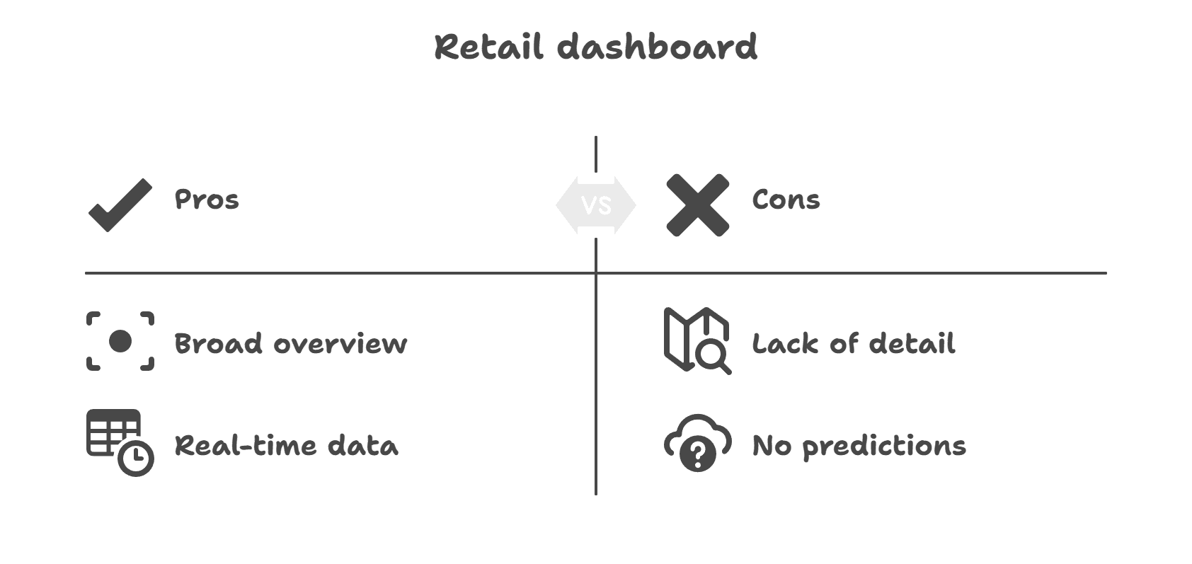
Dashboards are good at one thing: showing you what happened. That’s valuable, and it’s also where they stop.
- They show change without cause: a dashboard tells you conversion fell 8% last week. It doesn’t tell you the drop came from a paid social campaign sending unqualified traffic.
- They report history, not forecast: knowing inventory turnover was 4x last quarter is useful. Knowing what demand looks like next quarter is what prevents the stockout.
- They fragment when sources don’t connect: three dashboards showing three partial pictures is worse than one incomplete picture, because now the numbers disagree and meetings become reconciliation sessions.
- They don’t scale with complexity: the dashboard that worked at one channel and 200 SKUs struggles at four channels and 2,000. As retail sales volumes grow, so does the data behind them, and more data on the same screen produces less clarity.
None of that makes dashboards a bad idea. It makes them a starting layer. The step past it is data analytics for retail, where consolidation, segmentation, and forecasting sit on top of the reporting view. If you’re building that foundation, eCommerce analytics covers the groundwork.
Retail analytics dashboard examples in Putler
Putler consolidates data from ecommerce platforms, payment gateways, and analytics tools, then splits it across purpose-built dashboards. What follows is a set of worked examples rather than descriptions of dashboard types.
It connects 17+ integrations covering Shopify, WooCommerce, Amazon, Etsy, eBay, PayPal, Stripe, and Braintree, with automatic deduplication so a PayPal payment on a Shopify store doesn’t count twice.
Home dashboard
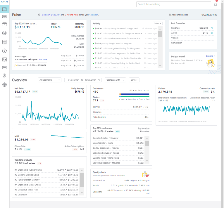
The Home dashboard is the central view: critical sales KPIs, sales and business graphs, transaction activity, customer leaderboard, and top-performing products in one screen.
It maps to the executive dashboard pattern above, answering whether the business is healthy without drilling in.
Sales dashboard
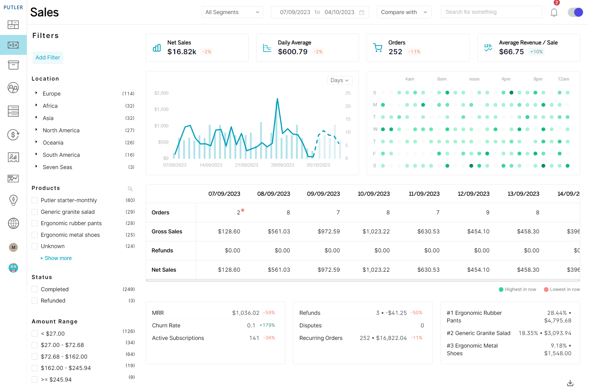
The sales dashboard covers sales metrics and activity, sales chart and breakdown, sales heatmap, SaaS metrics, order list, and instant refund processing without visiting the payment platform.
The heatmap is the piece most retail sales dashboards lack. It shows which days and hours customers actually buy.
Products dashboard
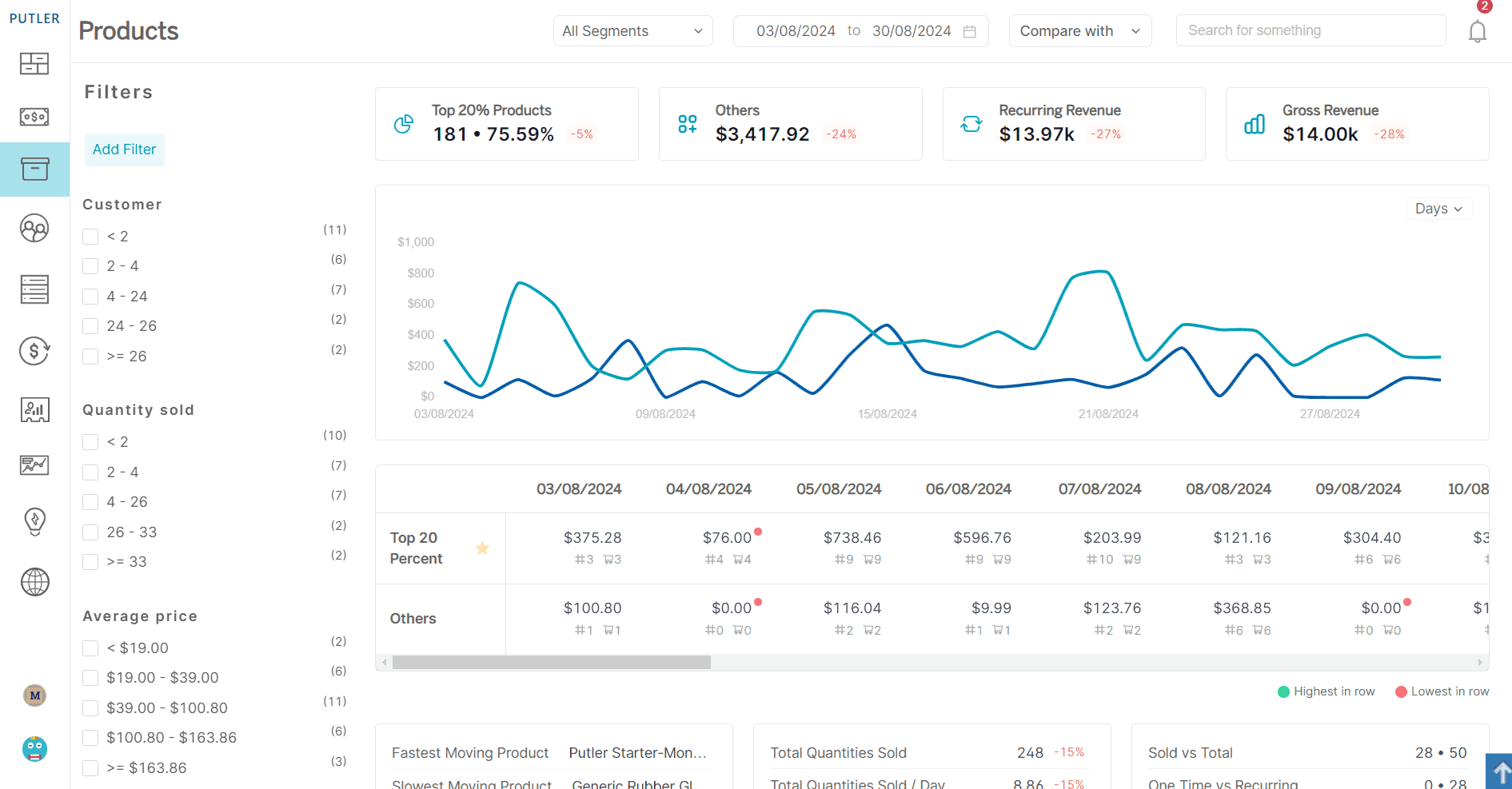
The Product dashboard shows product metrics, breakdown chart, fastest and slowest-moving products, list view, and in-depth product cards.
It covers the merchandising question from the inventory section: which products earn their place.
Customers dashboard
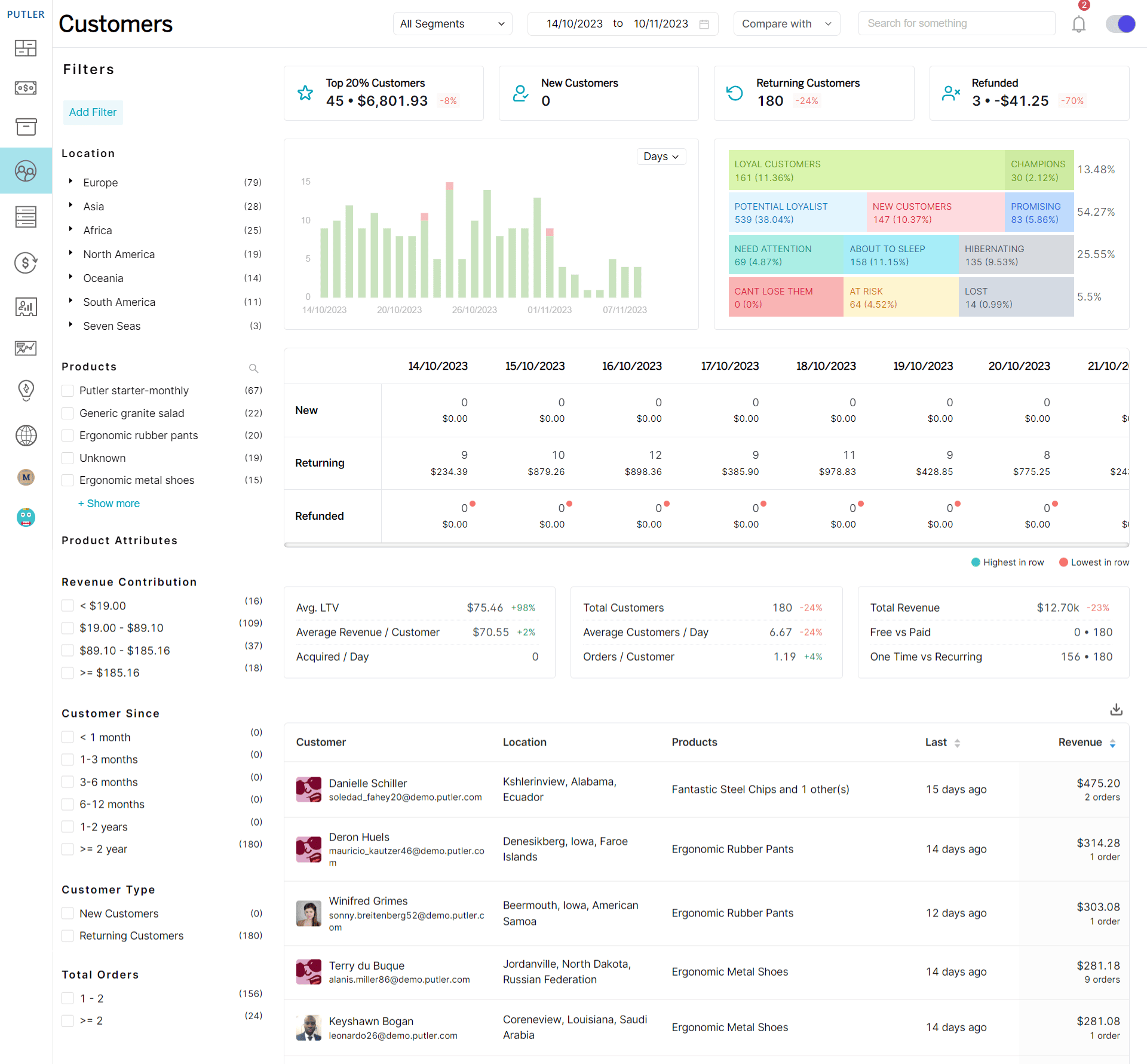
The Customer dashboard covers customer metrics, breakdown chart, RFM analysis, SaaS customer metrics, customer list, and in-depth cards, segmenting by buying behaviour, region, products purchased, and revenue contribution.
This is the segmentation dashboard pattern, built without manual setup.
Insights dashboard
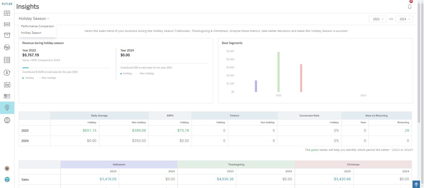
The Insights dashboard compares holiday season performance year over year and lets you compare any two periods you choose.
Audience and Web Analytics dashboards
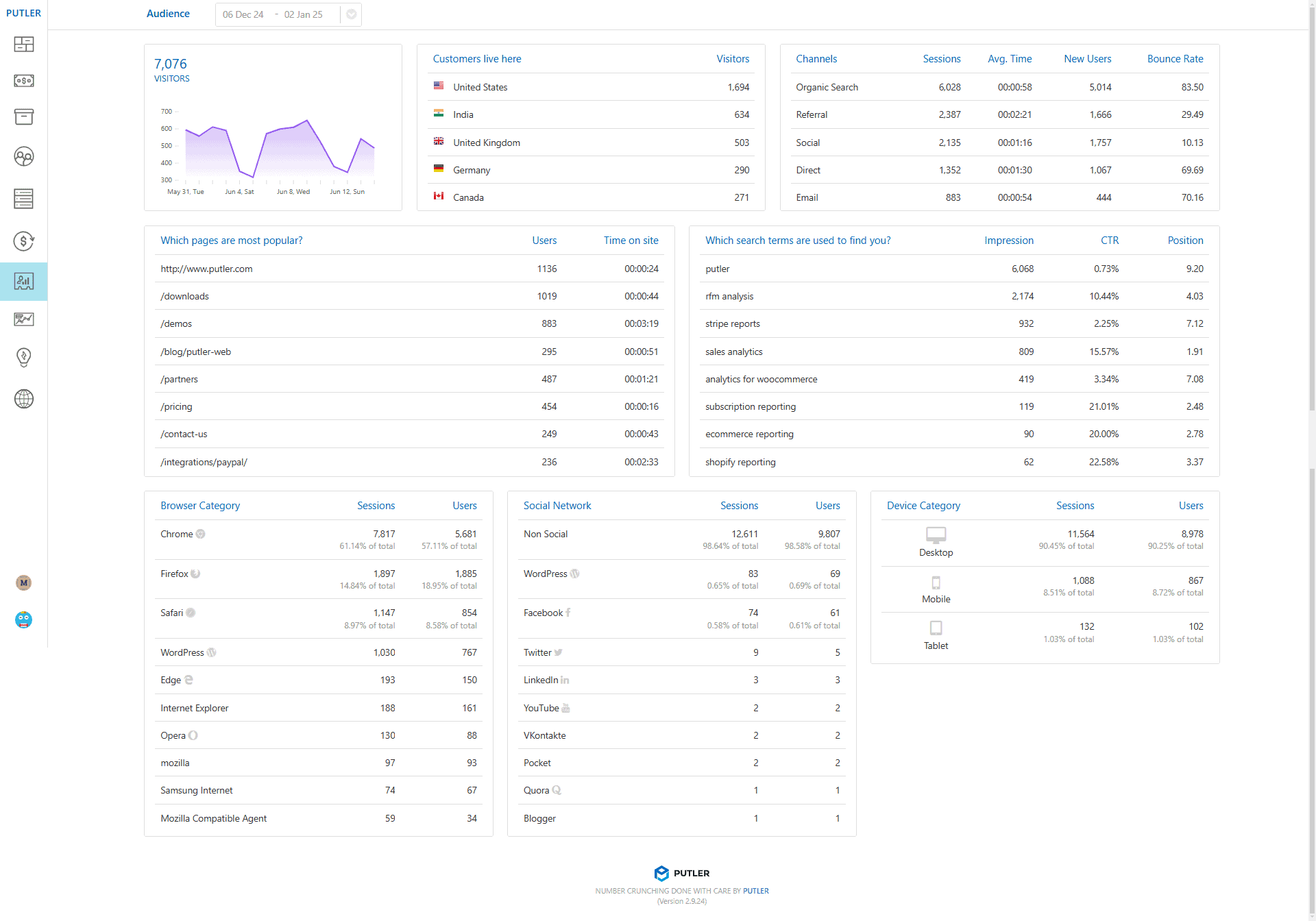
The Audience dashboard pulls from Google Analytics and Search Console to connect traffic data with revenue.
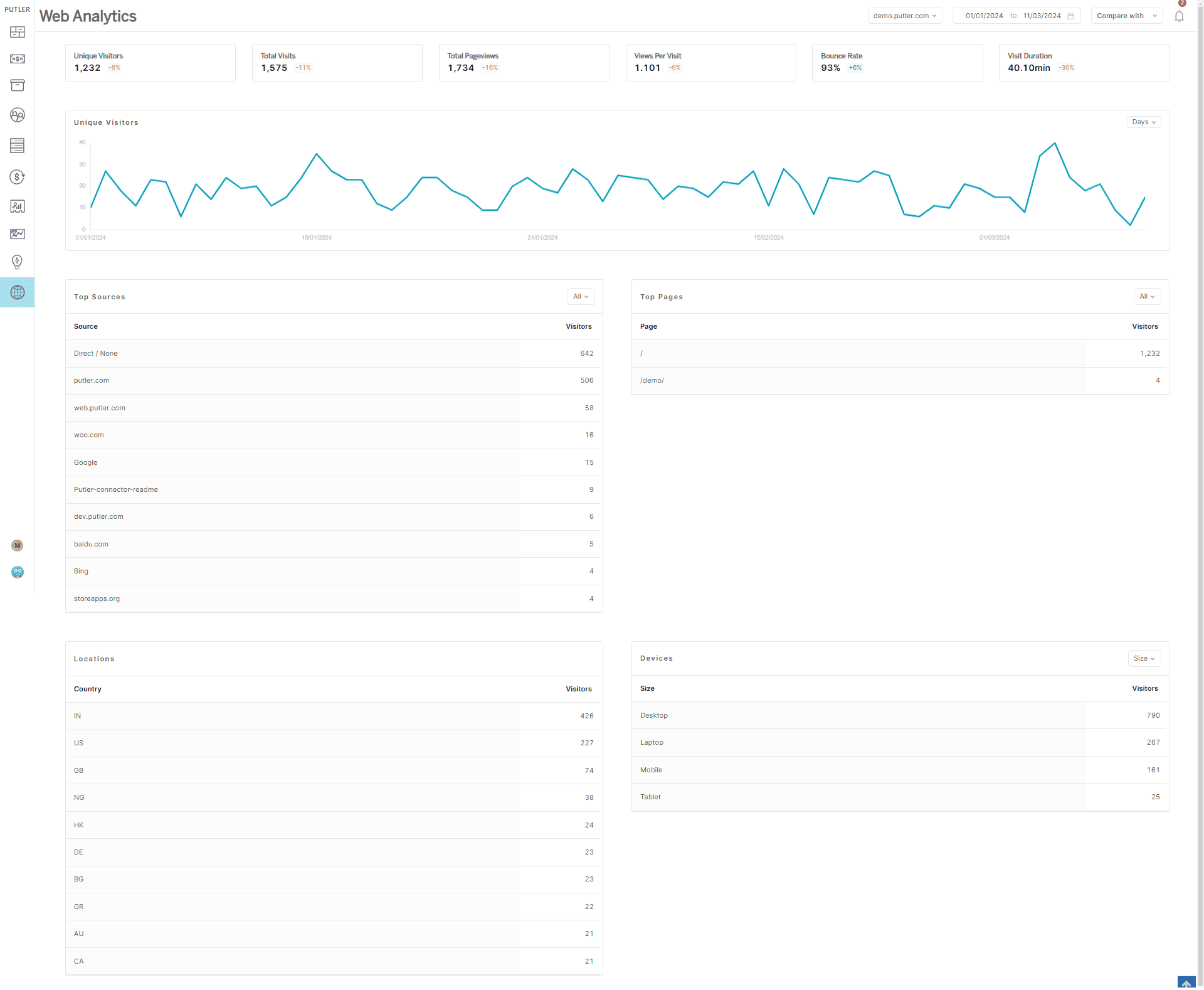
The Web Analytics dashboard runs independently of Google Analytics, giving a privacy-focused view of top pages, traffic sources, and demographics.
Together they cover the eCommerce dashboard pattern: the visitors who didn’t buy.
Time Machine dashboard
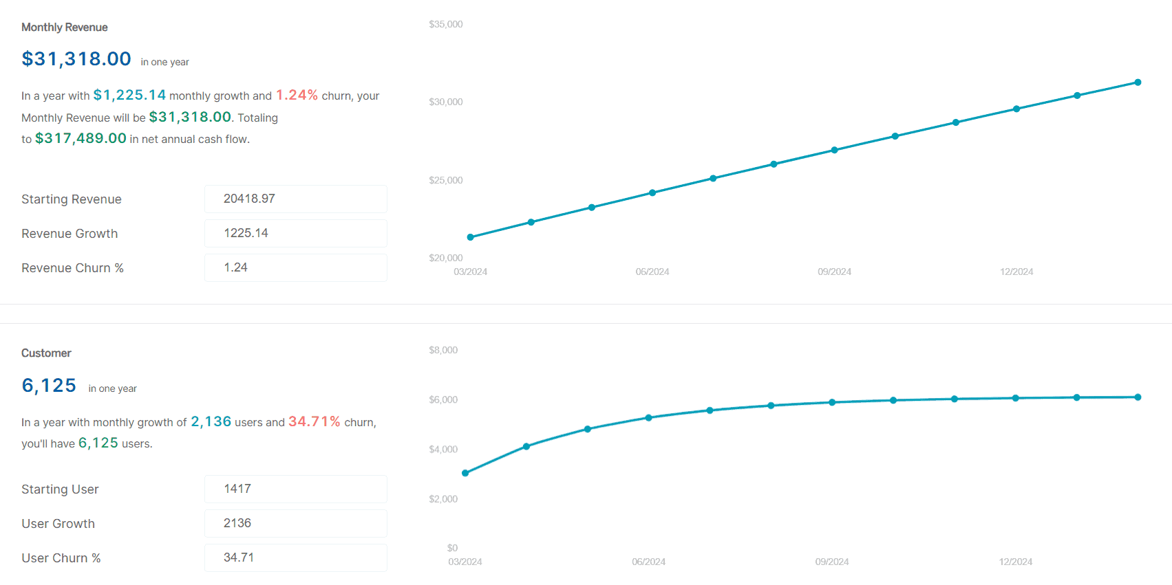
The Time Machine dashboard is the forecasting layer, and the direct answer to the “dashboards report history” limit above. It has three parts:
- Revenue forecast: projected monthly revenue for the year ahead, using current growth rate and revenue churn
- Customer forecast: projected customer count at the end of 12 months
- 10x forecast: the growth rate needed to reach 10x, which turns an abstract ambition into a number you can plan against
Transactions and Subscriptions dashboards
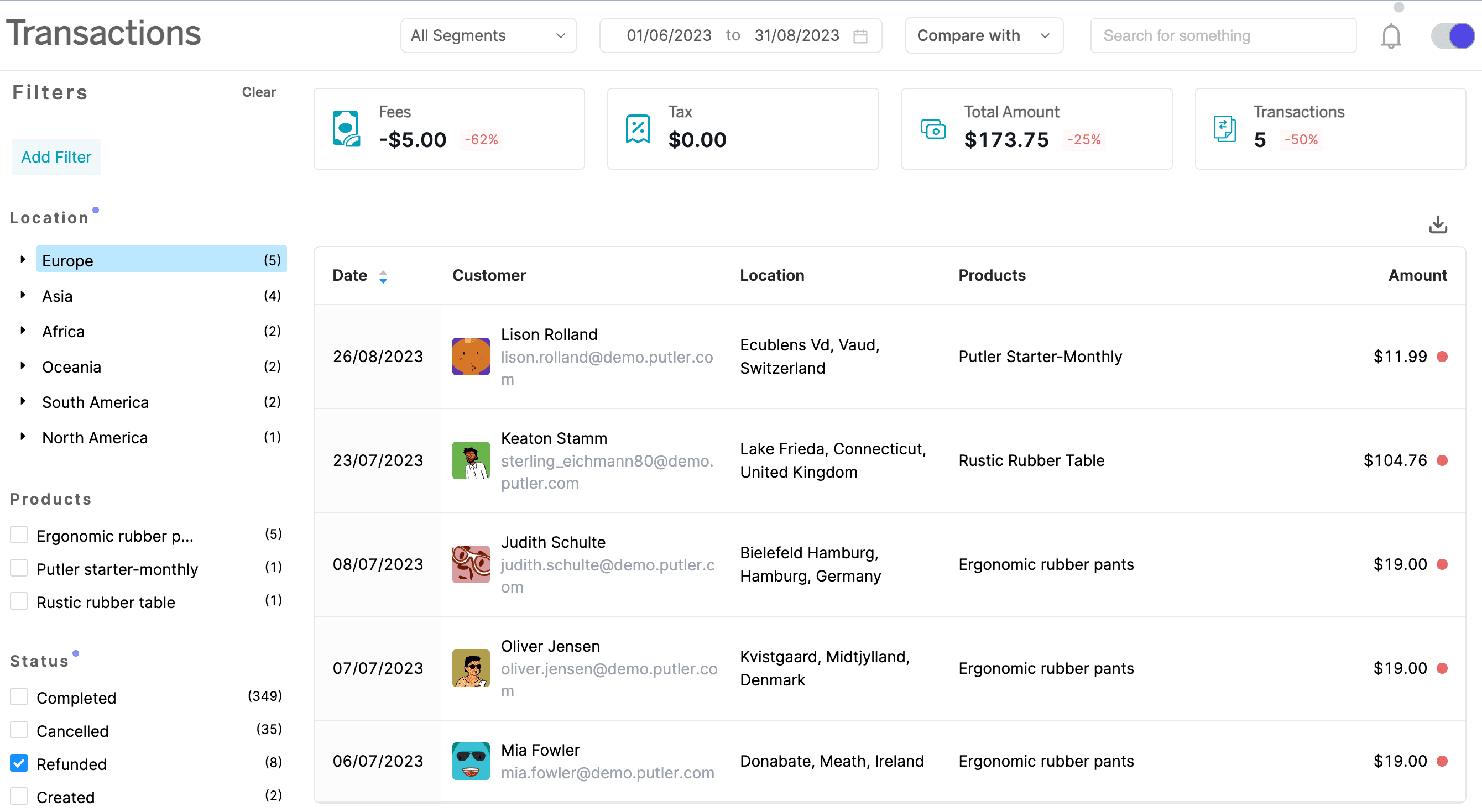
The Transactions dashboard covers sales, refunds, disputes, and other financial activity.
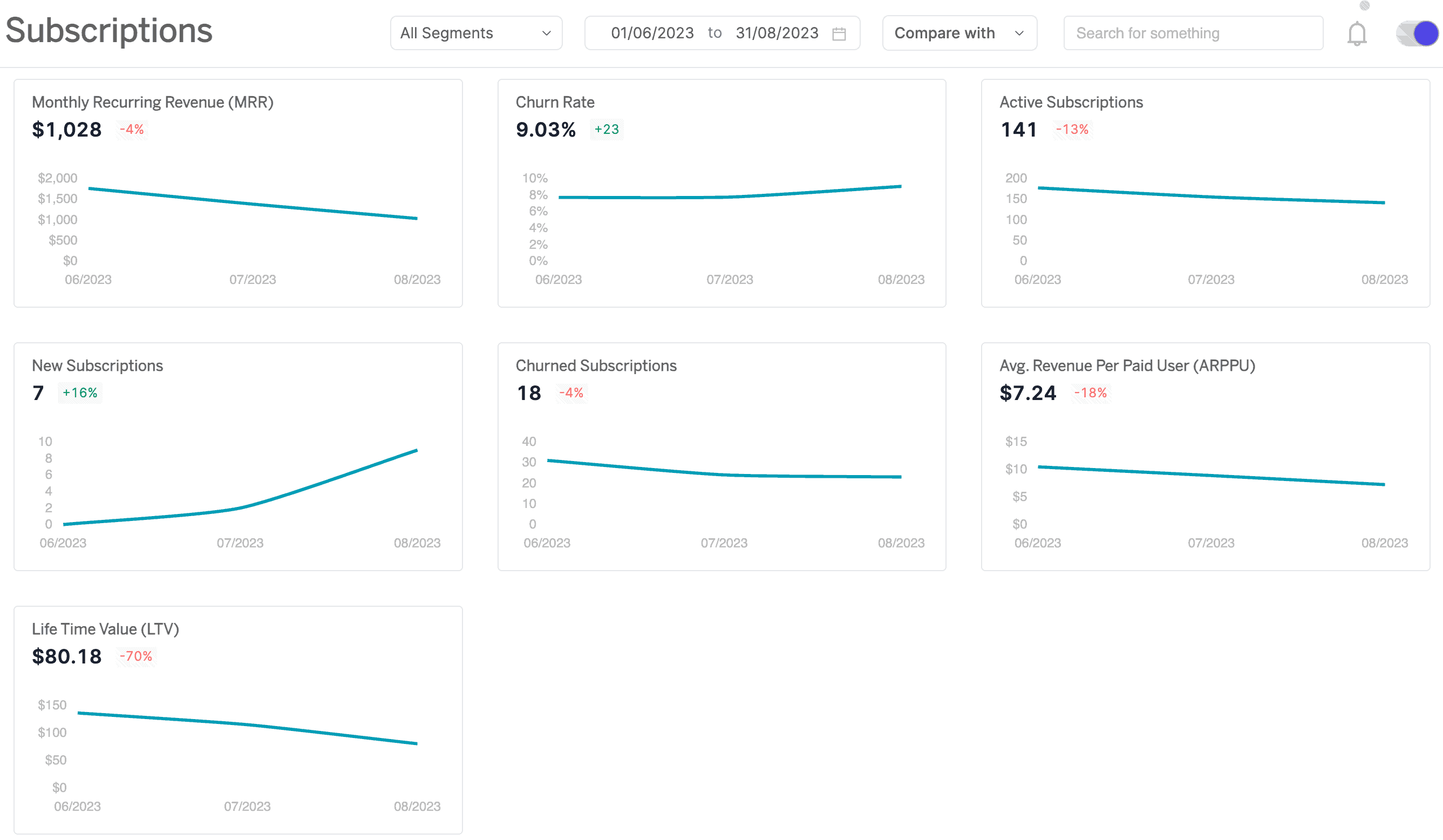
The Subscriptions dashboard covers monthly recurring revenue, churn rate, active subscriptions, new subscriptions, and churned subscriptions for subscription retail models.
FAQs
What is a retail dashboard?
A retail dashboard is a visual interface that pulls sales, inventory, customer, and financial data into one screen so retailers can monitor performance and act without running reports.
What are the most common retail dashboard examples?
Sales, inventory, store performance, eCommerce, customer segmentation, financial, marketing, and executive dashboards. Each answers a different question for a different audience, which is why most retailers run several rather than one.
What KPIs belong on a retail dashboard?
Four families. Sales: total and like-for-like growth, average transaction value, units per transaction. Inventory: turnover, sell-through rate, GMROI, stockout rate. Customer: conversion, retention, lifetime value, basket size. Financial: gross and net margin, cash flow.
What is GMROI and why does it matter?
Gross margin return on investment divides gross margin by average inventory cost. Above 1 means inventory earns more than it costs; below 1 means it loses money. It combines margin and turnover in one number, which makes it the sharpest measure of whether a product earns its shelf space.
What is the difference between a retail dashboard and retail analytics?
A dashboard shows what happened through visual reporting. Analytics explains why it happened and forecasts what’s next, using segmentation, cohort analysis, and predictive models. Dashboards are the display layer, analytics is the reasoning layer.
How many dashboards should a retailer have?
One per audience rather than one per data source. A store manager, an eCommerce lead, and a CFO need different numbers, and combining them produces a screen that serves none of them well.
How often should you check a retail dashboard?
Daily for sales, transactions, and traffic. Weekly for conversion, inventory movement, and channel performance. Monthly for margin, retention, lifetime value, and forecasting.
Why do retail dashboards stop getting used?
Usually because numbers were added without a decision attached. If nothing changes based on what a metric shows, people stop looking at it, and eventually stop opening the dashboard at all.
Building a retail dashboard that gets used
The dashboards that survive aren’t the comprehensive ones. They’re the ones where every number belongs to someone who acts on it.
Start with the decision you make most often. Add the numbers that inform it. Give it an owner and a comparison point. Then build the next one for the next audience rather than adding rows to the first.
2