
Your store traffic increased 28% last month. At first glance, that sounds like growth.
But revenue stayed flat. Conversion rate dropped. Returning customers purchased less often than usual. Refunds quietly increased from 2.1% to 4.8%.
So what actually happened?
- Did the new traffic come from low-intent visitors?
- Did a campaign attract the wrong audience?
- Did mobile checkout performance worsen?
- Did customers buy once and never return?
- Or did one high-performing product start declining without anyone noticing?
This is the real challenge with performance analysis. Most businesses track numbers. Very few investigate changes.
And that difference matters.
Because performance problems rarely appear all at once. They emerge gradually:
- conversion rates slowly decline,
- repeat purchases weaken,
- refund rates creep upward,
- profitable products lose momentum,
- customer acquisition becomes more expensive.
By the time revenue visibly drops, the underlying problem may have existed for months.
Tracking performance changes over time is not about staring at dashboards every day. It is about learning how to investigate what changed, why it changed, and whether the change actually matters.
This article walks through that process of how to track performance changes over time.
- what businesses should compare,
- where they should look,
- how analysts interpret trends,
- and what actions usually follow.
Why tracking performance changes matters
Looking at isolated numbers is dangerous because numbers without context can be misleading.
Imagine these two scenarios.
| Metric | April | May |
|---|---|---|
| Revenue | $82,000 | $84,000 |
| Orders | 1,420 | 1,180 |
| Average Order Value | $57 | $71 |
At first glance, revenue increased. But order volume dropped sharply.
That usually means one of three things happened:
- Prices increased
- A high-ticket product sold unusually well
- Existing customers spent more while new customer acquisition weakened
Each explanation leads to a completely different business decision.
Now compare another example:
| Metric | January | February | March |
|---|---|---|---|
| Conversion Rate | 3.4% | 3.1% | 2.7% |
| Mobile Conversion Rate | 3.0% | 2.4% | 1.9% |
| Traffic | Stable | Stable | Stable |
This is the kind of trend businesses often miss.
Traffic looks healthy, revenue may still look “acceptable,” but mobile users are increasingly failing to complete purchases.
That usually signals:
- checkout friction,
- slow mobile pages,
- broken payment flows,
- or poor campaign targeting.
If nobody compares performance over time, the issue keeps growing quietly.
This is why trend analysis matters more than snapshots.
A single number tells you what happened today.
Performance tracking tells you whether something is improving, weakening, stabilizing, or becoming risky.
Businesses doing deeper internal sales performance analysis usually compare revenue alongside conversion trends, refunds, and returning customer behavior instead of evaluating revenue in isolation.
What businesses actually do when investigating performance changes
Before jumping into tools, it helps to understand how analysts usually investigate problems.
A common mistake is checking random dashboards without a process. Good analysis follows a sequence.
For example:
Problem: Revenue declined 12% this month.
A good analyst usually checks data in this order:
Step 1: Compare traffic trends
First question: did fewer people visit the store?
If traffic dropped significantly, the problem may be acquisition-related.
Check:
- GA4 traffic trends
- traffic source changes
- campaign traffic
- organic search decline
- paid ads performance
If traffic stayed stable, move deeper.
Step 2: Compare conversion rates
If visitors remained stable but revenue dropped, the next question becomes: are fewer visitors converting?
Now compare:
- overall conversion rate,
- mobile vs desktop conversion,
- landing page performance,
- checkout abandonment trends.
Example:
| Device | Last Month | This Month |
|---|---|---|
| Desktop Conversion | 4.1% | 4.0% |
| Mobile Conversion | 3.2% | 1.8% |
This immediately narrows the investigation.
Now the analyst focuses specifically on mobile experience.
At this point, analysts usually stop looking at acquisition and start investigating checkout behavior.
Step 3: Check product-level changes
Sometimes only a few products drive most revenue loss.
Compare:
- top-selling products,
- product page conversion,
- stock availability,
- refund increases,
- pricing changes.
Example:
| Product | Last Month Revenue | This Month Revenue |
|---|---|---|
| Running Shoes | $18,000 | $7,200 |
| Protein Powder | $9,400 | $9,700 |
Now the issue is clearly concentrated in one product category.
Possible next questions:
- Did ads stop running?
- Did inventory go out of stock?
- Did competitors reduce prices?
- Did product reviews worsen?
Step 4: Compare returning customer trends
If product sales weakened broadly, analysts often check customer behavior next.
Questions:
- Are repeat customers returning less often?
- Has purchase frequency declined?
- Did subscription churn increase?
Example:
| Metric | Previous Quarter | Current Quarter |
|---|---|---|
| Returning Customer Rate | 38% | 24% |
| Average Days Between Orders | 41 | 68 |
This suggests retention problems, not just acquisition problems.
Now the business may investigate:
- email engagement,
- loyalty offers,
- customer support issues,
- subscription fatigue,
- competitor switching.
Subscription businesses usually track churn, renewals, and recurring revenue trends separately because retention problems often appear long before revenue drops.
This is what real performance tracking looks like.
One insight leads to the next investigation step.
Tools businesses use to track performance changes over time
Different tools help answer different questions.
No single dashboard explains everything.
That is why analysts usually combine traffic analytics, sales analytics, customer behavior analysis, and spreadsheet comparisons.
Let’s look at how businesses actually use these tools in practice.
Google Analytics 4 (GA4)
What GA4 helps analyze?
GA4 is primarily used to investigate:
- traffic changes,
- acquisition performance,
- user behavior,
- landing page trends,
- device performance,
- conversion paths.
It answers questions like: did traffic quality decline? Which channel changed? Are users abandoning pages faster? Is mobile performance worsening? Did campaign behavior change?
How businesses track changes in GA4
Step 1: Open Reports → Acquisition → Traffic Acquisition
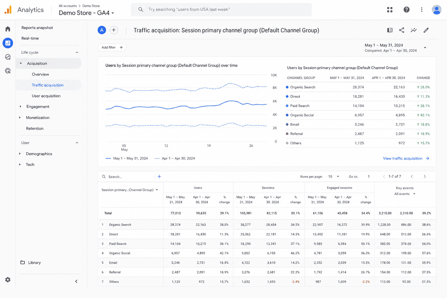
Compare:
- current month vs previous month,
- current quarter vs previous quarter.
Focus on:
- sessions,
- engaged sessions,
- engagement rate,
- conversions by channel.
Example:
| Channel | Sessions Change | Conversion Change |
|---|---|---|
| Organic Search | +4% | +3% |
| Paid Social | +42% | -18% |
This usually signals low-intent paid traffic. The business may reduce ad spend or improve targeting.
Step 2: Compare device performance
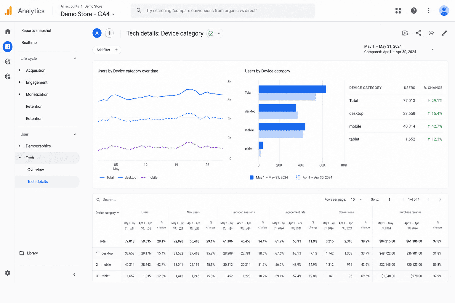
Go to: Reports → Tech → Tech Details
Segment by:
- mobile,
- desktop,
- tablet.
If mobile traffic increased but mobile conversion dropped, the business usually investigates checkout UX, page speed, broken buttons, and payment gateway issues.
| Device | Traffic Change | Conversion Change |
|---|---|---|
| Mobile | +31% | -22% |
| Desktop | +4% | +1% |
This is usually where analysts realize the problem is experience-related rather than acquisition-related.
Step 3: Analyze landing page changes
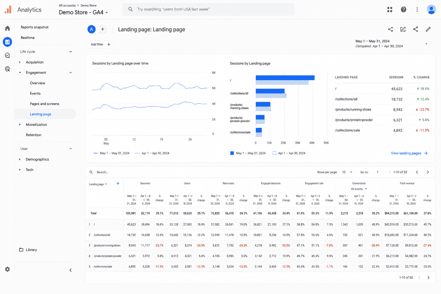
Open: Reports → Engagement → Landing Pages
Compare:
- bounce rate changes,
- engagement rate,
- conversion performance.
Example: a blog post suddenly drives massive traffic but produces almost no purchases.
That often means:
- informational traffic,
- weak CTA alignment,
- wrong audience targeting.
Traffic growth alone is not success. Traffic quality matters more.
Shopify Analytics
What Shopify Analytics helps analyze
Shopify Analytics is commonly used for:
- sales trends,
- order behavior,
- conversion funnel analysis,
- returning customer tracking,
- product sales changes.
How businesses use Shopify Analytics
Step 1: Compare sales over time
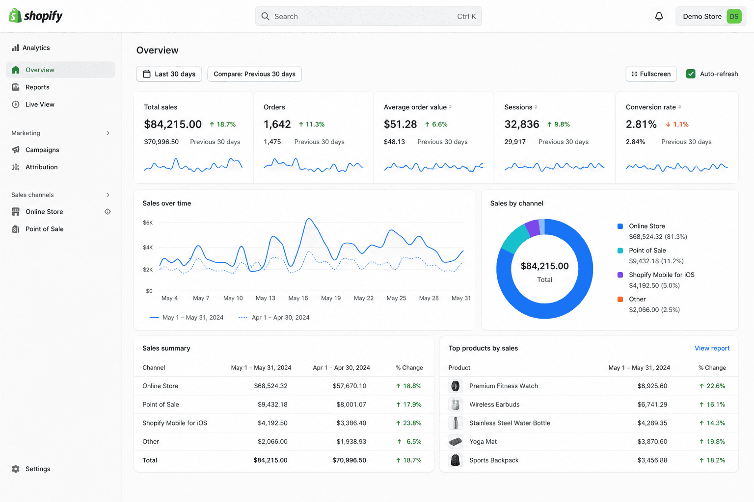
Open: Analytics → Dashboard → Sales Over Time
Instead of only checking revenue, compare:
- total sales,
- returning customer sales,
- average order value,
- discounts,
- refunds.
Example:
| Metric | Last 30 Days | Previous 30 Days |
|---|---|---|
| Revenue | $96,000 | $101,000 |
| Orders | 2,100 | 2,580 |
| AOV | $46 | $39 |
Interpretation: revenue decline is relatively small despite a major order drop. That often means fewer buyers but higher-value purchases. The business may now focus on acquisition weakness rather than pricing problems.
Step 2: Check returning customer reports
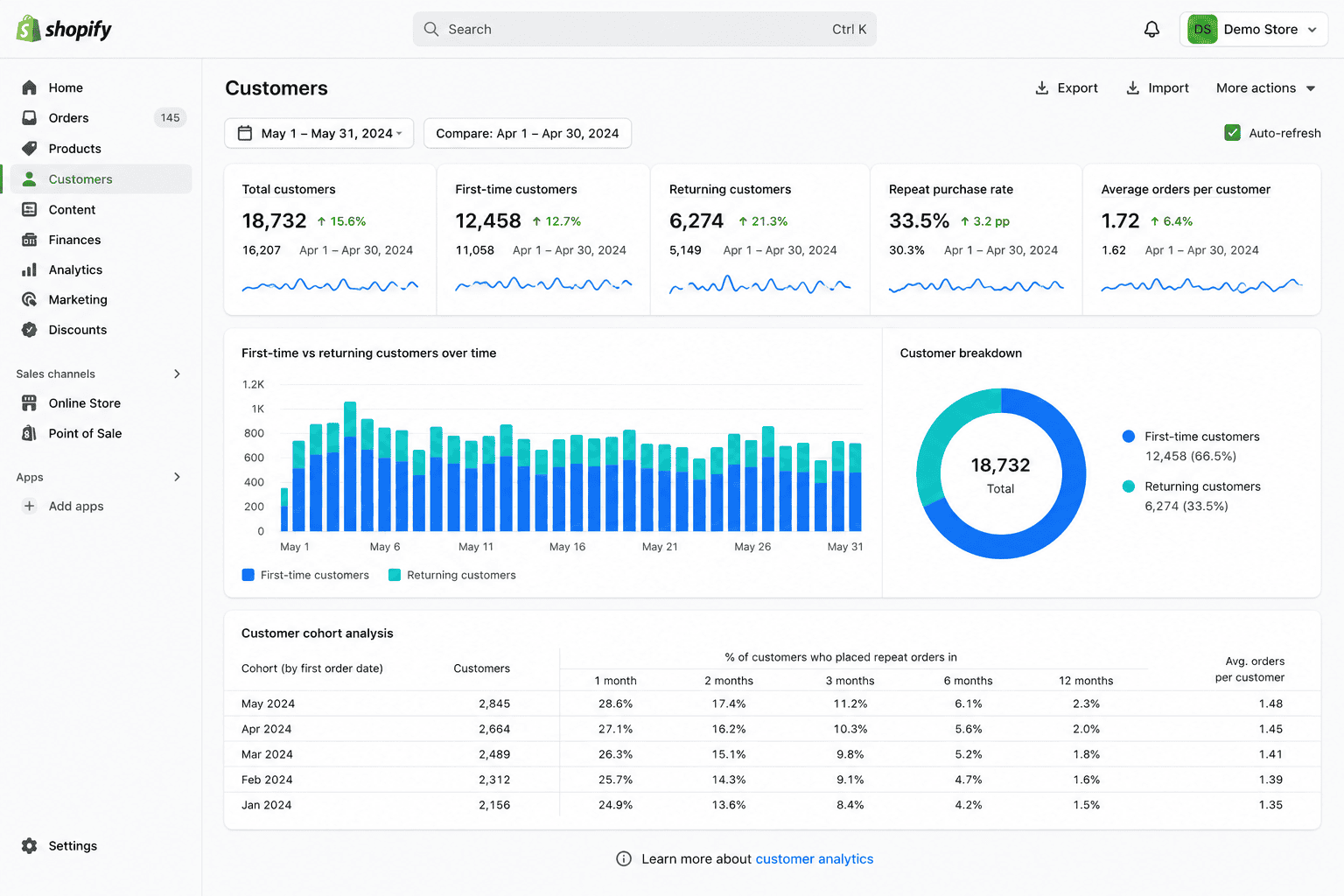
Open: Analytics → Customers
Compare:
- first-time customers,
- returning customer rate,
- repeat purchase trends.
If first-time purchases rise but repeat purchases decline, growth may not be sustainable. That usually pushes businesses to improve:
- email retention,
- onboarding,
- loyalty campaigns,
- subscription offers.
WooCommerce Analytics
What WooCommerce Analytics helps analyze
WooCommerce Analytics helps track:
- product sales,
- coupon performance,
- category performance,
- refunds,
- customer order behavior.
It is especially useful for stores with large product catalogs. Businesses managing multiple WooCommerce stores often struggle to compare performance consistently across separate storefront dashboards.
How businesses analyze changes in WooCommerce
Step 1: Open Analytics → Products
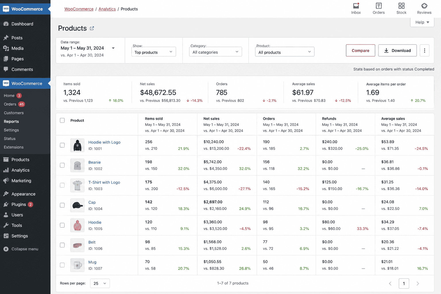
Compare:
- product revenue,
- units sold,
- net sales,
- refunds.
Example:
| Product | Units Sold Change | Revenue Change |
|---|---|---|
| Coffee Beans | -8% | -7% |
| Coffee Machine | +2% | -34% |
This often signals discounting problems. Revenue dropped much faster than unit sales.
Now the analyst checks:
- discount campaigns,
- pricing changes,
- coupon overuse.
Step 2: Compare refund trends
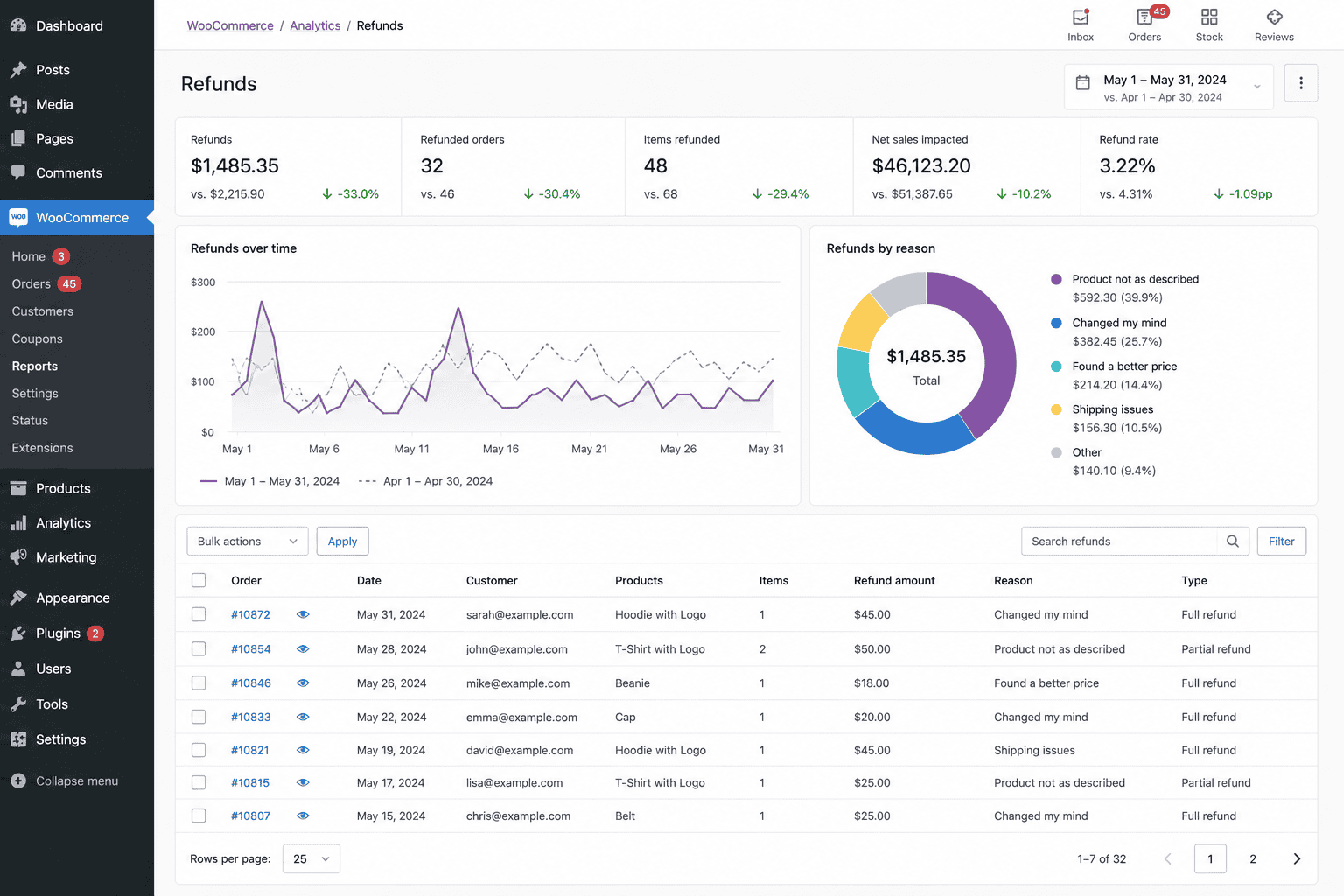
Open: Analytics → Revenue
Track refund growth over several months.
Example:
| Month | Refund Rate |
|---|---|
| January | 1.9% |
| February | 2.2% |
| March | 4.7% |
At this point, analysts usually stop treating refunds as isolated incidents.
Now they investigate:
- shipping delays,
- defective inventory,
- misleading product pages,
- support complaints.
Why spreadsheets eventually become a problem
Most businesses eventually export data into spreadsheets. Initially, this works.
But performance analysis becomes difficult once data spreads across:
- GA4,
- Shopify,
- WooCommerce,
- Stripe,
- PayPal,
- subscription tools,
- ad platforms.
Now the analyst spends more time merging reports than analyzing them.
This becomes especially painful when comparing:
- customer behavior,
- subscription retention,
- multi-store performance,
- product profitability,
- refunds across payment gateways.
Tracking revenue across multiple currencies and payment gateways becomes especially difficult when reports are spread across disconnected systems.
Metrics businesses compare over time and how they interpret them
This is where analysis becomes more interesting.
Metrics themselves are not useful.
Interpretation is.
Revenue trends
A revenue drop is not automatically alarming.
Analysts usually ask:
- Did traffic also decline?
- Did conversion decline?
- Did refunds increase?
- Did one large product weaken?
- Was last month unusually strong?
Example:
| Month | Revenue |
|---|---|
| January | $82,000 |
| February | $84,000 |
| March | $78,000 |
A 7% decline may not matter if February had a major campaign. But if March continues into April, the business starts investigating aggressively.
Patterns matter more than isolated dips.
Conversion rate trends
Small conversion drops over long periods are dangerous because businesses often ignore them.
Example:
| Month | Conversion Rate |
|---|---|
| January | 3.8% |
| February | 3.5% |
| March | 3.1% |
| April | 2.7% |
Traffic may still look healthy. But profitability is quietly weakening.
This often leads analysts to inspect:
- mobile checkout,
- landing pages,
- pricing changes,
- shipping costs,
- competitor offers.
Returning customer trends
Returning customer decline usually appears before revenue decline.
Example:
| Quarter | Returning Customer Rate |
|---|---|
| Q1 | 42% |
| Q2 | 36% |
| Q3 | 29% |
That usually signals:
- weaker customer satisfaction,
- stronger competition,
- reduced retention campaigns,
- poor post-purchase experience.
Businesses often respond by improving:
- email sequences,
- loyalty rewards,
- subscription offers,
- personalized campaigns.
Traffic quality changes
More traffic is not always better.
| Source | Traffic Change | Revenue Change |
|---|---|---|
| Organic Search | +5% | +7% |
| Paid Social | +62% | -11% |
This often means ad targeting became broader but less qualified.
The business may:
- narrow targeting,
- improve landing pages,
- reduce low-performing campaigns.
Real analytical workflow: investigating a revenue decline
Let’s walk through a realistic investigation.
Problem: Revenue declined 18% over 45 days.
Step 1: Check traffic
Traffic declined only 2%. So acquisition is probably not the main issue.
Step 2: Compare conversion rate
Conversion fell from 3.4% to 2.5%. Now the investigation focuses on conversion problems.
Step 3: Segment by device
Desktop conversion stayed stable. Mobile conversion dropped sharply.
Now the analyst checks mobile checkout, page speed, payment errors, and mobile UX changes.
| Device | Last Month | Current Month |
|---|---|---|
| Desktop | 4.0% | 3.9% |
| Mobile | 3.1% | 1.7% |
Step 4: Compare product performance
One product category lost 42% revenue. Inventory analysis reveals multiple out-of-stock periods. Now the business has a likely explanation.
Step 5: Check returning customers
Returning customer rate also declined slightly. This suggests the issue may be broader than inventory alone. Now retention campaigns get reviewed too.
Final conclusion
The revenue decline was caused by:
- mobile conversion problems,
- inventory issues,
- weakening retention simultaneously.
This is how real analytical thinking works.
Not: “Revenue dropped.”
But: “What changed first, and what changed next?”
How Putler helps track performance changes over time
This is usually where businesses hit operational limits.
- GA4 explains traffic behavior.
- Shopify explains orders.
- WooCommerce explains products.
- Stripe tracks subscriptions.
- PayPal tracks payments.
- Spreadsheets attempt to combine everything.
But investigating performance changes becomes painfully fragmented.
This is where Putler becomes useful.
Instead of manually merging exports, businesses can analyze:
- sales,
- customers,
- products,
- refunds,
- subscriptions,
- retention,
- multi-store performance
from one place.
Businesses managing multiple PayPal accounts often run into fragmented reporting problems because customer, refund, and subscription data remain split across accounts.
Example: investigating falling revenue in Putler
A business notices revenue declining across two stores.
Inside Putler, they compare:
- Sales Breakdown Chart
- Product Filters
- Returning Customer Trends
- Refund Trends
- Order Status Facets
They quickly discover:
- one product category declining,
- refunds increasing only for mobile orders,
- repeat purchases weakening in one region.
Without centralized reporting, that investigation could take hours across multiple tools.
Useful Putler features for trend analysis
Sales Heatmap: Helps identify weak sales days, seasonal patterns, and unusual purchasing behavior.
Customer Segments: Useful for comparing repeat buyers, high-value customers, inactive customers, and subscription churn groups.
Sales Breakdown Chart: Useful for comparing stores, products, payment gateways, and time periods.
Order Status Facets: Helps analyze refunds, pending orders, failed payments, and canceled orders. Analysts typically compare refund spikes against failed payment increases next.
What a good weekly performance review actually looks like
A useful weekly review is not “checking dashboards.”
It is answering specific questions in sequence.
A practical workflow often looks like this:
| Question | Why It Matters |
|---|---|
| Did traffic change significantly? | Detect acquisition problems early |
| Did conversion change? | Separate traffic issues from sales issues |
| Which channels changed most? | Identify campaign problems |
| Which products gained/lost momentum? | Detect inventory or pricing issues |
| Did refunds increase? | Catch customer experience problems |
| Are returning customers weakening? | Identify retention risk early |
A good weekly review usually starts with traffic and conversion changes first.
If both remain stable, analysts move deeper into product performance, refunds, and customer retention trends.
If conversion weakens suddenly, the investigation often shifts immediately toward device performance, checkout behavior, and failed payment analysis.
The goal is not to react to every fluctuation.
The goal is to spot patterns before they become expensive.
Conclusion
Tracking performance changes over time is not really about dashboards.
It is about learning how to investigate business behavior.
Good analysts do not stop at: “Revenue declined.”
They keep asking:
- What changed first?
- Which segment changed most?
- Is this temporary or consistent?
- Is the problem acquisition, conversion, retention, or product-related?
- What evidence supports that conclusion?
That process is what helps businesses catch problems early, before revenue damage becomes obvious.
A healthy business is not one where every metric constantly increases.
It is one where the team understands:
- what changed,
- why it changed,
- and what needs attention before revenue starts falling.
That’s the real purpose of tracking performance changes over time.