
Marketing analytics tools have multiplied so fast that picking the right one is now a bigger problem than the analytics gap they were built to solve.
There are tools for traffic, tools for product behavior, tools for paid attribution, tools for email revenue, tools for SEO, and tools that just plug all of those tools together. Each one solves a real problem. None of them solves all of them.
This guide cuts through that noise. The 10 marketing analytics tools below are the ones that actually matter in 2026, picked across three audiences: eCommerce stores, SaaS companies, and marketing teams or agencies.
Every tool entry includes what it does, key features, pricing, and an honest pros and cons list. No fluff, no marketing pages dressed up as reviews.
By the end, you will know exactly which tools fit your stack and which to skip.
Quick comparison: the 10 best marketing analytics tools
| Tool | Best for | Starting price |
|---|---|---|
| Google Analytics 4 | Website and app traffic analytics | Free |
| HubSpot Marketing Hub | CRM-connected campaign attribution | $20/seat/mo |
| Semrush | SEO and AI search visibility | $139.95/mo |
| Mixpanel | Product analytics for SaaS | Free / $20/mo |
| Klaviyo | Email and SMS revenue analytics | Free / $20/mo |
| Triple Whale | Shopify paid attribution | Free / $129/mo |
| Supermetrics | Data connector for BI tools | ~$29/mo |
| Amplitude | Behavioral cohorts and experiments | Free / $49/mo |
| Contentsquare | Heatmaps and session replay | Free / $40/mo |
| Putler | Multi-gateway revenue and customer analytics | $20/mo |
1. Google Analytics 4
Google Analytics 4 is the world’s most widely used web analytics platform, installed on over 28 million websites. It replaced Universal Analytics in July 2023 and brought a fundamental shift from session-based to event-based tracking.
For any business with a website or app, GA4 is the non-negotiable starting point before adding anything else to the stack.
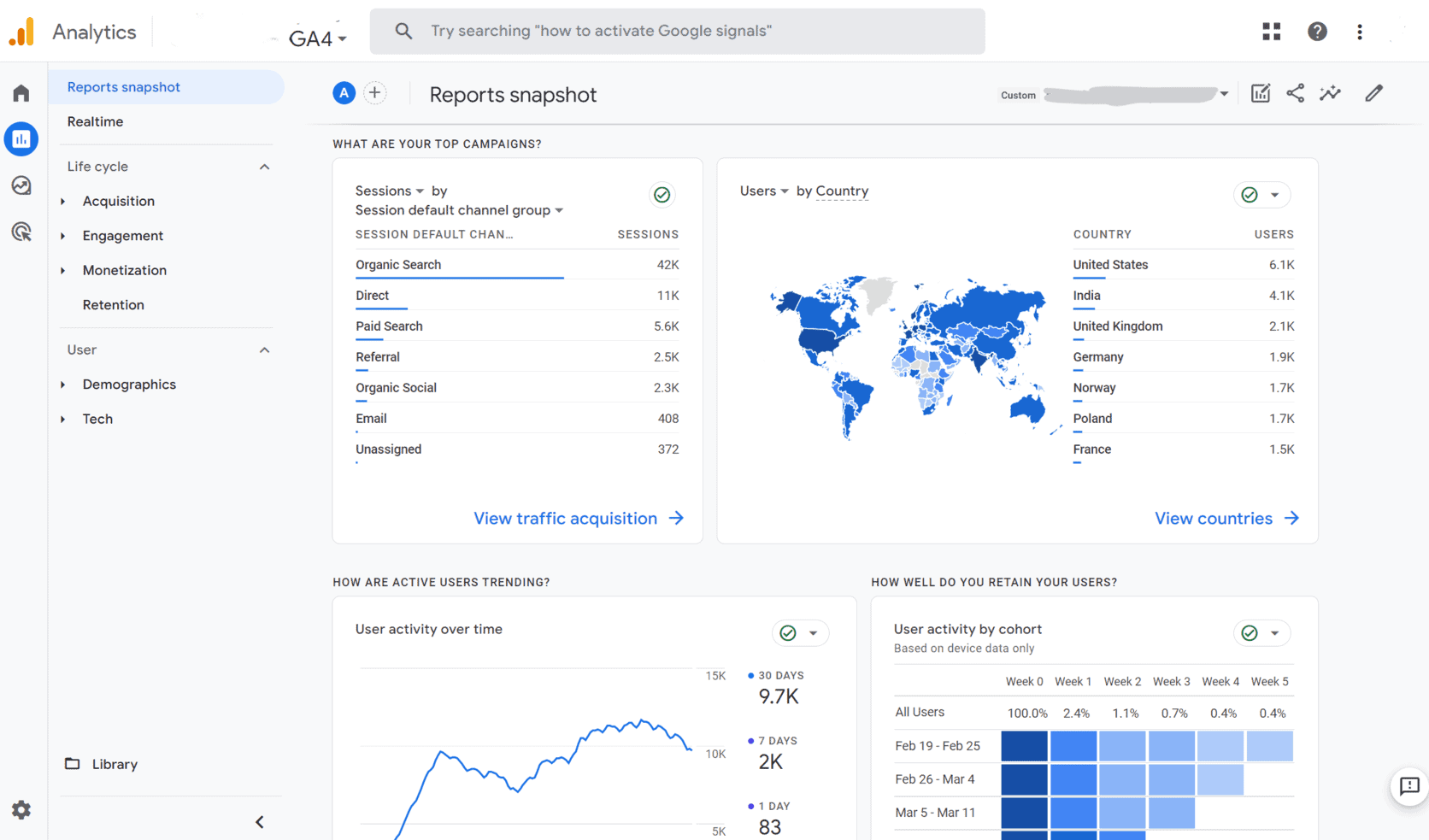
The standard version is completely free. Google Analytics 360, the enterprise tier, starts at $150,000 per year and adds unsampled reporting, higher data limits, and SLA guarantees.
Key features:
- Event-based tracking: every user interaction, page view, click, scroll, purchase, or custom action is tracked as an event with parameters. This replaces the rigid Category/Action/Label structure of Universal Analytics and makes cross-platform measurement cleaner.
- Cross-platform tracking: one GA4 property tracks your website and mobile app together using Firebase SDKs, giving a unified view of the customer journey across devices.
- Exploration reports: drag-and-drop custom analyses including funnel exploration, path exploration, cohort analysis, and segment overlap. These replace the old custom reports with more flexibility.
- Predictive audiences and AI insights: machine learning surfaces anomaly detection, purchase probability, churn probability, and automated recommendations without any manual setup.
- Cross-channel budgeting (beta, 2026): projection plans and scenario plans inside GA4 let teams forecast results and compare channel performance without leaving the platform.
- BigQuery export: raw event-level data exports directly to BigQuery on the free tier, which used to require a paid plan. This unlocks custom SQL analysis for technical teams.
- Google ecosystem integration: native connections to Google Ads, Google Search Console, Google Merchant Center, and Looker Studio. If your ad spend runs through Google, this integration is hard to replicate elsewhere.
- Consent Mode v2: adjusts data collection behavior based on user consent signals, supporting GDPR and CCPA compliance workflows.
Pros:
- Completely free for the vast majority of businesses
- Deepest Google Ads integration available anywhere
- BigQuery export included on the free tier
- Cross-platform web and app tracking in one property
- Predictive analytics and anomaly detection built in
- Works for eCommerce, SaaS, content sites, and apps equally well
Cons:
- Steep learning curve, especially for teams migrating from Universal Analytics
- Data sampling applies on large datasets in the standard interface
- Default reports are less intuitive than many alternatives
- Data processing delays of 24 to 48 hours on some reports
- Privacy regulations require careful consent configuration to stay compliant
- Not built for revenue analytics or payment gateway reporting. Google Analytics alternatives cover this gap.
2. HubSpot Marketing Hub
HubSpot Marketing Hub is an all-in-one marketing platform that combines campaign management, automation, CRM data, and analytics under one roof.
It is built for B2B and B2C marketing teams that want to connect campaign activity directly to pipeline and revenue without stitching together separate tools.
The analytics are not a standalone reporting layer. They are embedded inside everything the platform does, which means every email, landing page, ad, and workflow generates performance data automatically.
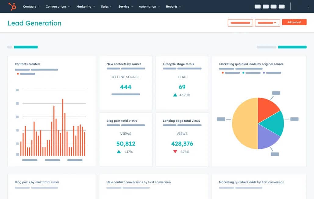
Pricing is seat and contact based. The free tier covers basic traffic and email analytics with single-touch attribution only.
Starter begins at $20 per seat per month. Professional starts at $1,300 per month for 3 seats and 2,000 marketing contacts, and is where multi-touch attribution unlocks. Enterprise starts at $5,000 per month.
Key features:
- Multi-touch revenue attribution: six pre-built attribution models on Professional and above: first touch, last touch, linear, time decay, U-shaped, and W-shaped. These map every marketing touchpoint to closed revenue in the CRM, so you can see which channels actually drive deals.
- Campaign analytics: group emails, landing pages, ads, and social posts under one campaign umbrella and track combined performance including sessions, contacts generated, deals influenced, and revenue attributed.
- Traffic analytics: website session tracking by source, page, and device. Shows which traffic sources produce the highest-quality leads, not just the most visits.
- Custom dashboards and reports: drag-and-drop report builder with access to CRM, marketing, and pipeline data in one place. Teams can build reports that cross marketing and sales without exporting to a spreadsheet.
- Funnel reporting: tracks how contacts move through lifecycle stages from subscriber to MQL to SQL to customer, with conversion rates at each stage visible in the dashboard.
- AEO (Answer Engine Optimization), launched April 2026: $50 per month standalone or bundled with Professional and Enterprise. Tracks brand visibility in AI-powered search engines like ChatGPT and Perplexity.
- Ad analytics: connects to Google Ads, Facebook Ads, and LinkedIn Ads. Tracks ad ROI alongside organic marketing activity in the same dashboard.
- Email and landing page analytics: open rates, click rates, conversion rates, and A/B test results embedded directly into the asset view without needing a separate report.
Pros:
- Marketing and CRM data live in the same platform, no integration required
- Multi-touch attribution ties campaign activity directly to revenue
- Clean interface that most marketing teams can learn without heavy training
- Covers email, social, ads, landing pages, and web analytics in one place
- Strong for B2B teams running inbound with a defined lead funnel
- AEO feature tracks AI search visibility, which most tools still miss
Cons:
- Pricing escalates fast, a 10-person team on Professional can clear $15,000 in year one including onboarding and contact overages
- Multi-touch attribution and custom reports locked behind Professional ($1,300/month)
- Contact-based pricing penalises list growth with no grace period for mid-contract overages
- Custom attribution model logic requires Enterprise tier
- Not built for eCommerce transaction analytics. Dedicated revenue attribution tools fit better here.
- Overkill for small teams that only need one or two of its many modules
3. Semrush
Semrush started as a keyword research tool and has grown into a full search and visibility platform covering SEO, content marketing, competitive intelligence, PPC research, social media, and AI search visibility.
Adobe completed its acquisition of Semrush in April 2026, adding enterprise distribution behind the product.
It is the platform of choice for content-led marketing teams where organic search is the primary growth channel.
Pricing: Pro plan at $139.95 per month (or $117.33 annually), Guru at $249 per month ($208.33 annually), Business at $499 per month ($416.66 annually). A free tier with limited daily queries is available, and a 7-day trial on paid plans.
Key features:
- Keyword Magic Tool: generates millions of keyword variations filtered by intent, difficulty, volume, and SERP features. The primary workflow for any content strategy built around organic search.
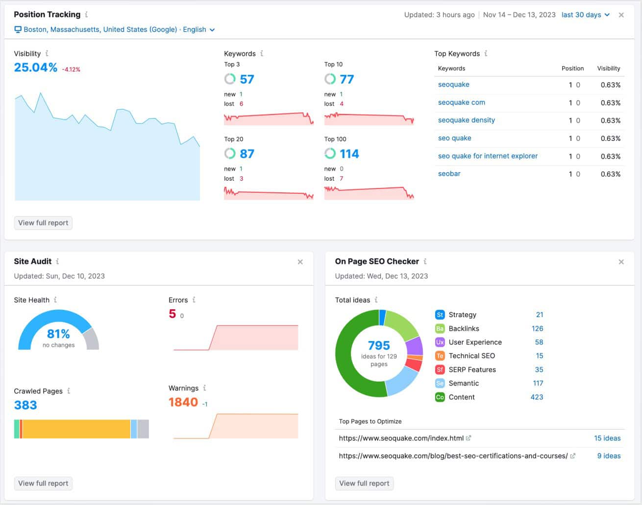
- Position tracking: daily rank tracking for target keywords across devices and locations. Shows SERP movements, featured snippet gains and losses, and competitor position changes side by side.
- Site audit: deep technical SEO crawl with Core Web Vitals integration. Flags broken links, duplicate content, crawlability issues, and page speed problems with prioritised fix recommendations.
- Traffic analytics: estimates competitor website traffic, sources, engagement metrics, and audience demographics. Used for competitive benchmarking without needing access to their GA4.
- Organic research: reveals every keyword a competitor ranks for, their top traffic-driving pages, and estimated monthly organic visitors. The core workflow for reverse-engineering competitor content strategies.
- Backlink analytics: full backlink profile for any domain including referring domains, anchor text distribution, toxic link detection, and link acquisition history.
- AI Visibility Toolkit (2026): tracks brand mentions and visibility in AI-powered search engines including ChatGPT, Google AI Overviews, Perplexity, and Gemini. Identifies prompts and topics to target for AI search presence.
- Content Marketing Platform (Guru and above): topic research, SEO content templates, content audit, and ContentShake AI for AI-assisted content generation. Integrates with Looker Studio for combined reporting.
Pros:
- The most comprehensive SEO and search intelligence platform available in one subscription
- AI Visibility Toolkit covers brand presence in AI search, a gap most analytics tools still miss
- Competitor traffic and keyword data available without any access to their internal tools
- Integrates with GA4, Google Search Console, and Looker Studio for combined reporting
- Strong agency workflow with client reporting, PDF exports, and white-label options on higher tiers
- 55+ tools in one platform reduces the need for separate SEO point solutions
Cons:
- Expensive entry point at $139.95 per month; value only comes when using most of the toolset
- Content Marketing Platform and historical data locked behind Guru tier ($249/month)
- Not a revenue analytics tool. No payment, transaction, or eCommerce KPIs reporting
- Overwhelming for beginners; the breadth of features creates a steep learning curve
- Competitor traffic estimates are approximations, not verified data
- Only one user seat on Pro; additional seats cost extra on all plans
4. Mixpanel
Mixpanel is a product analytics platform built around one idea: track what users actually do inside your product, not just where they come from.
While GA4 tells you traffic sources and page views, Mixpanel tells you which features users engage with, where they drop out of an onboarding flow, and which behavior patterns lead to retention versus churn.
It is the standard choice for SaaS analytics and app teams running product-led growth.
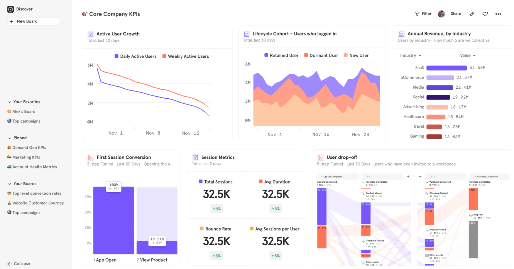
Pricing: Free plan includes 1 million monthly events, 10,000 session replays, and 12 months data retention.
Growth tier starts at $20 per month (billed annually) for up to 10,000 monthly tracked users (MTUs), scaling with volume. Enterprise pricing is custom, with extended data retention up to 7 years.
Key features:
- Event-based tracking: every user action, clicks, form submissions, feature usage, purchases, is tracked as a named event with custom properties. This gives a far more granular view of product behavior than page-view-based tools.
- Funnel analysis: visualises user journeys through any defined sequence of steps and shows exactly where users drop off. Used for signup flows, onboarding, checkout optimization, and feature adoption.
- Retention analysis: cohort-based retention tracking that shows how user engagement changes over time after a triggering event. The primary report for measuring whether product changes actually improve stickiness.
- Behavioral cohorts: group users by any combination of actions they have or have not taken, then filter every other report by that cohort. Allows surgical segmentation without SQL.
- Session replay with AI summaries: watch actual user interactions, linked directly to event data. The AI Summary tab generates a written summary of each session so you don’t have to watch the full clip. Free tier includes 10,000 replays per month.
- Metric Trees: define top-line business metrics as a tree with input metrics rolling up to output metrics. Aligns product, growth, and exec teams on what actually moves the needle.
- Feature flags and experiments: controlled rollouts to selected user segments and A/B test measurement within the same platform. Reduces the need for a separate experimentation tool.
- Warehouse connectors: native data pipelines to Snowflake, BigQuery, Databricks, and Redshift. Lets technical teams query raw Mixpanel data alongside other business data in their warehouse.
Pros:
- Generous free tier, 1 million events and 10,000 session replays per month
- Funnel and retention analysis depth is unmatched for product-led teams
- Session replay tied directly to event data: click a funnel drop-off, watch the replays
- No SQL required for most analyses, accessible for non-technical marketers
- Feature flags and experiments reduce the need for separate tools
- Warehouse-native mode for teams that want analytics on top of their own data
Cons:
- Steeper learning curve than most competitors, implementation takes careful planning upfront
- Event-based pricing punishes fast growth, teams regularly report 2 to 3x cost overruns vs. budget
- Cohort behavior is evaluated at query time, not as static lists, which surprises analysts
- Not a marketing analytics tool in the traditional sense, no campaign attribution or ad spend tracking
- No revenue or payment gateway analytics beyond what you instrument manually
- Advanced experimentation locked behind Enterprise tier
5. Klaviyo
Klaviyo is an email and SMS marketing platform built specifically for eCommerce brands. It has over 160,000 customers and is the dominant choice for Shopify and WooCommerce stores that want to drive revenue through lifecycle marketing, not just send newsletters.
What separates Klaviyo from generic email tools is that it pulls purchase history, product catalog data, and behavioral signals directly from the store and uses them to power segmentation, automation, and predictive analytics.
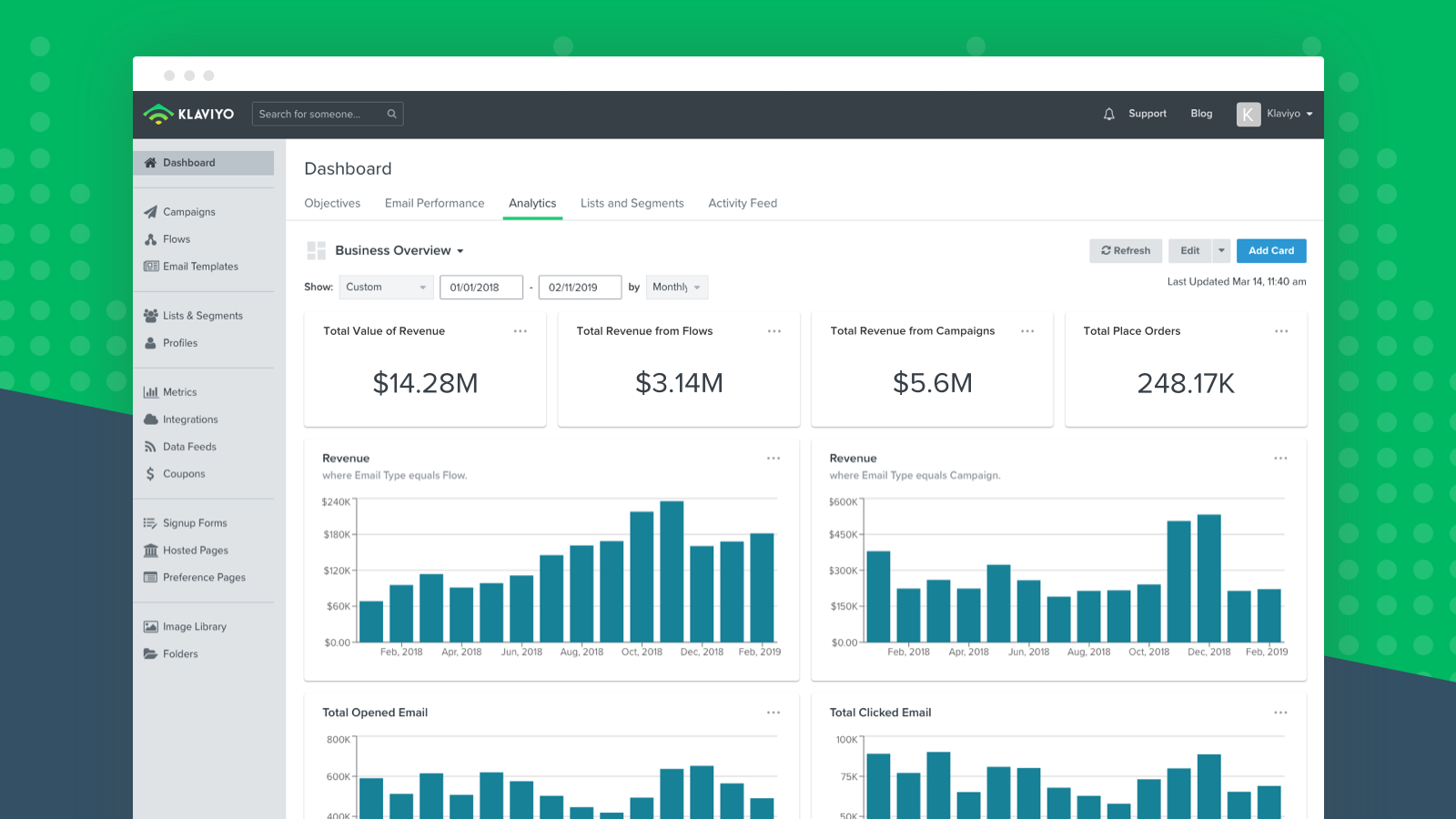
Pricing: Free plan for up to 250 contacts and 500 emails per month. Email plan starts at $20 per month for up to 500 contacts with unlimited sends. Email and SMS plan starts at $35 per month.
Pricing scales with active profiles, not total contacts, which is fairer than most ESPs.
Key features:
- Revenue attribution analytics: every email and SMS campaign is tied to actual revenue from your store. You can see exactly how much revenue each flow, campaign, and segment generated, not just open rates and click rates.
- Predictive analytics: machine learning models trained on eCommerce data that calculate customer lifetime value, churn probability, next order date, and repeat purchase likelihood for every profile. Used to build smarter segments without manual rules.
- RFM segmentation: built-in recency, frequency, and monetary segmentation groups customers into high-value, at-risk, and lapsed segments. Available on paid plans for automated win-back and retention campaigns.
- Flows automation builder: visual workflow builder with 80 pre-built templates covering abandoned cart, welcome series, post-purchase, browse abandonment, win-back, and price drop flows. Conditional logic and branching based on customer data are built in.
- Deep eCommerce integration: native sync with Shopify, WooCommerce, BigCommerce, and Magento. Product images, pricing, inventory status, and order history sync in real time. No manual CSV uploads.
- SMS and multi-channel automation: SMS flows with TCPA and GDPR compliance tools built in. Email and SMS can run in the same flow with channel-based branching.
- K:AI Marketing Agent: generates campaign content from product catalogs and brand guidelines, learning from past send performance.
- A/B testing: tests subject lines, send times, content variations, and full flow branches with statistical significance tracking.
Pros:
- Revenue attribution tied to actual store transactions, not just clicks
- Predictive CLV, churn, and next-order models built in on paid plans
- Best-in-class behavioral segmentation for eCommerce audiences
- 80 pre-built automation flow templates that work out of the box
- Profile-based pricing is fairer than contact-count pricing, duplicate records do not inflate your bill
- Native Shopify and WooCommerce integration that actually just works
Cons:
- Pricing escalates sharply with list size, $20/month at 500 contacts grows to $150/month at 10,000 and $400/month at 25,000
- Built almost entirely for eCommerce, SaaS teams and B2B businesses get limited value
- Steep learning curve for advanced flows and segmentation logic
- Predictive analytics and customer lifetime value models require a minimum amount of historical order data to be useful
- SMS credits are separate from email pricing and can add up quickly at scale
- Not a broader marketing analytics platform, no SEO, ad attribution, or traffic analytics
6. Triple Whale
Triple Whale is a paid media attribution and Shopify analytics platform built exclusively for Shopify brands. It started as a dashboard for DTC founders in 2021 and evolved into what is now closer to an analytics operating system for performance marketers.
The platform serves over 10,000 DTC brands and processes more than 9 billion events daily.
The core problem it solves is the attribution gap that opened after Apple’s iOS 14.5 privacy changes gutted Meta’s native pixel tracking, Triple Whale’s first-party pixel reconstructs customer journeys that platform-reported numbers now miss entirely.
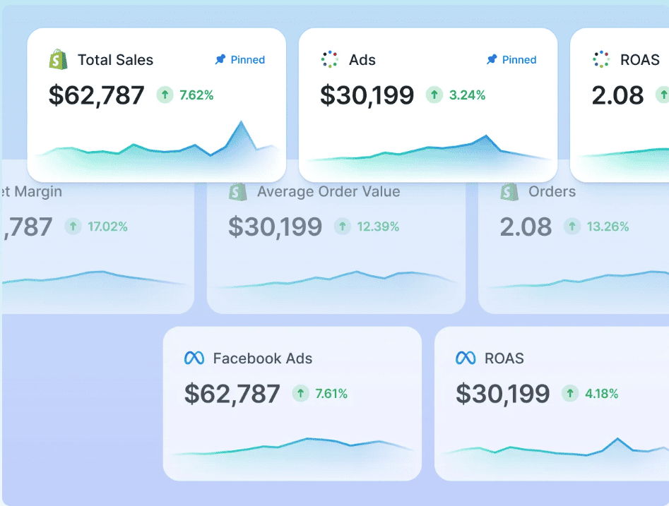
Pricing: Free plan includes basic attribution and a blended dashboard. Starter (Growth) at $129 per month, Pro at $199 per month. Enterprise pricing is custom.
Paid tiers are most valuable for stores spending $15,000 or more per month on paid media, below that threshold the cost-to-value ratio thins out.
Key features:
- Triple Pixel (first-party attribution): server-side and client-side tracking that captures conversion data directly from your Shopify store, bypassing browser cookie limitations and iOS privacy restrictions. Supports headless Shopify. The pixel sits outside Meta’s, Google’s, and TikTok’s walled gardens, giving you a source of truth that does not depend on platform-reported numbers.
- Unified dashboard: pulls data from Meta, Google, TikTok, Pinterest, Klaviyo, and Shopify into one view. Shows blended ROAS, revenue, ad spend, and net profit alongside each other without switching tabs.
- Compass (unified measurement): combines Multi-Touch Attribution (MTA), Marketing Mix Modeling (MMM), and incrementality testing in a single measurement framework. Designed for brands spending $50,000 or more per month who need layered confidence in budget allocation decisions.
- Creative analytics: performance analysis at the individual ad creative level, hooks, headlines, and images, across Meta, Google, and TikTok simultaneously. Shows which creatives drive the highest ROAS and where fatigue is setting in.
- Moby AI: trained on data from 50,000+ brands representing over $82 billion in GMV. Generates budget reallocation recommendations, revenue forecasts, creative briefs, audience suggestions, and ad creative with platform-specific sizing. Moby Agents can execute optimizations autonomously.
- Cohort analysis and LTV: customer cohorts by acquisition channel, first-order product, and time period. Shows which acquisition sources generate customers with the highest long-term value, not just the lowest initial CPA.
- Post-purchase survey attribution: captures customer-reported discovery sources at checkout. Used alongside pixel data to triangulate attribution for channels that are harder to track algorithmically.
Pros:
- Best first-party pixel attribution for Shopify brands in a post-iOS 14 world
- Creative analytics at the asset level across all platforms in one view
- Moby AI goes beyond reporting to generate recommendations and execute actions
- Cohort and LTV analysis reveals which channels actually generate valuable customers
- Free plan provides a usable data foundation without any upfront cost
- Built specifically for DTC, the interface and terminology match how performance marketers think
Cons:
- Shopify-only, not usable for WooCommerce, BigCommerce, or non-Shopify stores
- Paid tiers only justify their cost at $15,000 or more in monthly ad spend
- Enterprise tier locks the best features (Moby advanced, full Compass) behind custom pricing
- Attribution is probabilistic, not deterministic, useful as a signal, not as gospel
- Not a general marketing analytics tool, no SEO, email, or content analytics
- Occasional dashboard updates have surprised users with unexpected UI changes
7. Supermetrics
Supermetrics is a data connector, not a dashboarding tool. It pulls data from 100+ marketing platforms, Google Ads, Meta, LinkedIn, TikTok, Shopify, HubSpot, Salesforce, and more, and routes it to wherever your team does its analysis: Google Sheets, Excel, Looker Studio, Power BI, BigQuery, Snowflake, or Tableau.
It does not build visualizations or dashboards itself.
The pitch is simple: stop copying numbers manually from ten different platforms every Monday morning and let Supermetrics do it automatically on a schedule.
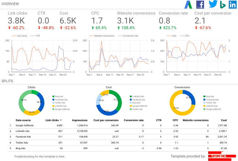
Pricing has changed frequently. Current structure starts at around €29 per month for a single destination, scaling by the number of data sources and destinations needed.
Multiple destinations stack separately. Teams consistently report that what starts at $49 per month grows to $200 to $300 or more once sources and destinations are added. Enterprise pricing is custom.
Key features:
- 100+ data connectors: covers virtually every major advertising platform (Google Ads, Meta, LinkedIn, TikTok, Pinterest, Snapchat), analytics tool (GA4, Adobe Analytics), eCommerce platform (Shopify, WooCommerce), CRM (HubSpot, Salesforce), and SEO tool (Semrush, Ahrefs). If your marketing stack has a platform, Supermetrics almost certainly connects to it.
- Automated data refresh: daily batch refresh by default (2 AM UTC), with hourly refresh available on higher tiers. Replaces the daily ritual of manually exporting CSVs.
- Multiple destinations: routes data to Google Sheets, Excel, Looker Studio, Power BI, Tableau, BigQuery, Snowflake, and more. Teams choose the tool where they already work, rather than switching to a new interface.
- Data blending: combine data from multiple sources into a single query. Pull Google Ads spend and Shopify revenue into the same row to calculate ROAS without a spreadsheet formula. Widget-level filters with AND/OR logic added in early 2026.
- Pre-built report templates: dozens of ready-made templates for common marketing KPIs across Google Ads, Meta, LinkedIn, GA4, and more. Useful starting points that reduce setup time.
- Scheduled reports: automatic delivery of refreshed data on a set schedule, useful for agencies sending client reports or finance teams that need weekly marketing spend summaries.
Pros:
- Widest connector library in the category, 100+ sources is hard to beat
- Works with the reporting tools your team already uses, no new interface to learn
- Automated refresh eliminates manual data exports entirely
- Strong for agencies managing multiple clients across many platforms
- Pre-built templates reduce setup time for common marketing reports
- BigQuery and Snowflake destinations support data warehouse workflows for technical teams
Cons:
- No built-in dashboards or visualizations, you still need a separate tool for that
- Pricing is complex and frequently surprises users, entry price of $49 often grows to $300+ with add-ons
- Per-destination billing means costs stack if you need data in multiple tools
- No free tier; trials are time-limited
- When something breaks, troubleshooting requires checking both Supermetrics and the destination tool
- Not useful as a standalone analytics tool. Data consolidation is its job, not insight
8. Amplitude
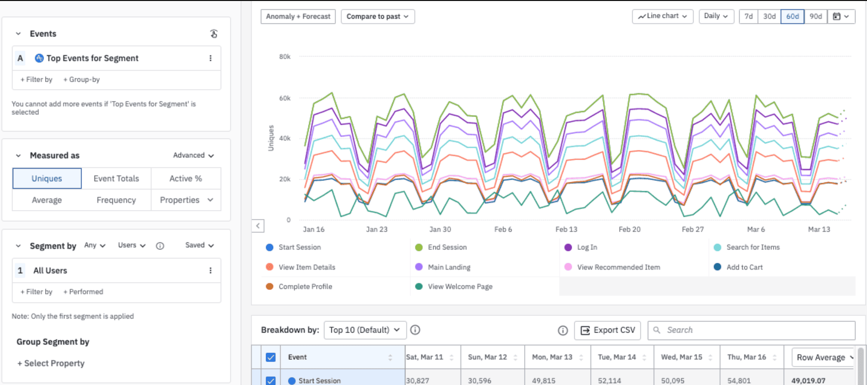
Amplitude is a product analytics platform used by over 45,000 teams including Spotify, Walmart, PayPal, and NBC. It competes directly with Mixpanel but goes deeper on experimentation, behavioral cohort analysis, and predictive intelligence.
Amplitude is the default choice for product and growth teams at growth-stage and enterprise companies that need to handle large event volumes reliably, run frequent A/B tests, and understand the behavioral drivers of long-term retention.
It is listed on NASDAQ (AMPL), which gives some procurement teams comfort on long-term vendor stability.
Pricing: Starter free plan with up to 50,000 MTUs and 10 saved charts. Plus tier starts at $49 per month scaling with MTUs. Growth tier is custom (typically $22,000 to $250,000+ per year). Enterprise is custom.
Amplitude is consistently 2 to 5 times more expensive than Mixpanel at equivalent Growth and Enterprise volumes per verified buyer data.
Key features:
- Behavioral cohort analysis: group users by any combination of actions, properties, and timing, “users who completed onboarding within 24 hours and used the export feature within 7 days” becomes a tracked cohort over time. Compare retention, conversion, and revenue across cohorts to find what actually drives long-term engagement. Best-in-class for this use case.
- Funnel analysis: multi-step conversion funnels with flexible event ordering, holdout analysis, and breakdown by any user property. Identifies where users drop out and which segments convert better.
- Experiment (native A/B testing): runs controlled experiments with statistical significance built in. Amplitude’s native experimentation engine eliminates the need for a separate A/B testing tool and connects test results directly to product behavior data.
- Retention analysis: N-day and bracket retention charts show how product changes affect user return rates over time. Supports custom retention windows and event-based retention definitions.
- Compass and Personas (AI-powered): ML models that identify which user behaviors predict long-term retention (Compass) and automatically surface user persona clusters (Personas) without manual segmentation work.
- Session replay: included on free and paid tiers, linked to behavioral event data. Watch sessions of specific cohorts or funnel drop-off users directly from within any report.
- Data governance tools: schema management, event validation, and data audit tools that prevent analytics taxonomies from becoming messy as teams scale. Important for organizations where multiple teams instrument events independently.
- Warehouse-native analytics: connects directly to Snowflake, BigQuery, Databricks, and Redshift. Teams can run Amplitude analyses on top of their own data warehouse without duplicating data.
Pros:
- Best-in-class behavioral cohort depth for understanding retention drivers
- Native experimentation engine connects A/B tests directly to product behavior
- Handles massive event volumes without performance degradation
- Free Starter plan with 50,000 MTUs is useful for early-stage teams
- Strong data governance tools prevent taxonomy drift as teams scale
- Publicly traded, which matters for enterprise procurement stability requirements
Cons:
- Consistently 2 to 5 times more expensive than Mixpanel at Growth and Enterprise tiers
- Growth tier pricing is opaque, most contracts exceed $50,000 per year and require sales negotiation
- Significant learning curve for non-technical team members
- Initial SDK implementation requires meaningful engineering effort
- Event taxonomy planning is essential upfront, poor planning leads to messy data quickly
- Not built for marketing campaign attribution, SEO, or subscription analytics
9. Contentsquare
Contentsquare is a digital experience analytics platform that answers one question quantitative tools cannot: why are users behaving the way they do?
While GA4 tells you that 68% of users dropped off your checkout page, Contentsquare shows you exactly what they clicked, where they hesitated, what frustrated them, and which UX element caused them to leave.
It absorbed Hotjar in 2021 and completed the full merger in July 2025, so all the heatmap and session replay features Hotjar users relied on now live inside Contentsquare, including the free-forever plan.
Pricing: Free plan includes session replay, unlimited heatmaps, funnel analysis, and dashboards with a capped number of monthly sessions.
Growth plan starts at $40 per month with increased session limits, journey analysis, impact analysis, zone-based heatmaps, and AI capabilities. Pro and Enterprise plans are sales-assisted with custom pricing.
Key features:
- Session replay: anonymized reconstructions of individual visitor sessions showing every click, scroll, and hesitation. Used to understand exactly what happened during a specific user journey. Pro plan adds AI-powered replay summaries and automatic frustration signal detection.
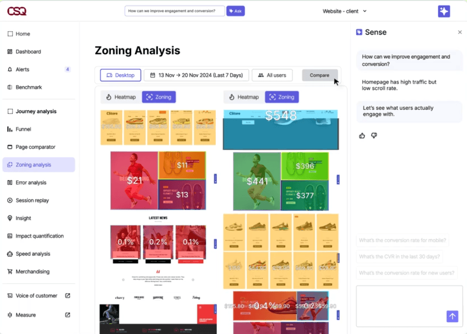
- Zone-based heatmaps: click, scroll, and hover heatmaps by page section. Shows which content zones attract attention and which are ignored. Available on all plans including free. Zone-based analysis is more granular than traditional heatmaps because it measures interaction per element, not just screen position.
- Journey analysis: visual maps of how users navigate between pages, where they enter, where they exit, and which paths lead to conversion versus abandonment. Available from the Growth plan.
- Funnel analysis: conversion funnel tracking with drop-off quantification. Shows how many sessions experienced the same drop-off point and estimates the revenue impact of fixing it (Impact Quantification feature).
- Struggle analysis: automatically detects frustration signals, rage clicks, dead clicks, error clicks, and repeated back-and-forth navigation, and surfaces the pages and elements causing the most user friction.
- AI insights: surfaces anomalies and behavioral patterns without requiring manual analysis. Highlights which pages or segments experienced unusual drop-offs and flags them for investigation.
- Error monitoring: identifies JavaScript, API, and text-based errors occurring on the site, shows how frequently each error appears, and estimates conversion loss caused by it.
- Integrations: connects with GA4, Adobe Analytics, Optimizely, AB Tasty, and 100+ technology partners. Session replays and heatmaps can be linked to A/B test variations for qualitative validation.
Pros:
- Free plan includes session replay and heatmaps, usable with no financial commitment
- Shows the qualitative “why” behind quantitative metrics that no other tool in this list covers
- Zone-based heatmaps are more precise than traditional pixel-based heatmaps
- Impact Quantification estimates revenue impact of UX issues to help prioritise fixes
- Inherited Hotjar’s user base and free plan terms after the merger, familiar to millions of marketers
- Strong for eCommerce and UX teams optimising conversion funnels
Cons:
- Session replay does not match Hotjar’s pre-merger quality per some early post-migration user reviews
- Initial setup of mappings, goals, and segments takes meaningful time
- Pro and Enterprise pricing is fully custom and sales-gated, no transparent numbers at higher tiers
- Raw data export is limited, complicating cross-analysis with external data sources
- Not a traffic analytics or conversion rate tool. No channel, ad spend, or revenue reporting
- Comparing page snapshots over time is difficult; no labelling of iterations
10. Putler
Every tool in this list solves one piece of the analytics puzzle. GA4 covers traffic. Klaviyo covers email revenue. Triple Whale covers paid attribution. Mixpanel and Amplitude cover product behavior.
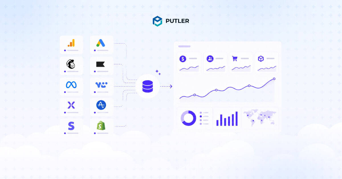
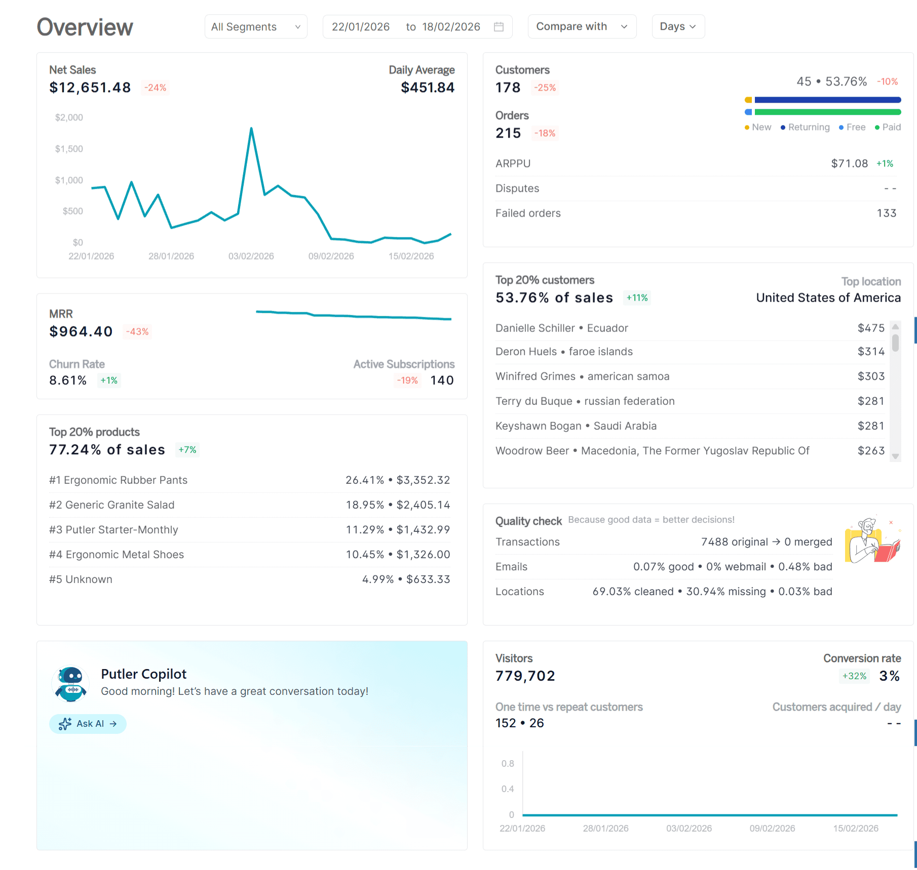
Putler is the tool that brings the business numbers together, revenue, customers, products, subscriptions, and transactions, from every store, gateway, and marketplace into a single dashboard.
Putler connects to 17+ data sources including PayPal, Stripe, Braintree, Razorpay, Authorize.Net, 2Checkout, Shopify, WooCommerce, BigCommerce, Easy Digital Downloads, Amazon, eBay, Etsy, Gumroad, Google Analytics, Google Search Console, and Mailchimp.
It automatically deduplicates transactions, converts 36+ currencies, aligns time zones, and resolves mismatches between cart and gateway data. The cleanup happens in the background. You connect your sources and the consolidated view appears.
Pricing starts at $20 per month (first month $1), scaling with revenue volume. A 14-day free trial with no credit card required.
Key features:
- Multi-source data consolidation: connects all stores, payment gateways, and marketplaces into one unified view. A payment recorded in both WooCommerce and Stripe is counted once. A customer who buys through PayPal and Stripe across two stores appears as one customer record. This deduplication is what most analytics tools skip entirely.
- 200+ KPIs across 7 dashboards: dedicated dashboards for Sales, Products, Customers, Subscriptions, Transactions, Audience (web analytics), and a Home Dashboard with the business overview. Every important number is accessible without building a custom report.
- RFM customer segmentation: automatically segments every customer into one of 11 groups, Champions, Loyal, At Risk, Lost, and more, based on recency, frequency, and monetary value. Segments export to Mailchimp or CSV for targeted campaigns. No manual setup required.
- Sales heatmap: shows the best times to sell by hour and day of week based on actual transaction history. Identifies peak sales windows and seasonal patterns for campaign timing and staffing decisions.
- Subscription analytics: tracks MRR, ARR, churn rate, active subscriptions, failed renewals, and subscriber LTV for businesses using WooCommerce Subscriptions, Stripe, Braintree, Authorize.Net, or EDD on subscription models. Handles mixed one-time and recurring revenue in the same dashboard.
- Forecasting and goal tracking: revenue projections based on historical trends and progress tracking against custom revenue goals. Shows whether the month is on pace before the month ends.
- Instant transaction search: find any customer, order, or transaction across all connected sources in seconds. Useful for customer support teams handling refund requests without switching between platforms.
- Multi-currency and multi-timezone: 36+ currency conversions with a single reporting currency, and timezone alignment across sources that report in different zones. Accurate consolidated revenue numbers without manual adjustment.
Pros:
- The only tool in this list that consolidates multiple payment gateways, eCommerce platforms, and marketplaces into one dashboard
- Automatic deduplication between cart and gateway data, no spreadsheet formulas required
- RFM segmentation built in out of the box, no manual configuration needed
- Covers both eCommerce and SaaS metrics in the same view
- Works for multi-store and multi-gateway businesses where every other tool shows siloed numbers
- Pricing starts at $20 per month, accessible without an enterprise budget
Cons:
- Not a traffic analytics tool, audience reporting draws from Google Analytics and Search Console rather than native first-party tracking
- Not built for paid media attribution or creative analytics
- Subscription analytics limited to supported platforms (Stripe, WooCommerce Subscriptions, Braintree, Authorize.Net, EDD)
- Historical data import depth depends on plan (2 years on lower plans, up to 5 years on higher)
How to pick the right marketing analytics tool
The 10 tools above solve different problems. Picking the wrong one is expensive. Picking the right one usually comes down to three questions.
What do you sell?
eCommerce stores need revenue, customer, and product analytics first. Klaviyo, Triple Whale, and Putler are built for that. SaaS businesses need product behavior, retention, and experimentation. Mixpanel and Amplitude are built for that. Content sites and B2B teams need traffic, SEO, and lead attribution. GA4, Semrush, and HubSpot cover that.
How many platforms is your data spread across?
One store on one gateway, native tools and a single analytics platform are enough. Multiple stores, multiple gateways, multiple marketplaces, you need data consolidation or you will spend every Monday morning reconciling spreadsheets. Putler, Supermetrics, and warehouse-based setups solve that.
What is the question you cannot answer today?
If you cannot answer “which products drive the most repeat customers?”, you need RFM segmentation. If you cannot answer “which ad creative is winning right now?”, you need Triple Whale or Amplitude. If you cannot answer “is my month on pace?”, you need a tool with forecasting. Pick the tool that answers your hardest current question, then add the next one when it becomes a bottleneck.
Most stacks end up using three to five of these tools together, not one. That is normal. The mistake is paying for ten when three would have done the job.
FAQs about marketing analytics tools
What are marketing analytics tools?
Marketing analytics tools are platforms that collect, process, and report on marketing data so teams can measure performance and make better decisions.
They cover everything from website traffic and SEO to email revenue, ad attribution, product behavior, and customer analytics.
Most businesses use three to five different marketing analytics tools together because no single platform covers every angle.
What is the best free marketing analytics tool?
Google Analytics 4 is the best free marketing analytics tool for most businesses. It covers web and app traffic, conversion events, and integrates with Google Ads.
Mixpanel, Amplitude, Klaviyo, Triple Whale, and Contentsquare also have usable free tiers for their specific use cases.
Which marketing analytics tool is best for eCommerce?
For eCommerce specifically, Klaviyo handles email and SMS revenue, Triple Whale handles paid ad attribution for Shopify, and Putler consolidates multi-gateway and multi-store data into one dashboard with built-in sales forecasting.
Most serious eCommerce stacks use a combination of these.
Which marketing analytics tool is best for SaaS?
Mixpanel and Amplitude are the two leading product analytics tools for SaaS businesses.
Mixpanel is more accessible for non-technical teams; Amplitude goes deeper on experimentation and behavioral cohorts. HubSpot fits if marketing-to-revenue attribution matters most.
How much do marketing analytics tools cost?
Free tiers exist for most tools, including GA4, Mixpanel, Amplitude, Klaviyo, Triple Whale, and Contentsquare.
Paid plans range from $20 per month at the low end (Klaviyo, Putler, Mixpanel) to $1,300+ per month at enterprise scale (HubSpot Professional, Amplitude Growth).
Most growing businesses spend between $200 and $1,500 per month across three to five tools combined.
Do I need more than one marketing analytics tool?
Almost always, yes. Different tools solve different problems.
A typical stack might combine GA4 for traffic, Klaviyo for email revenue, Triple Whale or Putler for revenue consolidation, and Mixpanel for product behavior.
The goal is to use the smallest number of tools that answer the questions you actually have, not the biggest.
Final thoughts on marketing analytics tools
No single tool in this list covers every angle of marketing analytics. The right stack depends on what you sell, who you sell to, and how many platforms your data is spread across.
Pick the tools that answer the questions you cannot answer today, and add the next one only when you hit a wall.
For multi-channel eCommerce and SaaS businesses dealing with revenue spread across multiple gateways, stores, and marketplaces, Putler closes the consolidation gap that no other tool in this list solves on its own.
Start there if your numbers do not add up. Add the others as the stack grows.